Inspiring
April 5, 2023
Question

Header/nav advice

  • April 5, 2023
  • 4 replies
  • 806 views

Hello,

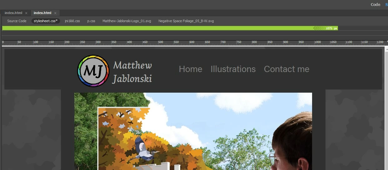
One big question I've had while creating a portfolio for myself is how to make my name (h1) align with my logo. So far, the only way I know of adjusting the leading is the line-height (3.5vw) decloration. The distance between "Matthew" and "Jablonski" satisfies me.


However, I end up having my whole name slightly lower than I would like (in relation to my logo). What revision(s) do I need to make to move the phrase up slightly? Please make any additional suggestions to how I've done my coding. 


Matthew

This topic has been closed for replies.

4 replies

Jon Fritz
Community Expert
Community Expert
April 5, 2023

I think I'd hit the old easy button on this one and simply move the name text into Photoshop and turn it, and the MJ circle, into a single image.

Nancy OShea
Community Expert
Community Expert
April 5, 2023

I'm all for easy but for web images, Illustrator vector image & text exported to SVG would be better for this than a raster image.


Nancy O'Shea— Product User & Community Expert
Inspiring
April 5, 2023

Full discloser: As you can see, I am no expert with DW. However, all of your advise is hugely informative to me and very valuable to me. To Nancy's point about the logo: it actually is an SVG. And to Osgood: I would mean a lot to me if you could please show me how you would approach the h1 issue, if possible.


Matthew

Nancy OShea
Community Expert
Community Expert
April 5, 2023

Don't style individual elements.  That's a bad habit to get into.  Instead create a layout structure similar to an artist's grid into which you place your items.  Working within a grid makes designing pages & canvases a lot simpler to manage.


Floats fell out of favor quite a while ago -- too hard to control.  Whenever possible, use CSS Flexbox or newer CSS Grids instead of Floats.


Nancy O'Shea— Product User & Community Expert
Legend
April 5, 2023

Most of your h1 css makes no sense at all. Certainly using 3.5vw line height IS NOT going to close the vertical gap between the 2 words as that refers to 'width' NOT height, use 3.5vh which refers to height and see if that gives you the required result. Personally I dont set font properties using either vw or vh so I cant guarantee anything. 


Seriously you just need to use the flexbox example provided then close the line-height if you require less vertical space between the 2 words. This will verticallly center align the words with your logo.

BenPleysier
Community Expert
Community Expert
April 5, 2023
Wappler is the DMXzone-made Dreamweaver replacement and includes the best of their powerful extensions, as well as much more!
Inspiring
April 5, 2023

Thanks for the reference. I tried using the following decloration, having so slightly effect of a reduction in the padding-left: .75%.


display: flex;
justify-content: center;
align-items: center;
height: 100%;


I guess my real question might be: is there a way to only effect the "Jablonski"'s leading - like, making class for that name??? 


Matthew