Participant
April 26, 2017
Answered

Help with side by side div

  • April 26, 2017
  • 7 replies
  • 482 views

Hello:

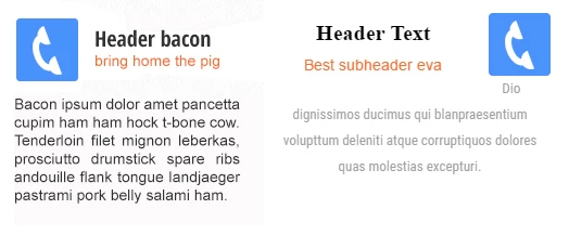
Can someone help me with a styling issue please? I am trying to create a div that looks like the example on the left. The closest I've been able to get is the example on the right. Can someone help with the CSS that would achieve this?

Thanks!

Sarah

    This topic has been closed for replies.
    Correct answer hans-g.

    Hello Sarah,

    my draft looks like this (I hope I understand you in the right way):
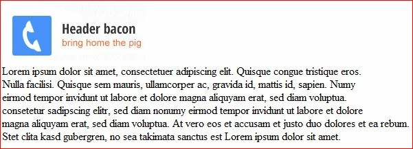
    and here is my code:

    <!doctype html>

    <html>

    <head>

    <meta charset="utf-8">

    <title>Help with side by side div</title>

    </head>

    <body>

    <p style="text-align: justify"><img src="sidebyside.jpg" alt="sidebyside ;-)))" width="209" height="82" style="float:left; margin-right:20px; margin-top:7px;" />       

    <p style="text-align: justify">       

    <p style="text-align: justify">       

    <p style="text-align: justify">Lorem ipsum dolor sit amet, consectetuer adipiscing elit. Quisque congue tristique eros.<br>

              Nulla facilisi. Quisque sem mauris, ullamcorper ac, gravida id, mattis id, sapien. Numy<br>

              eirmod tempor invidunt ut labore et dolore magna aliquyam erat, sed diam voluptua.<br>

              consetetur sadipscing elitr, sed diam nonumy eirmod tempor invidunt ut labore et dolore<br>

              magna aliquyam erat, sed diam voluptua. At vero eos et accusam et justo duo dolores et ea rebum.<br>

    Stet clita kasd gubergren, no sea takimata sanctus est Lorem ipsum dolor sit amet.

    <p style="text-align: justify">

    <p style="text-align: justify">

    <p style="text-align: justify">

    <p style="text-align: justify">

    <p style="text-align: justify">

    <p style="text-align: justify">

    </body>

    </html>

    You should "play" a little bit with the parameters float and margin to see what happens.

    Hans-Günter

    7 replies

    Preran
    Legend
    April 27, 2017

    Did the many solutions provided here help? I request that you mark the one that helped you the most as correct. It will help others that visit this post in the future.

    Thanks,

    Preran

    hans-g.
    Legend
    April 26, 2017

    Hi, as an addition to osgood_'s hint, I would like to add:

    <img src="http://placehold.it/65x65" width="65" height="65" style="float:left; margin-right:20px; margin-top:7px;" />

    to get:

    Hans-Günter

    hans-g.
    Legend
    April 26, 2017

    ... and as I said above: "You should "play" a little bit with the parameters float and margin to see what happens."

    Legend
    April 26, 2017

    Personally these days I'd use Flexbox - example below:

    <!DOCTYPE html>

    <html">

    <head>

    <meta charset="UTF-8" />

    <title>Side by Side</title>

    <style>

    .column {

    width: 30%;

    }

    .column header {

    display: -ms-flexbox;

    display: flex;

    -ms-flex-align: center;

    align-items: center;

    }

    .column h4 {

    font-size: 20px;

    margin: 0;

    padding: 0 0 0 20px;

    }

    .column span {

    display: block;

    font-size: 16px;

    }

    </style>

    </head>

    <body>

    <article class="column">

    <header>

    <img src="http://placehold.it/65x65"> 

    <h4>Header bacon

    <span>bring home the pig</span>

    </h4>

    </header>

    <p>Lorem ipsum dolor sit amet, vel semper adipisci consequat ne, epicurei necessitatibus an nam. Decore doctus vis ad, ea sed oporteat appellantur efficiantur. Ex legere malorum placerat qui, mea petentium maluisset voluptatum ne, mei no scripta dolores dissentiet. Eam dolorum repudiandae ea, graece dissentias cu quo. Dicit fierent mel id.</p>

    </article>

    </body>

    </html>

    Nancy OShea
    Community Expert
    Community Expert
    April 26, 2017

    Sarah,

    Are you using Bootstrap to create your responsive layout?

    If so, this is the relevant code for 4 columns on large devices, 2 column on smaller devices.

    <div class="container">

    <div class="row">

    <div class="col-lg-3 col-md-6 col-sm-6">

    <h2><span class="glyphicon glyphicon-pencil" aria-hidden="true"></span> Lorem ipsum</h2>

    <p>Lorem ipsum dolor sit amet, consectetur adipisicing elit. Corporis accusamus praesentium eveniet ad unde doloremque ex officia eius ab quibusdam.</p>

    </div>

    <div class="col-lg-3 col-md-6 col-sm-6">

    <h2><span class="glyphicon glyphicon-music" aria-hidden="true"></span> Lorem ipsum</h2>

    <p>Lorem ipsum dolor sit amet, consectetur adipisicing elit. Eos, mollitia natus amet eligendi consequuntur. Veritatis ullam debitis voluptas repellat laboriosam.</p>

    </div>

    <div class="col-lg-3 col-md-6 col-sm-6">

    <h2><span class="glyphicon glyphicon-screenshot" aria-hidden="true"></span> Lorem ipsum</h2>

    <p>Lorem ipsum dolor sit amet, consectetur adipisicing elit. Quasi, error, itaque non vel architecto ratione obcaecati doloribus delectus illum harum?</p>

    </div>

    <div class="col-lg-3 col-md-6 col-sm-6">

    <h2><span class="glyphicon glyphicon-blackboard" aria-hidden="true"></span> Lorem ipsum</h2>

    <p>Lorem ipsum dolor sit amet, consectetur adipisicing elit. Cumque, nam voluptate accusantium nulla distinctio odit aliquam voluptatem ab. Earum, voluptatibus.</p>

    </div>

    </div>

    </div>

    Nancy

    Nancy O'Shea— Product User & Community Expert
    hans-g.
    Legend
    April 26, 2017

    ... you could maybe use this "outfit":

    BenPleysier
    Community Expert
    Community Expert
    April 26, 2017

    <!doctype html>

    <html>

    <head>

    <meta charset="utf-8">

    <title>Untitled Document</title>

    <style>

      .media {

      width: 25%;

      }

      .media img {

      display: block;

      float: left;

      margin-right: 15px;

      }

      .media h3 {

      padding-top: 15px;

      }

      .media h3 small {

      color: red;

      }

    </style>

    </head>

    <body>

    <div class="media">

      <img src="http://placehold.it/75x75">

      <h3>Header bacon <br><small>bring home the pig</small></h3>

      <p>Can someone help me with a styling issue please? I am trying to create a div that looks like the example on the left. The closest I've been able to get is the example on the right. Can someone help with the CSS that would achieve this?

    </p>

    </div>

    </body>

    </html>

    Wappler is the DMXzone-made Dreamweaver replacement and includes the best of their powerful extensions, as well as much more!
    hans-g.
    hans-g.Correct answer
    Legend
    April 26, 2017

    Hello Sarah,

    my draft looks like this (I hope I understand you in the right way):

    and here is my code:

    <!doctype html>

    <html>

    <head>

    <meta charset="utf-8">

    <title>Help with side by side div</title>

    </head>

    <body>

    <p style="text-align: justify"><img src="sidebyside.jpg" alt="sidebyside ;-)))" width="209" height="82" style="float:left; margin-right:20px; margin-top:7px;" />       

    <p style="text-align: justify">       

    <p style="text-align: justify">       

    <p style="text-align: justify">Lorem ipsum dolor sit amet, consectetuer adipiscing elit. Quisque congue tristique eros.<br>

              Nulla facilisi. Quisque sem mauris, ullamcorper ac, gravida id, mattis id, sapien. Numy<br>

              eirmod tempor invidunt ut labore et dolore magna aliquyam erat, sed diam voluptua.<br>

              consetetur sadipscing elitr, sed diam nonumy eirmod tempor invidunt ut labore et dolore<br>

              magna aliquyam erat, sed diam voluptua. At vero eos et accusam et justo duo dolores et ea rebum.<br>

    Stet clita kasd gubergren, no sea takimata sanctus est Lorem ipsum dolor sit amet.

    <p style="text-align: justify">

    <p style="text-align: justify">

    <p style="text-align: justify">

    <p style="text-align: justify">

    <p style="text-align: justify">

    <p style="text-align: justify">

    </body>

    </html>

    You should "play" a little bit with the parameters float and margin to see what happens.

    Hans-Günter