If you're going to use Bootstrap, use it for everything. It's much more than a layout. In this example, I used Bootstrap for layout and the responsive navbar with dropdowns across the top. In smaller devices, it collapses to a hamburger menu.
Desktop:
Mobile:
Code:
<!DOCTYPE html>
<html lang="en">
<head>
<meta charset="utf-8">
<title>Bootstrap 3.3.7 Layout</title>
<meta name="description" content="A site for recording the family tree of the higgs family from Holborn London UK"/>
<meta name="keywords" content="ancestry, binning, higgs, peterson, rockliffe, frederick higgs, rosina higgs, elizabeth higgs, richard higgs, robert higgs, harry higgs, david higgs, family, ancestry, holborn, london, family tree, amber"/>
<meta name="author" content="David Charles Higgs">
<meta http-equiv="X-UA-Compatible" content="IE=edge">
<meta name="viewport" content="width=device-width, initial-scale=1">
<!-- Latest compiled and minified Bootstrap CSS-->
<link rel="stylesheet" href="https://maxcdn.bootstrapcdn.com/bootstrap/3.3.7/css/bootstrap.min.css" integrity="sha384-BVYiiSIFeK1dGmJRAkycuHAHRg32OmUcww7on3RYdg4Va+PmSTsz/K68vbdEjh4u" crossorigin="anonymous">
<style>
body { padding-top: 58px; font-size:1.75rem; background-color: lightcyan}
.center-block { float: none }
header img {width:100%}
figcaption {font-style: italic; font-weight: 600;}
/**vertically aligned in medium, large displays**/
@media only screen and (min-width: 768px) {
.sameheight {
display: table;
table-layout: fixed
}
.equal {
display: table-cell;
vertical-align: middle;
float: none;
}
}
</style>
</head>
<body>
<!--begin responsive navbar-->
<nav class="navbar navbar-default navbar-fixed-top" role="navigation">
<div class="container-fluid">
<div class="navbar-header"> <a class="navbar-brand" href="index.php"> Higg's Family History </a>
<button type="button" class="navbar-toggle" data-toggle="collapse" data-target="#myNavbar">
<span class="icon-bar"></span>
<span class="icon-bar"></span>
<span class="icon-bar"></span>
</button>
</div>
<div class="collapse navbar-collapse" id="myNavbar">
<ul class="nav navbar-nav navbar-right">
<li class="active"><a href="#">This Page</a></li>
<li class="dropdown">
<a class="dropdown-toggle" data-toggle="dropdown" href="#">Dropdown <span class="caret"></span></a>
<ul class="dropdown-menu">
<li><a href="#">submenu 1-1</a></li>
<li><a href="#">submenu 1-2</a></li>
<li><a href="#">submenu 1-3</a></li>
</ul>
</li>
<li class="dropdown">
<a class="dropdown-toggle" data-toggle="dropdown" href="#">Dropdown <span class="caret"></span></a>
<ul class="dropdown-menu">
<li><a href="#">submenu 2-1</a></li>
<li><a href="#">submenu 2-2</a></li>
<li><a href="#">submenu 2-3</a></li>
</ul>
</li>
<li class="dropdown">
<a class="dropdown-toggle" data-toggle="dropdown" href="#">Dropdown <span class="caret"></span></a>
<ul class="dropdown-menu">
<li><a href="#">submenu 3-1</a></li>
<li><a href="#">submenu 3-2</a></li>
<li><a href="#">submenu 3-3</a></li>
</ul>
</li>
<li><a href="#">MENU 4</a> </li>
<li><a href="#">MENU 5</a> </li>
<li><a href="#">MENU 6</a></li>
</ul>
</div>
</div>
<!--end top nav-->
</nav>
<!--begin header-->
<header class="container-fluid">
<div class="row">
<img src="http://ancestry.higgsy.co.uk/archive/multiphoto_logo2.jpg" alt="banner image showing some nice pictures"/>
<h1 class="text-center">Harry Ernest "Monty" Binning 1911 - 1990a</h1>
</div>
</header>
<!--begin content-->
<article class="container">
<div class="row sameheight">
<div class="col-md-6 equal">
<figure class="text-center">
<img class="img-thumbnail" src="http://ancestry.higgsy.co.uk/archive/389_maud_Binning_with_baby_Monty_h600.JPG" alt="...">
<figcaption>Figure Caption goes here...</figcaption>
</figure>
</div>
<div class="col-md-6 equal">
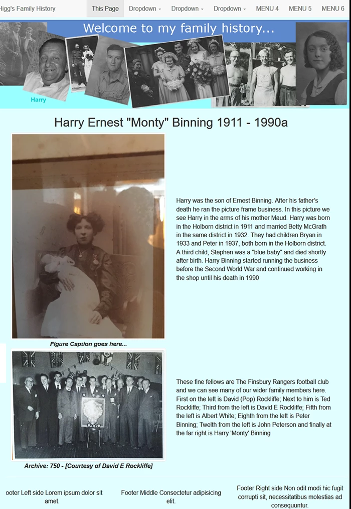
<p> Harry was the son of Ernest Binning. After his father’s death he ran the picture frame business. In this picture we see Harry in the arms of his mother Maud. Harry was born in the Holborn district in 1911 and married Betty McGrath in the same district in 1932. They had children Bryan in 1933 and Peter in 1937, both born in the Holborn district. A third child, Stephen was a "blue baby" and died shortly after birth. Harry Binning started running the business before the Second World War and continued working in the shop until his death in 1990</p>
</div>
</div>
<div class="row sameheight">
<div class="col-md-6 equal">
<figure class="text-center"><img class="img-thumbnail" src="http://ancestry.higgsy.co.uk/archive/750_Finsbury_Rangers_Dave_third_from_lef_900w.jpg" alt="image description">
<figcaption>Archive: 750 - [Courtesy of David E Rockliffe]</figcaption>
</figure>
</div>
<div class="col-md-6 equal">
<p> These fine fellows are The Finsbury Rangers football club and we can see many of our wider family members here. First on the left is David (Pop) Rockliffe; Next to him is Ted Rockliffe; Third from the left is David E Rockliffe; Fifth from the left is Albert White; Eighth from the left is Peter Binning; Twelth from the left is John Peterson and finally at the far right is Harry 'Monty' Binning</p>
</div>
</div>
</article>
<hr>
<!--begin footer-->
<footer class="container-fluid">
<div class="row sameheight">
<div class="col-sm-4 equal text-center">
Footer Left side Lorem ipsum dolor sit amet.
</div>
<div class="col-sm-4 equal text-center">
Footer Middle Consectetur adipisicing elit.
</div>
<div class="col-sm-4 equal text-center">
Footer Right side Non odit modi hic fugit corrupti sit, necessitatibus molestias ad consequuntur.
</div>
</div>
</footer>
<!--latest jQuery 3-->
<script src="https://code.jquery.com/jquery-3.2.1.min.js" integrity="sha256-hwg4gsxgFZhOsEEamdOYGBf13FyQuiTwlAQgxVSNgt4=" crossorigin="anonymous"></script>
<!--Bootstrap JS-->
<script src="https://maxcdn.bootstrapcdn.com/bootstrap/3.3.7/js/bootstrap.min.js" integrity="sha384-Tc5IQib027qvyjSMfHjOMaLkfuWVxZxUPnCJA7l2mCWNIpG9mGCD8wGNIcPD7Txa" crossorigin="anonymous"></script>
</body>
</html>


 AdChoices