Inspiring
July 18, 2019
Answered

How do you make make div height = image height ?

  • July 18, 2019
  • 3 replies
  • 1416 views

Current code below and image attached of problem.

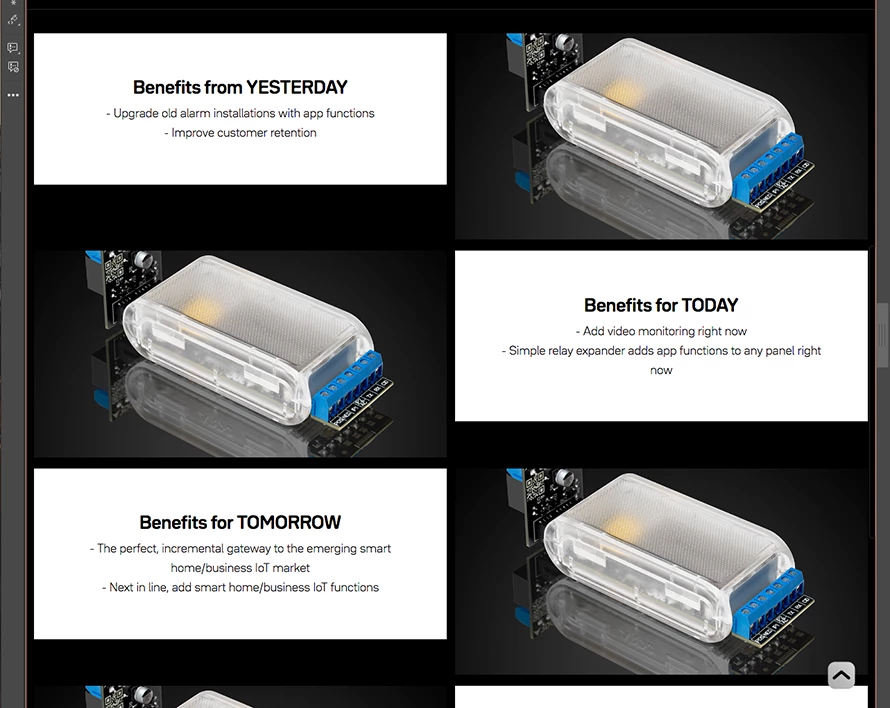
I need the white of the text block to stretch to the bottom of the image.

<div class="row">

                     <div class="col">

                             <div id="textblock">

                             <span class="h4">Benefits from YESTERDAY</span><br>   

                             <span class="p">- Upgrade old alarm installations with app functions</span><br>

                             <span class="p">- Improve customer retention</span>   

                             </div>   

                    </div>  

</div>

.row:before, .row:after {

    content: "";

    display: table;

}

.row:after {

    clear:both;

}

.row {

    width: 99%;

    display: inherit;

    position: relative;

    padding-right: 1%;

}

.col {

    width: 49%;

    height: auto;

    text-align: center;

    float: left;

    padding-bottom: 1%;

    padding-left: 1%;

    display: table-cell;

}

#textblock {

    text-align: center;

    width: 80%;

    max-width: 80%;

    padding-right: 10%;

    padding-left: 10%;

    padding-top: 10%;

    padding-bottom: 10%;

    position: relative;

    display: inline-block;

    background-color: #FFFFFF;

    height: auto;

}

This topic has been closed for replies.
Correct answer Peter Carr

Solution was, replace

display: table-cell;

with

display: flex;

flex-wrap: wrap;

I had tried this initially, something else must have been throughing it out.

3 replies

Peter CarrAuthorCorrect answer
Inspiring
July 19, 2019

Solution was, replace

display: table-cell;

with

display: flex;

flex-wrap: wrap;

I had tried this initially, something else must have been throughing it out.

Legend
July 18, 2019

You can do that with flexbox, code example below. Watch out for the caveats though.

Caveat 1: Make sure your text is all but a few lines because if a user zooms their broswer text too much the layout will break down, thats when you might want to consider using background images.

Caveat 2. Once you want to go to a 1 column layout for mobile you will need to re-order your containers otherwise you will get

text

image

image

text

text

image

instead of:

text

image

text

image

text

image

Flexbox handles this, see code below:

<!DOCTYPE html>

<html lang="en">

<head>

<meta charset="UTF-8">

<title>Flexbox</title>

<style>

body {

font-family: helvetica, sans-serif;

background-color: rgb(45, 52, 64);

}

.wrapper {

display: flex;

flex-wrap: wrap;

width: 80%;

margin: 0 auto;

}

.product_image {

position: relative;

flex-basis: 50%;

}

@media screen and (max-width: 768px) {

.product_image {

flex-basis: 100%;

}

}

.product_image img {

max-width: 100%;

height: auto;

display: block;

}

.product_info {

display: flex;

justify-content: center;

align-items: center;

flex-basis: 50%;

background-color: #fff;

}

@media screen and (max-width: 768px) {

.product_info {

flex-basis: 100%;

padding: 30px 0;

}

}

.info {

width: 75%;

}

.info h3 {

margin: 0;

padding: 0 0 10px 0;

text-align: center;

font-size: 18px;

line-height: 28px;

}

.info h3 span{

text-transform: uppercase;

}

.info ul {

margin: 0;

padding: 0;

text-align: center;

}

.info li {

margin: 0;

padding: 0 0 5px 0;

text-align: center;

list-style: none;

font-size: 14px;

line-height: 18px;

}

@media screen and (max-width: 768px) {

.one {

order: 1;

}

.two {

order: 2;

}

.three {

order: 4;

}

.four {

order: 3;

}

}

.imgCopyright {

position: absolute;

font-size: 12px;

bottom: 0;

right: 0;

background-color: rgba(0, 0, 0, 0.5);

color: #fff;

padding: 5px 10px;

}

     </style>

</head>

<body>

<div class="wrapper">

<div class="product_info one">

<div class="info">

<h3>Benefits from <span>Yesterday</span></h3>

<ul>

<li>- Upgrade old alarm installations with app functions</li>

<li>- Improve customer retention</li>

</ul>

</div>

<!-- end info -->

</div>

<!-- end product_info -->

<div class="product_image two">

<img src="https://images.unsplash.com/photo-1518717758536-85ae29035b6d?ixlib=rb-1.2.1&ixid=eyJhcHBfaWQiOjEyMDd9&auto=format&fit=crop&w=1050&q=80" alt="">

<div class="imgCopyright">©James Barker - unsplash.com</div>

</div>

<!-- end product_image -->

<div class="product_image three">

<img src="https://images.unsplash.com/photo-1507145569372-d69bae8bc9a0?ixlib=rb-1.2.1&ixid=eyJhcHBfaWQiOjEyMDd9&auto=format&fit=crop&w=966&q=80" alt="">

<div class="imgCopyright">©Berkay Gumustekin - unsplash.com</div>

</div>

<!-- end product_image -->


<div class="product_info four">

<div class="info">

<h3>Benefits for <span>Today</span></h3>

<ul>

<li>- Add video monitoring right now</li>

<li>- Simple relay expander adds app functions to any panel right now</li>

</ul>

</div>

<!-- end info -->

</div>

<!-- end product_info -->

<div class="product_info five">

<div class="info">

    <h3>Benefits for <span>Tomorrow</span></h3>

<ul>

<li>- The perfect, incremental gateway to the emerging smart home/buisness IoT market</li>

<li>- Next in line, and smart home/business IoT functions</li>

</ul>

</div>

<!-- end info -->

</div>

<!-- end product_info -->

<div class="product_image six">

<img src="https://images.unsplash.com/photo-1544568100-847a948585b9?ixlib=rb-1.2.1&ixid=eyJhcHBfaWQiOjEyMDd9&auto=format&fit=crop&w=967&q=80" alt="">

<div class="imgCopyright">©Jamie Street - unsplash.com</div>

</div>

<!-- end product_image -->

</div>

<!-- end wrapper -->

</body>

</html>

BenPleysier
Community Expert
Community Expert
July 18, 2019

The quickest way is to use the Bootstrap library which in turn uses Flexbox to achieve the centring of the content. Have a look at the following example. Copy and paste into a new document.

<!doctype html>

  <html><head>

    <base href="/aa/">

    <meta name="ac:base" content="/aa">

    <meta charset="UTF-8">

    <title>Using an SVG</title>

    <meta name="viewport" content="width=device-width, initial-scale=1, shrink-to-fit=no">

    <link rel="stylesheet" href="https://stackpath.bootstrapcdn.com/bootstrap/4.3.1/css/bootstrap.min.css" integrity="sha384-ggOyR0iXCbMQv3Xipma34MD+dH/1fQ784/j6cY/iJTQUOhcWr7x9JvoRxT2MZw1T" crossorigin="anonymous">

  </head>

  <body is="dmx-app" id="test">

    <main class="mt-5">

      <div class="container">

        <div class="row bg-dark align-items-center">

          <div class="col-6 bg-light text-center py-5">

            <dl>

              <dt class="mb-2">Benefits from YESTERDAY</dt>

              <dd class="mb-0">- Upgrade old alarm installations with app functions</dd>

              <dd class="mb-0">- Improve customer retention</dd>

            </dl>

          </div>

          <div class="col-6 p-0">

            <img src="https://images.unsplash.com/photo-1470777639313-60af88918203?ixlib=rb-1.2.1&ixid=eyJhcHBfaWQiOjEyMDd9&auto=format&fit=crop&w=1350&q=80" class="img-fluid">

          </div>

        </div>

        <div class="row bg-dark align-items-center">

          <div class="col-6 p-0">

            <img src="https://images.unsplash.com/photo-1470777639313-60af88918203?ixlib=rb-1.2.1&ixid=eyJhcHBfaWQiOjEyMDd9&auto=format&fit=crop&w=1350&q=80" class="img-fluid">

          </div>

          <div class="col-6 bg-light text-center py-5">

            <dl>

              <dt class="mb-2">Benefits from YESTERDAY</dt>

              <dd class="mb-0">- Upgrade old alarm installations with app functions</dd>

              <dd class="mb-0">- Improve customer retention</dd>

            </dl>

          </div>

        </div>

      </div>

    </main>

  </body></html>

Edit: Changed to reflect what you had.

Wappler is the DMXzone-made Dreamweaver replacement and includes the best of their powerful extensions, as well as much more!
Inspiring
July 18, 2019

Hi Ben.

I don't want the content centred. I just want the white block to be the same height as the image.

WolfShade
Legend
July 18, 2019

Sorry, but I think the title of this thread may not match what you are asking for.

The title makes me think you want the div height to match the image height.  But what you are asking in the body of your original post sounds like you want the image to match the div height.

The simplest way is to redo the image and size it to the div height.  I would suggest _not_ 'stretching' the image to match the div height as that would skew the image and make the letters look thinner/taller.

Or, you could give the div background the same color as the image background and just vertically center the image.

V/r,

^ _ ^