



How to make child element "truly" flexible in height???? Child won't adjust.
Hey everyone,
So I have a problem with some child elements, as you will see from the screen shots, and video that is subsequent. Do note, this for MOBILE view.
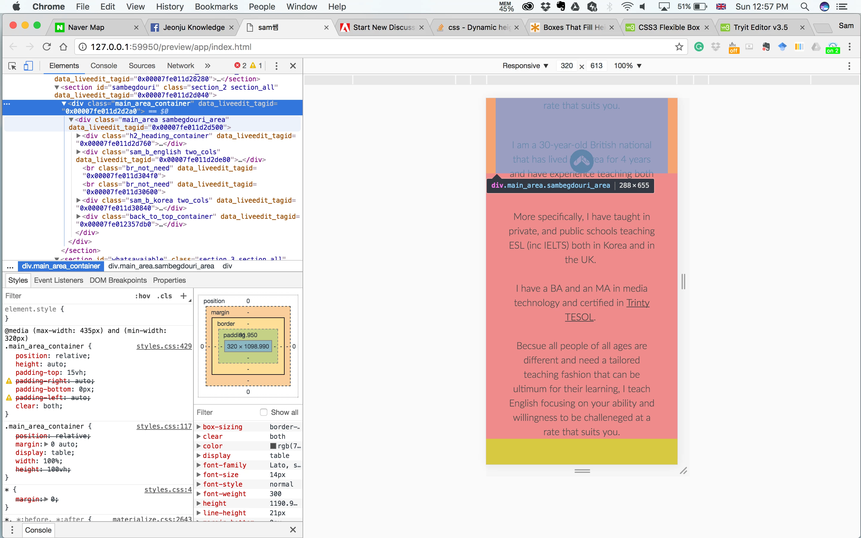
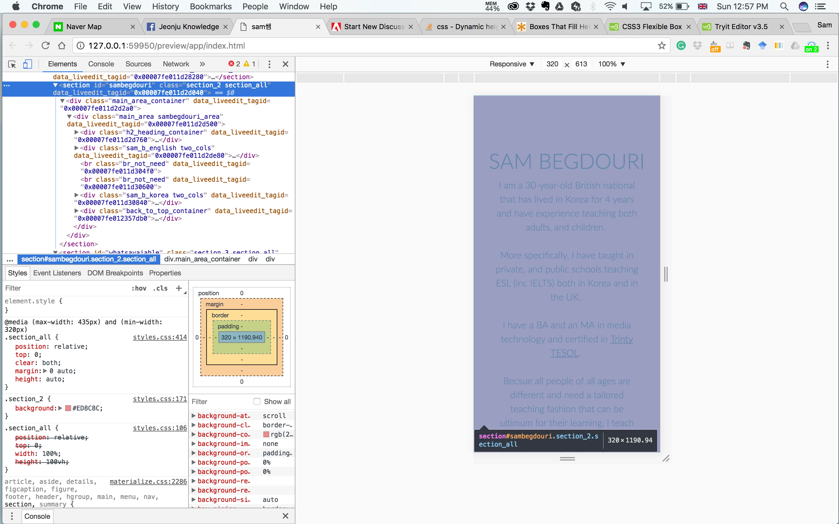
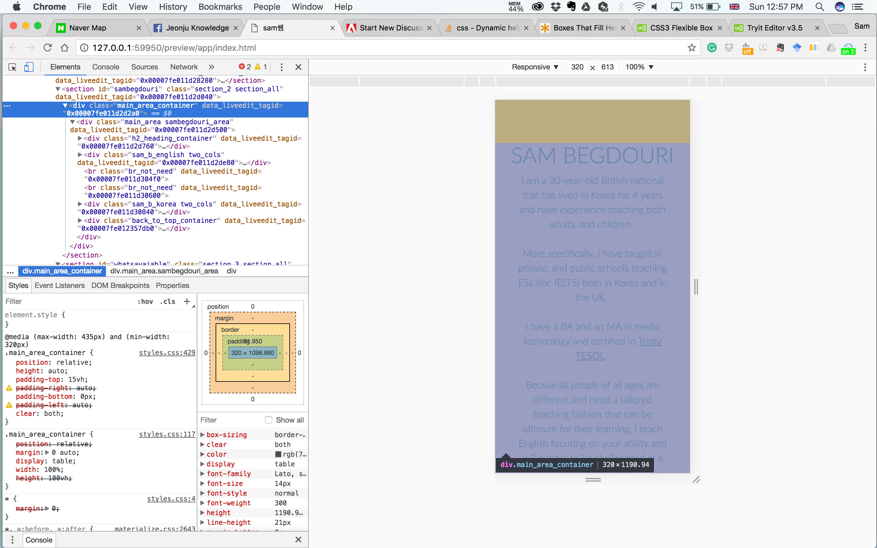
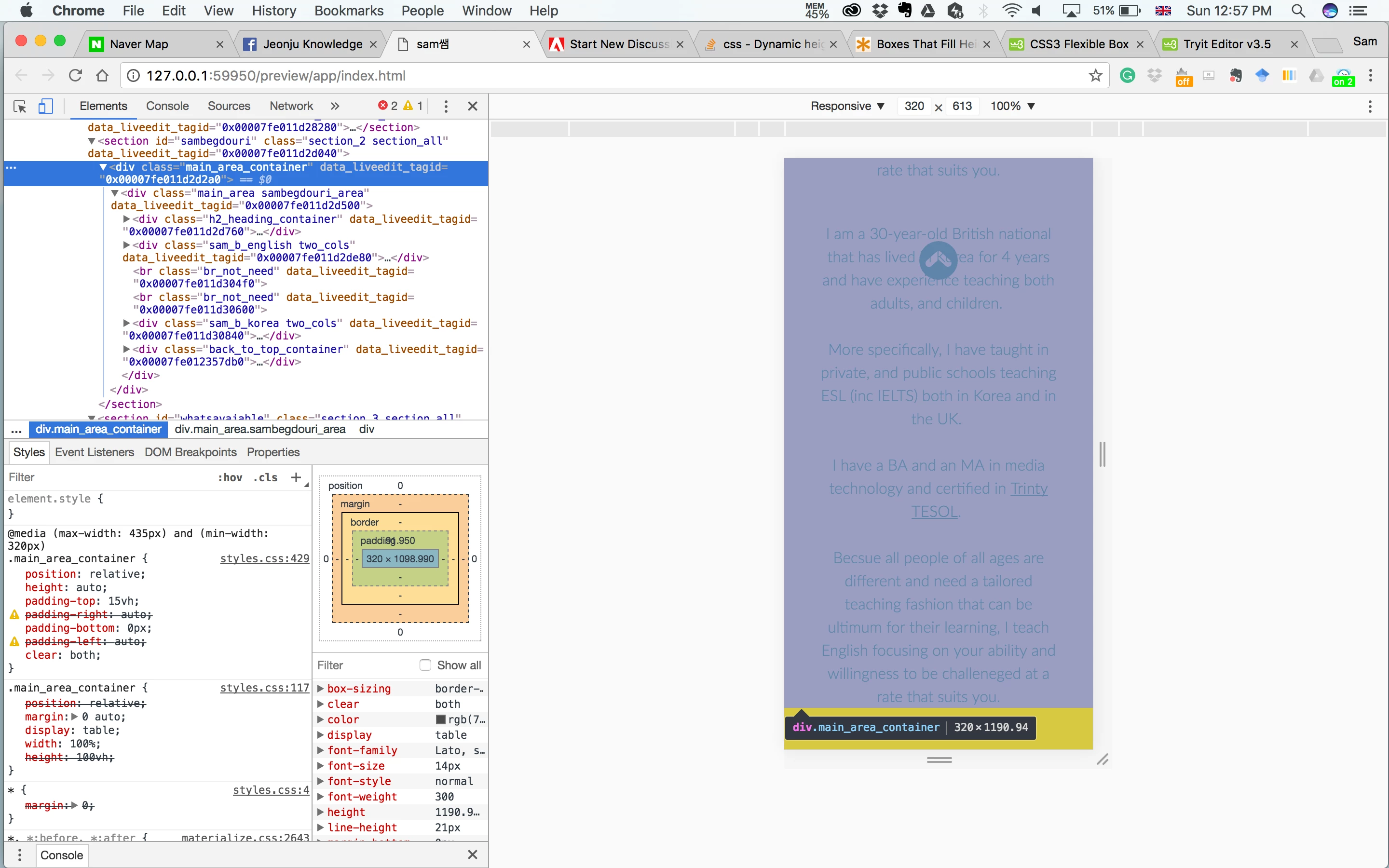
I know the difference between height: auto/100%. However, one of the parents (also child) elements does not resize to the size of its parent element.
As a result, one child element, a "back-to-top" button is placed half way up of the parent element, and not at the bottom of its brothers/sisters elements (same level).
here is the code, screenshots, and a video to help express my problem in further detail. Thank you to every/anyone who can help me with this issue.
<section id="whatsavaiable" class="section_3 section_all">
<div class="main_area_container">
<div class="main_area available_area">
<div class="h2_heading_container">
<h2 class="title_heading h2_what_is_available">WHAT'S AVAILABLE</h2>
</div>
<div class="section_3_text_wrapper">
<div class="sam_b_english two_cols">
<div class="p_text_container">
<h3>General English</h3>
<h3>•</h3>
<h3>Converstation</h3>
<h3>•</h3>
<h3>Business</h3>
<h3>•</h3>
<h3>Academic</h3>
<h3>•</h3>
<h3>IELTS training</h3>
</div>
</div>
<br class="br_not_need"><br class="br_not_need">
<div class="sam_b_korea provide_korean two_cols">
<div class="p_text_container">
<h3>일반 영어</h3>
<h3>•</h3>
<h3>회화</h3>
<h3>•</h3>
<h3>비즈니스 영어</h3>
<h3>•</h3>
<h3>고급 영어 (입시)</h3>
<h3>•</h3>
<h3>IELTS 교육</h3>
</div>
</div>
<div class="back_to_top_container">
<a href="#top"><div class="back_to_top_icon"></div></a>
</div>
</div>
</div>
</div>
</section>
GLOBAL
.p_text_container {
position: relative;
width: 70%;
top: 5vh;
display: block;
margin: 0 auto;
text-align: center;
}
.icon_container{
position: relative;
width: 100%;
display: block;
margin: 0 auto;
top: 10vh;
}
.back_to_top_icon {
background-image: url(../assets/icons/back_to_top.svg);
background-repeat: no-repeat;
position: relative;
top: 0;
margin: 0 auto;
height: 40px;
width: 40px;
text-align: center;
vertical-align: middle;
}
@media (min-width:320px) and (max-width:435px){
main {
position: relative;
top: 0;
clear: both;
height: auto;
}
.section_all {
position: relative;
top: 0;
clear: both;
margin: 0 auto;
height: auto;
}
.main_area_container {
position: relative;
height: auto;
padding-top: 15vh;
padding-right: auto;
padding-bottom: 0px;
padding-left: auto;
clear: both;
}
h2 {
margin: 0 auto 10px auto;
font-size: 36px;
}
.p_text_container {
height: 100%;
clear: both;
margin: 0 auto;
display: block;
width: 85%;
top: 0;
}
.p_text_container p {
position: relative;
top: 0;
margin: 0 auto;
font-size: 16px;
height: 100%;
text-align: center;
}
.back_to_top_icon {
position: relative;
margin: 20px auto;
top: 0;
}
}
 AdChoices