Participating Frequently
November 9, 2017
Answered

How to move objects?

  • November 9, 2017
  • 2 replies
  • 442 views

I'm making a web site as a school project, and are kind of new to all this coding. I can't seem to place the objects where I want them to be, the black splatter is supposed to be on the middle of the page next to the navigation menu on the left (see picture), but it just gets placed down on the page... how can I move it further up on the page? I also want some pictures on the right side next to this "splatter", how do I manage to place them next to the "splatter" if I can get that one right?

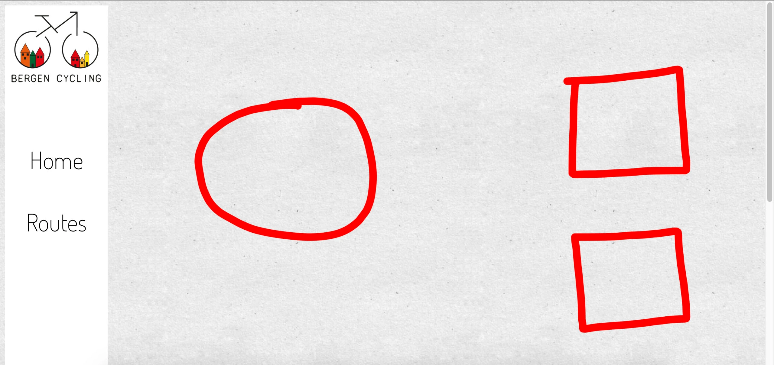
I want the "splatter" image to be where the circle is, and images where the squares is. Now the "splatter" is placed down on the page...

<!doctype html>

<html>

<head>

<meta charset="UTF-8">

<title>Untitled Document</title>

<style type="text/css">

body {

  background-image: url(natural_paper.png);

  background-repeat: repeat;

}

#header {

  background-color: #;

  float: left;

  height: 200px;

  width: 200px;

  padding-top: 10px;

  padding-bottom: 10px;

  padding-left: 10px;

}

#nav {

  background-color: #ffffff;

  height: 600px;

  width: 171px;

  padding-top: 10px;

}

a {

  font-size: 40px;

  color: #000000;

  font-family: dosis;

  font-style: normal;

  font-weight: 200;

}

a:link {

  text-decoration: none;

}

a:visited {

  text-decoration: none;

  color: #000000;

}

a:hover {

  text-decoration: none;

  color: #ffdd00;

}

a:active {

  text-decoration: none;

  font-size: 36px;

  font-family: dosis;

  font-style: normal;

  font-weight: 200;

}

#content {

  background-color: #;

  height: 500px;

  width: 700px;

  margin: auto;

  top: auto;

  float: right;

  clear: both;

}

</style>

<!--The following script tag downloads a font from the Adobe Edge Web Fonts server for use within the web page. We recommend that you do not modify it.-->

<script>var __adobewebfontsappname__="dreamweaver"</script>

<script src="http://use.edgefonts.net/coming-soon:n4:default;dosis:n4,n2:default.js" type="text/javascript"></script>

</head>

<body>

<div class=".header" id="header"><img src="logo 5.png" width="150" height="120" alt=""/></div>

  <nav class=".nav" id="nav"><div align="center">

   <p style="font-family: dosis; font-style: normal; font-weight: 400; font-size: 50px;"><a href="Bergen cycling.html" title="Home">Home</a></p>

  <p><a href="Routes.html" title="Routes">Routes</a></p></nav></div>

  <div class=".content" id="content"><img src="splatter 1.png" width="700" height="500" alt=""/></div>

</body>

</html>

This is all of my HTML and CSS so far. If there's anything else wrong with the coding or something that could be done better/ different, feel free to tell, as I said I'm new to this and want to learn as much as possible 🙂 The "splatter" I'm talking about is the #content tag.

    This topic has been closed for replies.
    Correct answer osgood_

    Technically better is the code below. You should really be using Flexbox to form 3 columns, as the example code below shows. Setting fixed widths these days is poor as your webpage will not be responsive but as I think you are learning it might be a place to start initially and less confusing, so I have deliberately produced a fixed width design. You should really be using percentage widths to allow the page to flow with the width of the device its being viewed on.....

    <!doctype html>

    <html>

    <head>

    <meta charset="UTF-8">

    <title>3 column Flexbox example</title>

    <style type="text/css">

    body {

    background-image: url(natural_paper.png);

    background-repeat: repeat;

    }

    figure {

    margin: 0;

    padding: 0;

    text-align: center;

    }

    .page_wrapper {

    display: flex;

    width: 1200px;

    margin: 0 auto;

    }

    .header {

    background-color: #f2f2f2;

    height: 200px;

    }

    nav {

    width: 200px;

    background-color: #f2f2f2;

    }

    nav img {

    margin-bottom: 150px;

    }

    nav ul {

    margin: 0;

    padding: 0;

    }

    nav li {

    margin: 0 0 45px 0;

    padding: 0;

    list-style: none;

    }

    nav a {

    text-decoration: none;

    font-size: 40px;

    color: #000000;

    font-family: dosis;

    font-style: normal;

    font-weight: 200;

    display: block;

    text-align: center;

    }

    nav a:hover {

    color: #ffdd00;

    }

    .content {

    display: flex;

    justify-content: center;

    align-items: center;

    background-color: yellow;

    width: 700px;

    }

    .side_bar {

    display: flex;

    flex-direction: column;

    justify-content: center;

    align-items: center;

    background-color: #CF9;

    width: 300px;

    }

    </style>

    <!--The following script tag downloads a font from the Adobe Edge Web Fonts server for use within the web page. We recommend that you do not modify it.-->

    <script>var __adobewebfontsappname__="dreamweaver"</script>

    <script src="http://use.edgefonts.net/coming-soon:n4:default;dosis:n4,n2:default.js" type="text/javascript"></script>

    </head>

    <body>

    <div class="page_wrapper">

    <nav class="nav">

    <figure>

    Logo image goes here

    </figure>

    <ul>

    <li><a href="#">Home</a></li>

    <li><a href="#">Routes</a></li>

    </ul>

    </nav>

    <main class="content">

    <figure>

    Splatter Image goes here

    </figure>

    </main>

    <aside class="side_bar">

    <figure>

    Side images go here

    </figure>

    <figure>

    Side images go here

    </figure>

    </aside>

    <!-- end side_bar -->

    </div>

      <!-- end page_wrapper -->

    </body>

    </html>

    2 replies

    osgood_Correct answer
    Legend
    November 9, 2017

    Technically better is the code below. You should really be using Flexbox to form 3 columns, as the example code below shows. Setting fixed widths these days is poor as your webpage will not be responsive but as I think you are learning it might be a place to start initially and less confusing, so I have deliberately produced a fixed width design. You should really be using percentage widths to allow the page to flow with the width of the device its being viewed on.....

    <!doctype html>

    <html>

    <head>

    <meta charset="UTF-8">

    <title>3 column Flexbox example</title>

    <style type="text/css">

    body {

    background-image: url(natural_paper.png);

    background-repeat: repeat;

    }

    figure {

    margin: 0;

    padding: 0;

    text-align: center;

    }

    .page_wrapper {

    display: flex;

    width: 1200px;

    margin: 0 auto;

    }

    .header {

    background-color: #f2f2f2;

    height: 200px;

    }

    nav {

    width: 200px;

    background-color: #f2f2f2;

    }

    nav img {

    margin-bottom: 150px;

    }

    nav ul {

    margin: 0;

    padding: 0;

    }

    nav li {

    margin: 0 0 45px 0;

    padding: 0;

    list-style: none;

    }

    nav a {

    text-decoration: none;

    font-size: 40px;

    color: #000000;

    font-family: dosis;

    font-style: normal;

    font-weight: 200;

    display: block;

    text-align: center;

    }

    nav a:hover {

    color: #ffdd00;

    }

    .content {

    display: flex;

    justify-content: center;

    align-items: center;

    background-color: yellow;

    width: 700px;

    }

    .side_bar {

    display: flex;

    flex-direction: column;

    justify-content: center;

    align-items: center;

    background-color: #CF9;

    width: 300px;

    }

    </style>

    <!--The following script tag downloads a font from the Adobe Edge Web Fonts server for use within the web page. We recommend that you do not modify it.-->

    <script>var __adobewebfontsappname__="dreamweaver"</script>

    <script src="http://use.edgefonts.net/coming-soon:n4:default;dosis:n4,n2:default.js" type="text/javascript"></script>

    </head>

    <body>

    <div class="page_wrapper">

    <nav class="nav">

    <figure>

    Logo image goes here

    </figure>

    <ul>

    <li><a href="#">Home</a></li>

    <li><a href="#">Routes</a></li>

    </ul>

    </nav>

    <main class="content">

    <figure>

    Splatter Image goes here

    </figure>

    </main>

    <aside class="side_bar">

    <figure>

    Side images go here

    </figure>

    <figure>

    Side images go here

    </figure>

    </aside>

    <!-- end side_bar -->

    </div>

      <!-- end page_wrapper -->

    </body>

    </html>

    Community Manager
    November 9, 2017

    Hi

    You can Use css floats, padding and margin to position images and containers in your site.

    Thanks