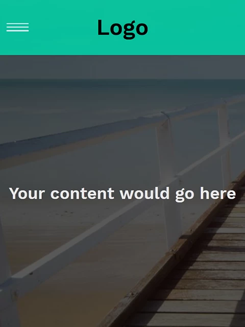
Dreamweaver doesn't support Grids and fractional units yet. But it looks fine in latest Chrome and Firefox browsers. See screenshot.
Your external stylesheet will not work correctly online because iit's pointing to a file:/// in OneDrive. You should keep site files in a defined local site folder on your primary hard drive. Don't use cloud or networked drives. For this reason, I'm not including your stylesheet here.
<!doctype html>
<html lang="en">
<head>
<meta charset="utf-8">
<title>Your Unique Page Title here</title>
<meta http-equiv="X-UA-Compatible" content="IE=edge">
<meta name="viewport" content="width=device-width, initial-scale=1">
<style>
@import url("https://fonts.googleapis.com/css?family=Work+Sans:300,600");
:root { --background: rgba(0, 214, 170, .85);
}
*, *::before, *::after { box-sizing: border-box; }
body {
background: #222;
margin: 0;
font-family: 'Work Sans', sans-serif;
font-weight: 400;
}
.content {
height: 200vh;
background: rgba(0,0,0,0.65) url(https://unsplash.it/1000/1000);
background-blend-mode: multiply;
background-size: cover;
display: grid;
place-items: center;
color: #eaeaea;
}
/* navigation styles start here */
header {
background: var(--background);
text-align: center;
position: fixed;
z-index: 999;
width: 100%;
}
/* changed this from the tutorial video to allow it to gain focus, making it tabbable */
.nav-toggle {
position: absolute !important;
top: -9999px !important;
left: -9999px !important;
}
.nav-toggle:focus ~ .nav-toggle-label { outline: 3px solid rgba(173, 216, 230, 0.75); }
.nav-toggle-label {
position: absolute;
top: 0;
left: 0;
margin-left: 1em;
height: 100%;
display: flex;
align-items: center;
}
.nav-toggle-label span, .nav-toggle-label span::before, .nav-toggle-label span::after {
display: block;
background: white;
height: 2px;
width: 2em;
border-radius: 2px;
position: relative;
}
.nav-toggle-label span::before, .nav-toggle-label span::after {
content: '';
position: absolute;
}
.nav-toggle-label span::before { bottom: 7px; }
.nav-toggle-label span::after { top: 7px; }
nav {
position: absolute;
text-align: left;
top: 100%;
left: 0;
background: var(--background);
width: 100%;
-webkit-transform: scale(1, 0);
transform: scale(1, 0);
-webkit-transform-origin: top;
transform-origin: top;
transition: -webkit-transform 400ms ease-in-out;
transition: transform 400ms ease-in-out;
transition: transform 400ms ease-in-out, -webkit-transform 400ms ease-in-out;
}
nav ul {
margin: 0;
padding: 0;
list-style: none;
}
nav li {
margin-bottom: 1em;
margin-left: 1em;
}
nav a {
color: white;
text-decoration: none;
font-size: 1.2rem;
text-transform: uppercase;
opacity: 0;
transition: opacity 150ms ease-in-out;
}
nav a:hover { color: #000; }
.nav-toggle:checked ~ nav {
-webkit-transform: scale(1, 1);
transform: scale(1, 1);
}
.nav-toggle:checked ~ nav a {
opacity: 1;
transition: opacity 250ms ease-in-out 250ms;
}

@media screen and (min-width: 800px) {
.nav-toggle-label { display: none; }
header {
display: grid;
grid-template-columns: 1fr auto minmax(600px, 3fr) 1fr;
}
.logo { grid-column: 2 / 3; }
nav {
/* the following lines are not from my video, but add Edge support */
position: relative;
text-align: left;
transition: none;
-webkit-transform: scale(1, 1);
transform: scale(1, 1);
background: none;
top: initial;
left: initial;
/* end Edge support stuff */
grid-column: 3 / 4;
display: flex;
justify-content: flex-end;
align-items: center;
}
nav ul { display: flex; }
nav li {
margin-left: 3em;
margin-bottom: 0;
}
nav a {
opacity: 1;
position: relative;
}
nav a::before {
content: '';
display: block;
height: 5px;
background: black;
position: absolute;
top: -.75em;
left: 0;
right: 0;
-webkit-transform: scale(0, 1);
transform: scale(0, 1);
transition: -webkit-transform ease-in-out 250ms;
transition: transform ease-in-out 250ms;
transition: transform ease-in-out 250ms, -webkit-transform ease-in-out 250ms;
}
nav a:hover::before {
-webkit-transform: scale(1, 1);
transform: scale(1, 1);
}
}
</style>
</head>

<body>
<header>
<h1 class="logo">Logo</h1>
<input type="checkbox" id="nav-toggle" class="nav-toggle">
<nav>
<ul>
<li><a href="#">Home</a></li>
<li><a href="#">About</a></li>
<li><a href="#">Blog</a></li>
<li><a href="#">Contact</a></li>
</ul>
</nav>
<label for="nav-toggle" class="nav-toggle-label"> <span></span> </label>
</header>
<div class="content">
<h2>Your content would go here</h2>
</div>
</body>
</html>


 AdChoices