Known Participant
October 14, 2019
Answered

Images centered side-by side

  • October 14, 2019
  • 4 replies
  • 608 views

Hello,


trying to put two images centered side-by-side. 

Here´s the code:


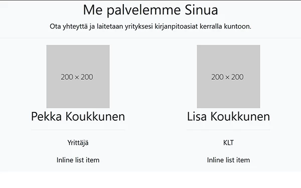
 <!-- Team Carousel Item 1 -->
 
 
   <div class="item">
            <div class="overlay"></div> 
            <img class="img-fluid mx-auto" src="img/agency/team/PK.jpg" alt="">
            <div class="team-caption">
              <h3>Pekka Koukkunen</h3>
              <hr class="colored">
              <p>Yrittäjä</p>
              <ul class="list-inline list-team-social">
                <li class="list-inline-item">
                   </li>
              </ul>
            </div>
          </div>
 
        <!-- Team Carousel Item 2 -->
 
           <div class="item">
            <div class="overlay"></div>
            <img class="img-fluid mx-auto" src="img/agency/team/LK.jpg" alt="">
            <div class="team-caption">
              <h3>Lisa Koukkunen</h3>
              <hr class="colored">
              <p>KLT</p>
              <ul class="list-inline list-team-social">
                <li class="list-inline-item">
                
                </li>
              </ul>
            </div>
          </div>
    This topic has been closed for replies.
    Correct answer Nancy OShea

    Since you're using Bootstrap 4, you can use Flexbox for this.  See my demo below with more recent Bootstrap 4.3.1.


    <!doctype html>
    <html lang="en">
    <head>
    <meta charset="utf-8">
    <meta http-equiv="X-UA-Compatible" content="IE=edge">
    <meta name="viewport" content="width=device-width, initial-scale=1">
    <title>Bootstrap 4.3.1 Starter</title>
    <link rel="stylesheet" href="https://stackpath.bootstrapcdn.com/bootstrap/4.3.1/css/bootstrap.min.css" integrity="sha384-ggOyR0iXCbMQv3Xipma34MD+dH/1fQ784/j6cY/iJTQUOhcWr7x9JvoRxT2MZw1T" crossorigin="anonymous">
    </head>
    
    <body>
    <!-- Team Section -->
    <section class="page-section bg-light text-center" id="Info">
    <h2>Me palvelemme Sinua</h2>
    <p class="mb-0">Ota yhteyttä ja laitetaan yrityksesi kirjanpitoasiat kerralla kuntoon.</p>
    <hr class="colored">
    
    <!--Flex container-->
    <div class="d-flex justify-content-around wow fadeIn"> 
    
    <!--flex item 1-->
    <div>
    <img class="img-fluid mx-auto" src="https://dummyimage.com/200x200/" alt="placeholder">
    <h3 class="team-caption">Pekka Koukkunen</h3>
    <hr class="colored">
    <p>Yrittäjä</p>
    <ul class="list-inline list-team-social">
    <li class="list-inline-item">Inline list item</li>
    </ul>
    </div>
    
    <!--flex item 2-->
    <div><img class="img-fluid mx-auto" src="https://dummyimage.com/200x200/" alt="placeholder">
    <h3 class="team-caption">Lisa Koukkunen</h3>
    <hr class="colored">
    <p>KLT</p>
    <ul class="list-inline list-team-social">
    <li class="list-inline-item">Inline list item</li>
    </ul>
    </div>
    <!--/flex container--></div>
    <!--/end section--></section>
    
    <!--first jQuery then popper then Bootstrap js--> 
    <script src="https://code.jquery.com/jquery-3.3.1.slim.min.js" integrity="sha384-q8i/X+965DzO0rT7abK41JStQIAqVgRVzpbzo5smXKp4YfRvH+8abtTE1Pi6jizo" crossorigin="anonymous"></script> 
    <script src="https://cdnjs.cloudflare.com/ajax/libs/popper.js/1.14.7/umd/popper.min.js" integrity="sha384-UO2eT0CpHqdSJQ6hJty5KVphtPhzWj9WO1clHTMGa3JDZwrnQq4sF86dIHNDz0W1" crossorigin="anonymous"></script> 
    <script src="https://stackpath.bootstrapcdn.com/bootstrap/4.3.1/js/bootstrap.min.js" integrity="sha384-JjSmVgyd0p3pXB1rRibZUAYoIIy6OrQ6VrjIEaFf/nJGzIxFDsf4x0xIM+B07jRM" crossorigin="anonymous"></script>
    </body>
    </html>
    

    4 replies

    Nancy OShea
    Community Expert
    Nancy OSheaCommunity ExpertCorrect answer
    Community Expert
    October 15, 2019

    Since you're using Bootstrap 4, you can use Flexbox for this.  See my demo below with more recent Bootstrap 4.3.1.


    <!doctype html>
    <html lang="en">
    <head>
    <meta charset="utf-8">
    <meta http-equiv="X-UA-Compatible" content="IE=edge">
    <meta name="viewport" content="width=device-width, initial-scale=1">
    <title>Bootstrap 4.3.1 Starter</title>
    <link rel="stylesheet" href="https://stackpath.bootstrapcdn.com/bootstrap/4.3.1/css/bootstrap.min.css" integrity="sha384-ggOyR0iXCbMQv3Xipma34MD+dH/1fQ784/j6cY/iJTQUOhcWr7x9JvoRxT2MZw1T" crossorigin="anonymous">
    </head>
    
    <body>
    <!-- Team Section -->
    <section class="page-section bg-light text-center" id="Info">
    <h2>Me palvelemme Sinua</h2>
    <p class="mb-0">Ota yhteyttä ja laitetaan yrityksesi kirjanpitoasiat kerralla kuntoon.</p>
    <hr class="colored">
    
    <!--Flex container-->
    <div class="d-flex justify-content-around wow fadeIn"> 
    
    <!--flex item 1-->
    <div>
    <img class="img-fluid mx-auto" src="https://dummyimage.com/200x200/" alt="placeholder">
    <h3 class="team-caption">Pekka Koukkunen</h3>
    <hr class="colored">
    <p>Yrittäjä</p>
    <ul class="list-inline list-team-social">
    <li class="list-inline-item">Inline list item</li>
    </ul>
    </div>
    
    <!--flex item 2-->
    <div><img class="img-fluid mx-auto" src="https://dummyimage.com/200x200/" alt="placeholder">
    <h3 class="team-caption">Lisa Koukkunen</h3>
    <hr class="colored">
    <p>KLT</p>
    <ul class="list-inline list-team-social">
    <li class="list-inline-item">Inline list item</li>
    </ul>
    </div>
    <!--/flex container--></div>
    <!--/end section--></section>
    
    <!--first jQuery then popper then Bootstrap js--> 
    <script src="https://code.jquery.com/jquery-3.3.1.slim.min.js" integrity="sha384-q8i/X+965DzO0rT7abK41JStQIAqVgRVzpbzo5smXKp4YfRvH+8abtTE1Pi6jizo" crossorigin="anonymous"></script> 
    <script src="https://cdnjs.cloudflare.com/ajax/libs/popper.js/1.14.7/umd/popper.min.js" integrity="sha384-UO2eT0CpHqdSJQ6hJty5KVphtPhzWj9WO1clHTMGa3JDZwrnQq4sF86dIHNDz0W1" crossorigin="anonymous"></script> 
    <script src="https://stackpath.bootstrapcdn.com/bootstrap/4.3.1/js/bootstrap.min.js" integrity="sha384-JjSmVgyd0p3pXB1rRibZUAYoIIy6OrQ6VrjIEaFf/nJGzIxFDsf4x0xIM+B07jRM" crossorigin="anonymous"></script>
    </body>
    </html>
    
    Nancy O'Shea— Product User & Community Expert
    lemonade2Author
    Known Participant
    October 22, 2019

    Thanks!


    Nancy OShea
    Community Expert
    Community Expert
    October 14, 2019

    Start by fixing your code errors.  You have quite a few unclosed tags that effect the display in browsers.  So fix those first and then we will re-examine the other issues.  See link below for details.

    https://validator.w3.org/nu/?doc=http%3A%2F%2Fwww.lemonworks.com%2Ftest2%2F

    Nancy O'Shea— Product User & Community Expert
    Nancy OShea
    Community Expert
    Community Expert
    October 14, 2019

    Code snippets don't tell the whole story.  As Jon said, post the URL to your problem page online.  Before I can make suggestion, I need to know exactly which version of Bootstrap you're using among other things.   The online page tells us all we need.

    Nancy O'Shea— Product User & Community Expert
    lemonade2Author
    Known Participant
    October 14, 2019
    Hi,
    Jon Fritz
    Community Expert
    Community Expert
    October 14, 2019

    That's not the code you need to change. You will need to make modifications to your page's .css stylesheet to get those two item <div> tags to sit side by side.

    If you post a link to your work in progress, the contributors here will be able to offer you guidance much more quickly.