Participant
August 2, 2025
Question

Issues with nav bar in mobile phone

  • August 2, 2025
  • 1 reply
  • 174 views

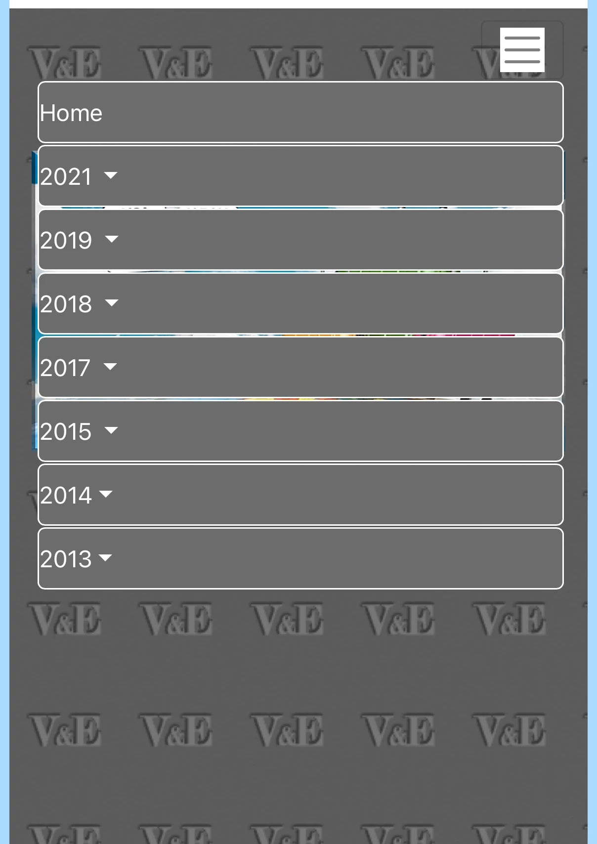
I am using Bootstrap 4 for my page and this Nav bar. While in full screen it all looks good , I am battling with the layout when resizing the screen for mobile phone.
Firstly I would like to have the contents on the right instead of left and
Secondly, would it be possible to limit the horizontal size to only extend as far as the contents go.
Please see attached screenshot.
Thanks for all help and advice, regards Ed


    1 reply

    BenPleysier
    Community Expert
    Community Expert
    August 2, 2025

    Firstly, I reccommend that you do NOT use Bootstrap 4. Use the latest Boostrap version instead,


    Copy the following code and paste this into a new document

    <!DOCTYPE html>
    <html lang="en">
    
    <head>
      <base href="/">
      <meta charset="UTF-8" />
      <meta name="viewport" content="width=device-width, initial-scale=1.0" />
      <title>Bootstrap 5.3 Responsive Navigation</title>
    
      <link rel="stylesheet" href="https://cdn.jsdelivr.net/npm/bootstrap@5.3.3/dist/css/bootstrap.min.css" integrity="sha384-QWTKZyjpPEjISv5WaRU9OFeRpok6YctnYmDr5pNlyT2bRjXh0JMhjY6hW+ALEwIH" crossorigin="anonymous" />
    </head>
    
    <body is="dmx-app" id="main">
      <nav class="navbar navbar-expand-lg">
        <div class="container">
          <a class="navbar-brand" href="#">Navbar</a>
          <button class="navbar-toggler" type="button" data-bs-toggle="collapse" data-bs-target="#collapse1" aria-controls="collapse1" aria-expanded="false" aria-label="Toggle navigation">
            <span class="navbar-toggler-icon"></span>
          </button>
          <div id="collapse1" class="collapse navbar-collapse justify-content-end">
            <div class="navbar-nav text-end me-2">
              <a class="nav-item nav-link active" href="#">Link</a>
              <a class="nav-item nav-link" href="#">Link</a>
              <a class="nav-item nav-link" href="#">Link</a>
              <a class="nav-item nav-link" href="#">Link</a>
              <a class="nav-item nav-link" href="#">Link</a>
              <a class="nav-item nav-link" href="#">Link</a>
            </div>
          </div>
        </div>
      </nav>
      <script src="https://cdn.jsdelivr.net/npm/bootstrap@5.3.3/dist/js/bootstrap.bundle.min.js" integrity="sha384-YvpcrYf0tY3lHB60NNkmXc5s9fDVZLESaAA55NDzOxhy9GkcIdslK1eN7N6jIeHz" crossorigin="anonymous"></script>
    </body>
    
    </html>
    Wappler is the DMXzone-made Dreamweaver replacement and includes the best of their powerful extensions, as well as much more!
    EdS45Author
    Participant
    August 2, 2025

    Brilliant... exactly what I was looking for.

    I am planning to switch to Bootstrap 5 - will the code also work with it?

    Thank you very much

    BenPleysier
    Community Expert
    Community Expert
    August 2, 2025

    As the title states:

    <title>Bootstrap 5.3 Responsive Navigation</title>
    Wappler is the DMXzone-made Dreamweaver replacement and includes the best of their powerful extensions, as well as much more!