cantey57311815
Participant
March 28, 2019
Question

List Items not filling Unordered List

  • March 28, 2019
  • 2 replies
  • 2041 views

Hello,

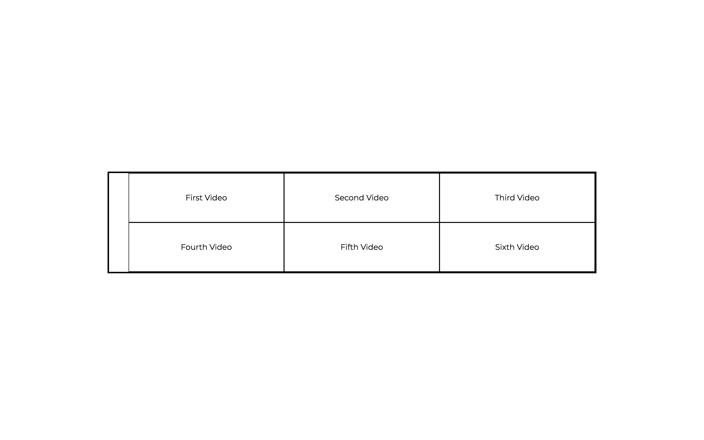
I'm pretty new to Web Development, and I'm trying to create a simple website. On one of my pages I have multiple list items within an unordered list. I've set the flex-basis to 33.33% and allowed it to wrap in hopes of getting three list items in each row. However, the list items are not filling the entire width of the unordered list; there is a significant gap on the left side. I would be grateful for any suggestions on how to make the list items fill the width of the unordered list.

Below I have attached a picture as well as the relevant HTML and CSS.

Thanks in advance!

HTML:

<main class="container">

    <ul>

      <li>First Video </li>

      <li>Second Video</li>

      <li>Third Video </li>

      <li>Fourth Video </li>

      <li>Fifth Video </li>

      <li>Sixth Video </li>

    </ul>

  </main>

CSS:

.container {

    width: 100%;

    margin: auto;

    max-width: 1000px;

    text-decoration: none;

    font-weight: 100;

    text-align: center;

    display: flex;

    justify-content: center;

}

ul {

    list-style-type: none;

    display: flex;

    font-weight: 400;

    margin: 0 auto;

    text-align: center;

    flex-wrap: wrap;

    border: medium solid #000000;

}

li {

    min-width: 250px;

    padding-top: 40px;

    padding-right: 40px;

    padding-left: 40px;

    padding-bottom: 40px;

    text-align: center;

    display: flex;

    margin: auto 0;

    border: thin solid #000000;

    flex-basis: 33.33%;

    justify-content: center;

    flex-wrap: wrap;

    position: static;

}

This topic has been closed for replies.

2 replies

ALsp
Legend
March 28, 2019
Legend
March 28, 2019

ALsp  wrote

Here's your solution:

http://projectseven.com/csslab/flexbox/hz-list/

You sure that's working Al - dont do anything in my browsers?

Unless I'm a little bit crazy shouldnt there be a li class:

li.flex-root-li

But I dont see one in the html:

<ul class="flex-root-ul closed" aria-label="Navigation Menu">

<li><a href="#">Menu Item</a></li>

<li><a href="#">Menu Item Two</a></li>

<li><a href="#">Menu Item 3</a></li>

<li><a href="#">Menu Item Four</a></li>

<li><a href="#">Menu Item Number 5</a></li>

<li><a href="#">Menu Item 6</a></li>

</ul>

ALsp
Legend
March 28, 2019

You sure that's working Al - dont do anything in my browsers?

I copied the CSS displayed in the black content area from another page in that folder. The actual CSS is in the head is fine and the menu displays fine in Chrome, Firefox, Edge, iPhone, and Android for me.

I corrected the CSS in the content area. Good catch :-)

Borders is always going to be a problem because of the wrap. Been there.

Nancy OShea
Community Expert
Community Expert
March 28, 2019

Before we go any deeper, is this supposed to be a menu?

And what do you envision for mobile and tablet screens?

Nancy O'Shea— Product User & Community Expert