Participating Frequently
March 5, 2018
Answered

Logo is out of alignment

  • March 5, 2018
  • 4 replies
  • 1372 views

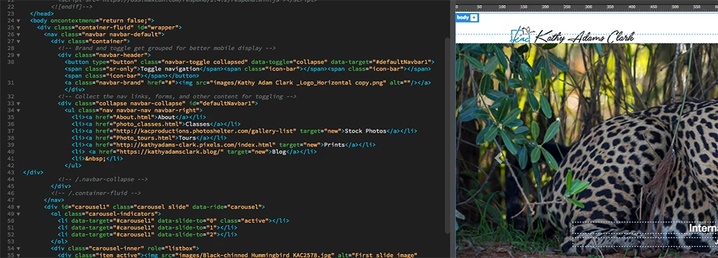
I created my website using the Dreamweaver Bootstrap tutorial.  All was good until I decided to change my logo.  The new logo sits lower than the original and out of alignment with my menu bar.

I've resized the new logo to exactly the same dimensions as the old logo.  The new one still won't align. 

No other problems inserting new photos on the rest of the website. 

Any help would be appreciated.

Here's a screen capture if this helps. 

    This topic has been closed for replies.
    Correct answer Nancy OShea

    Nancy, would you look again. 

    At one point, I got the logo in the right spot.  That made the sponsor icons in the middle of the page go out of alignment.

    I read some more and finally got the sponsor icons back into position.

    Now the logo is super tiny up at the top of the webpage.  Do appreciate your comment on right-click. 


    When things don't work as expected, it's almost always due to code errors.  See link below for details. 

    Showing results for http://kathyadamsclark.com/ - Nu Html Checker

    <At one point, I got the logo in the right spot.  That made the sponsor icons in the middle of the page go out of alignment.>

    That implies that you're not targeting the correct CSS selectors.

    4 replies

    Community Expert
    March 6, 2018

    Ok, so I re-examined the code and did a quick refresher on Bootstrap 3 menus.  So the issue that is presenting itself is the class .navbar-brand class.  Going back to the Bootstrap 3 documentation ( https://getbootstrap.com/docs/3.3/components/#navbar-brand-image ) it appears this can cause issues depending on your image dimensions.  In your case it is.  So what you would need to do is go to your styles.css file which is being included after the bootstrap CSS and then add the following in:

    .navbar-brand { padding: 0; }

    Because of the order of operations, this rule will cancel out the current padding: 15px 15px; in the bootstrap.css file that you have included.  Now this assumes that your new image is the same size as your current image (324x68px).  If the sizing is different, other adjustments may need to be made.

    KathyTexAuthor
    Participating Frequently
    March 18, 2018

    Ben, that still didn't fix the problem.  My logo is slightly below the container.

    I added the .navbar-brand {padding: 0;} to the last line of the styles.css file.  Uploaded that file.

    Then changed the logo png in the index source code and uploaded that. 

    You'll see that the logo is still sitting below the images and out of alignment with the navigation bar.

    This logo is the exact same size as the old logo and the old logo was aligned.

    Here's a link to my site:  Kathy Adams Clark KAC Productions

    http://kathyadamsclark.com/

    Nancy OShea
    Community Expert
    Community Expert
    March 6, 2018

    I assume you're going for something like this?

    CODE:

    <!doctype html>

    <html lang="en">

    <head>

    <meta charset="utf-8">

    <title>Bootstrap 3.3.7 Starter</title>

    <meta name="viewport" content="width=device-width, initial-scale=1">

    <meta http-equiv="X-UA-Compatible" content="IE=edge">

    <!-- Latest minified Bootstrap 3 CSS-->

    <link rel="stylesheet" href="https://maxcdn.bootstrapcdn.com/bootstrap/3.3.7/css/bootstrap.min.css" integrity="sha384-BVYiiSIFeK1dGmJRAkycuHAHRg32OmUcww7on3RYdg4Va+PmSTsz/K68vbdEjh4u" crossorigin="anonymous">

    <style>

    body {padding-top: 100px;}

    .navbar {min-height: 65px /**same height as logo**/}

    .navbar-brand {margin:0; padding:0;}

    .navbar-right {margin-top: 8px; /**adjust as req'd**/}

    </style>

    </head>

    <body>

    <!--begin top navbar-->

    <nav class="navbar navbar-default navbar-fixed-top" role="navigation">

    <div class="container-fluid">

    <div class="navbar-header">

    <button type="button" class="navbar-toggle" data-toggle="collapse" data-target="#myNavbar">

    <span class="icon-bar"></span>

    <span class="icon-bar"></span>

    <span class="icon-bar"></span>

    </button>

    <!--BRAND-->

    <a class="navbar-brand" href="#"><img src="https://dummyimage.com/300x65" alt="logo"></a>

    </div>

    <!--MENU ITEMS-->

    <div class="collapse navbar-collapse" id="myNavbar">

    <ul class="nav navbar-nav navbar-right">

    <li><a href="#">MENU 1</a></li>

    <li><a href="#">MENU 2</a></li>

    <li><a href="#">MENU 3</a></li>

    <li><a href="#">MENU 4</a></li>

    <li><a href="#">MENU 5</a></li>

    </ul>

    </div>

    </div>

    <!--end top navbar--></nav>

    <div class="container">

    <div class="row">

    PAGE CONTENT GOES HERE....

    </div>

    </div>

    <!--latest jQuery JS-->

    <script src="https://code.jquery.com/jquery-3.2.1.min.js" integrity="sha256-hwg4gsxgFZhOsEEamdOYGBf13FyQuiTwlAQgxVSNgt4=" crossorigin="anonymous"></script>

    <!--Latest Bootstrap JS-->

    <script src="https://maxcdn.bootstrapcdn.com/bootstrap/3.3.7/js/bootstrap.min.js" integrity="sha384-Tc5IQib027qvyjSMfHjOMaLkfuWVxZxUPnCJA7l2mCWNIpG9mGCD8wGNIcPD7Txa" crossorigin="anonymous"></script>

    </body>

    </html>

    Nancy O'Shea— Product User & Community Expert
    KathyTexAuthor
    Participating Frequently
    March 18, 2018

    Nancy, I tried your fix and the logo is still below the photo.

    Here's a link to my site:  Kathy Adams Clark KAC Productions

    Nancy OShea
    Community Expert
    Community Expert
    March 18, 2018

    Logo is not below the carousel photo for me.  See screenshots. 

    BTW Kathy, I advise against disabling right click.  It's super annoying, utterly useless and easily defeated by turning off JavaScript.   If you're serious about your work, use digital watermarking.  There's even a Photoshop addd-on for it.

    Photography Copyright Protection Solutions | Digimarc

    Digimarc copyright protection in Photoshop

    Nancy O'Shea— Product User & Community Expert
    Community Expert
    March 6, 2018

    I am pretty sure based on your code that I found your website and your issue is actually present today, just not as prevalent as with your updated image.  The issue is with your use of the bootstrap code.  So what you have today is a container around 2 divs.  There is no row for your content, nor any columns within the row.  So a lot of the normal rules that bootstrap has in place are not working because the core structure is not being found.  What I'm thinking you need to do is either 1 of two solutions:

    Either 1.  Inside your container, put a row div, and then your navbar header and navbar would be 2 columns with defined, or offset widths.  So for instance, you could do col-md-8 for your logo and col-md-4 for your navbar or col-md-4 for your logo and col-md-4 col-md-offset-4 for your navbar.

    Or 2. You can use this example from Bootstrap to use pull-right on the navbar to keep it on the right side while your logo stays to the left.  This example is within the code.

    KathyTexAuthor
    Participating Frequently
    March 6, 2018

    Ben M and Ben P:

    Here's my code for the navbar.  Any corrections in the code would be appreciated. 

    </head>

      <body oncontextmenu="return false;">

    <div class="container-fluid" id="wrapper">

      <nav class="navbar navbar-default">

        <div class="container">

          <!-- Brand and toggle get grouped for better mobile display -->

          <div class="navbar-header">

            <button type="button" class="navbar-toggle collapsed" data-toggle="collapse" data-target="#defaultNavbar1"><span class="sr-only">Toggle navigation</span><span class="icon-bar"></span><span class="icon-bar"></span><span class="icon-bar"></span></button>

            <a class="navbar-brand" href="#"><img src="images/Kathy Adam Clark _Logo_Horizontal copy.png" alt=""/></a></div>

          <!-- Collect the nav links, forms, and other content for toggling -->

          <div class="collapse navbar-collapse" id="defaultNavbar1">

            <ul class="nav navbar-nav navbar-right">

              <li><a href="About.html">About</a></li>

              <li><a href="photo_classes.html">Classes</a></li>

              <li><a href="http://kacproductions.photoshelter.com/gallery-list" target="new">Stock Photos</a></li>

              <li><a href="Photo_tours.html">Tours</a></li>

              <li><a href="http://kathyadams-clark.pixels.com/index.html" target="new">Prints</a></li>

              <li> <a href="https://kathyadamsclark.blog/" target="new">Blog</a></li>

              <li> </li>

            </ul>

    </div>

          <!-- /.navbar-collapse -->

            </div>

    BenPleysier
    Community Expert
    Community Expert
    March 6, 2018

    I do not see a problem with the code that I am privy to, which means that the problem could be elsewhere.

    If you want us to help you, we will need to see the full code, preferably by you uploading the page, including style sheets, and giving us a URL to that page.

    Wappler is the DMXzone-made Dreamweaver replacement and includes the best of their powerful extensions, as well as much more!
    KathyTexAuthor
    Participating Frequently
    March 6, 2018

    Ben P:

    Here's my code:

    </head>

      <body oncontextmenu="return false;">

    <div class="container-fluid" id="wrapper">

      <nav class="navbar navbar-default">

        <div class="container">

          <!-- Brand and toggle get grouped for better mobile display -->

          <div class="navbar-header">

            <button type="button" class="navbar-toggle collapsed" data-toggle="collapse" data-target="#defaultNavbar1"><span class="sr-only">Toggle navigation</span><span class="icon-bar"></span><span class="icon-bar"></span><span class="icon-bar"></span></button>

            <a class="navbar-brand" href="#"><img src="images/Kathy Adam Clark _Logo_Horizontal copy.png" alt=""/></a></div>

          <!-- Collect the nav links, forms, and other content for toggling -->

          <div class="collapse navbar-collapse" id="defaultNavbar1">

            <ul class="nav navbar-nav navbar-right">

              <li><a href="About.html">About</a></li>

              <li><a href="photo_classes.html">Classes</a></li>

              <li><a href="http://kacproductions.photoshelter.com/gallery-list" target="new">Stock Photos</a></li>

              <li><a href="Photo_tours.html">Tours</a></li>

              <li><a href="http://kathyadams-clark.pixels.com/index.html" target="new">Prints</a></li>

              <li> <a href="https://kathyadamsclark.blog/" target="new">Blog</a></li>

              <li> </li>

            </ul>

    </div>

          <!-- /.navbar-collapse -->

            </div>