Would you please send me a Screenshot on how it looks? :-) Or does it kinda look like the first screenshot I included? I see now that my settings for the site automatically sets to "50% side zoom" in Safari when I visit this page, could the problem actually be that simple? That my site is actually okay it's just has to be zoomed a little bit in Safari for some reason?
I will add the code you mention to my site, thanks!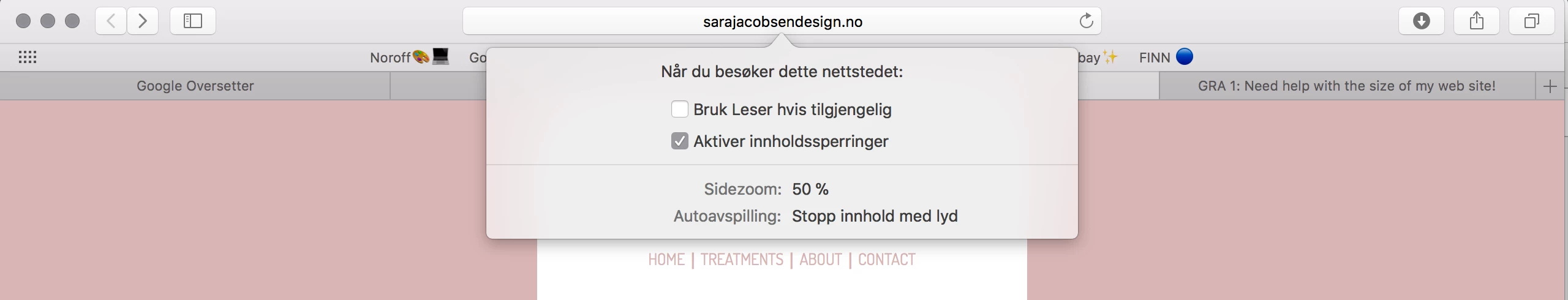
Copy & paste revised code below into a new, blank document.
<!doctype html>
<html lang="en">
<head>
<meta charset="UTF-8">
<title>Meraki</title>
<!--viewport meta tag for mobile devices-->
<meta name="viewport" content="width=device-width, initial-scale=1">
<!--Remove IE compatibility mode-->
<meta http-equiv="X-UA-Compatible" content="IE=edge">
<style>
body {
background-color: #d9b5b5;
font-family: coming-soon;
font-style: normal;
font-weight: 400;
text-align: center;
}
.container {
background-color: #FFF;
width: 80%;
margin: 0 auto;
}
header {
width: 80%;
margin: 0 auto
}
header img {
max-width: 100%;
margin: 0 auto;
padding-bottom: 10px;
}
nav {font-size: 1.2rem;}
nav ul li {
list-style: none;
display: inline-block;
}
nav ul li a {
text-decoration: none;
color: #D9B5B5;
}
nav ul li a:visited { color: #000; }
nav ul li a:hover, nav ul li a:active, nav ul li a:focus { text-decoration: underline }
.content {
width: 75%;
margin: 0 auto;
padding-top: 30px;
}
.content img { max-width: 100%; }
.content p {
font-size: 24px;
font-family: cedarville-cursive, cursive;
font-weight: 400;
}
footer {
width: 50%;
margin: 0 auto;
font-family: dosis;
font-weight: 400;
padding-top: 80px;
font-size: 14px;
}
</style>
</head>
<body>
<div class="container">
<header>
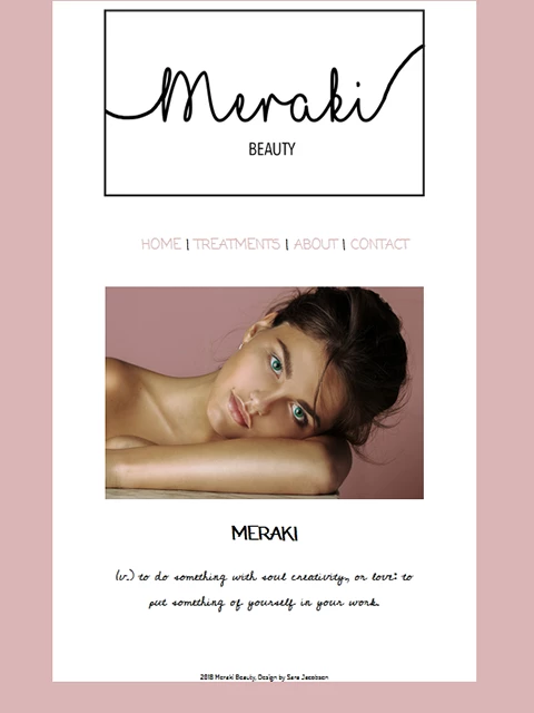
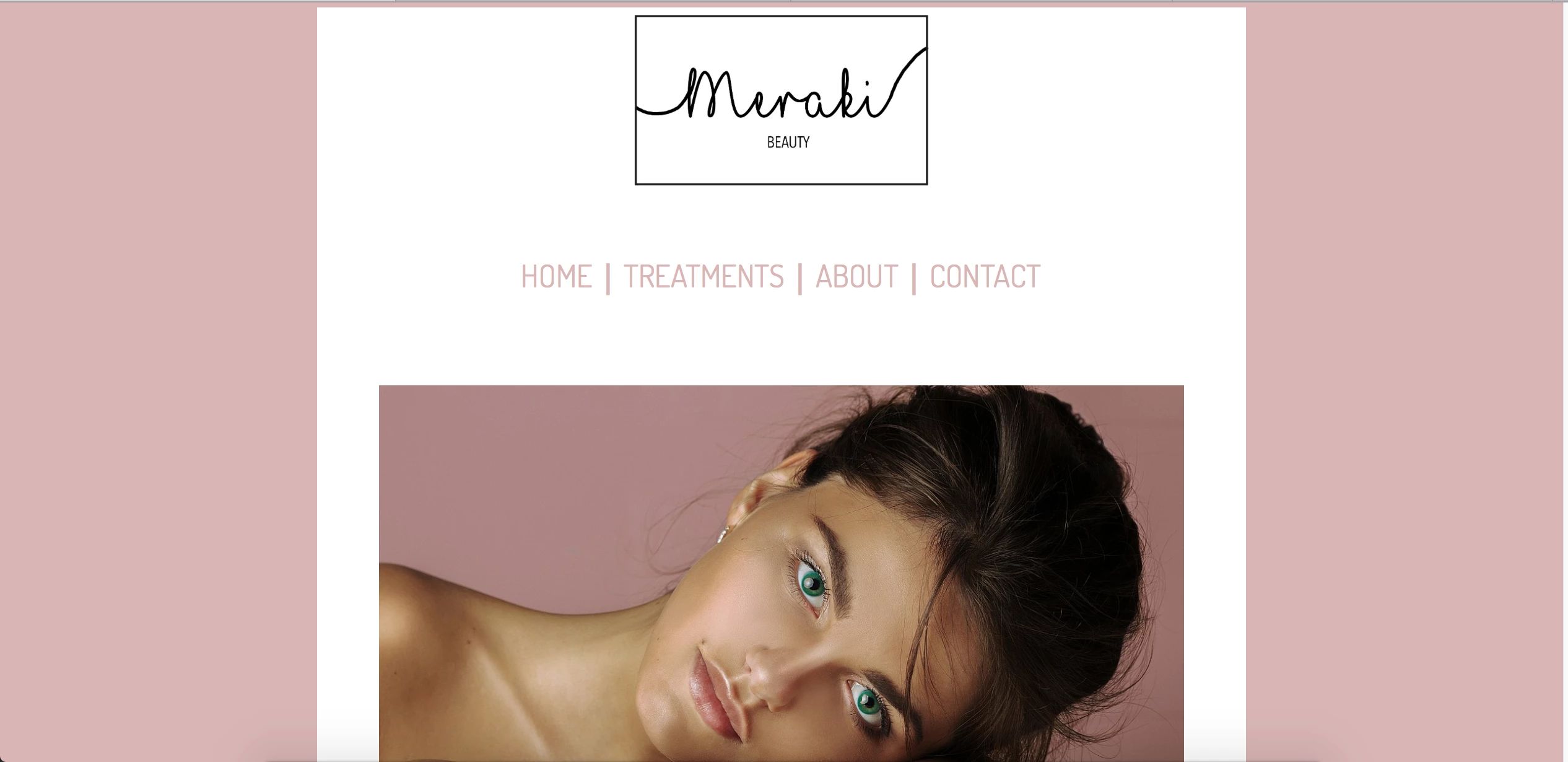
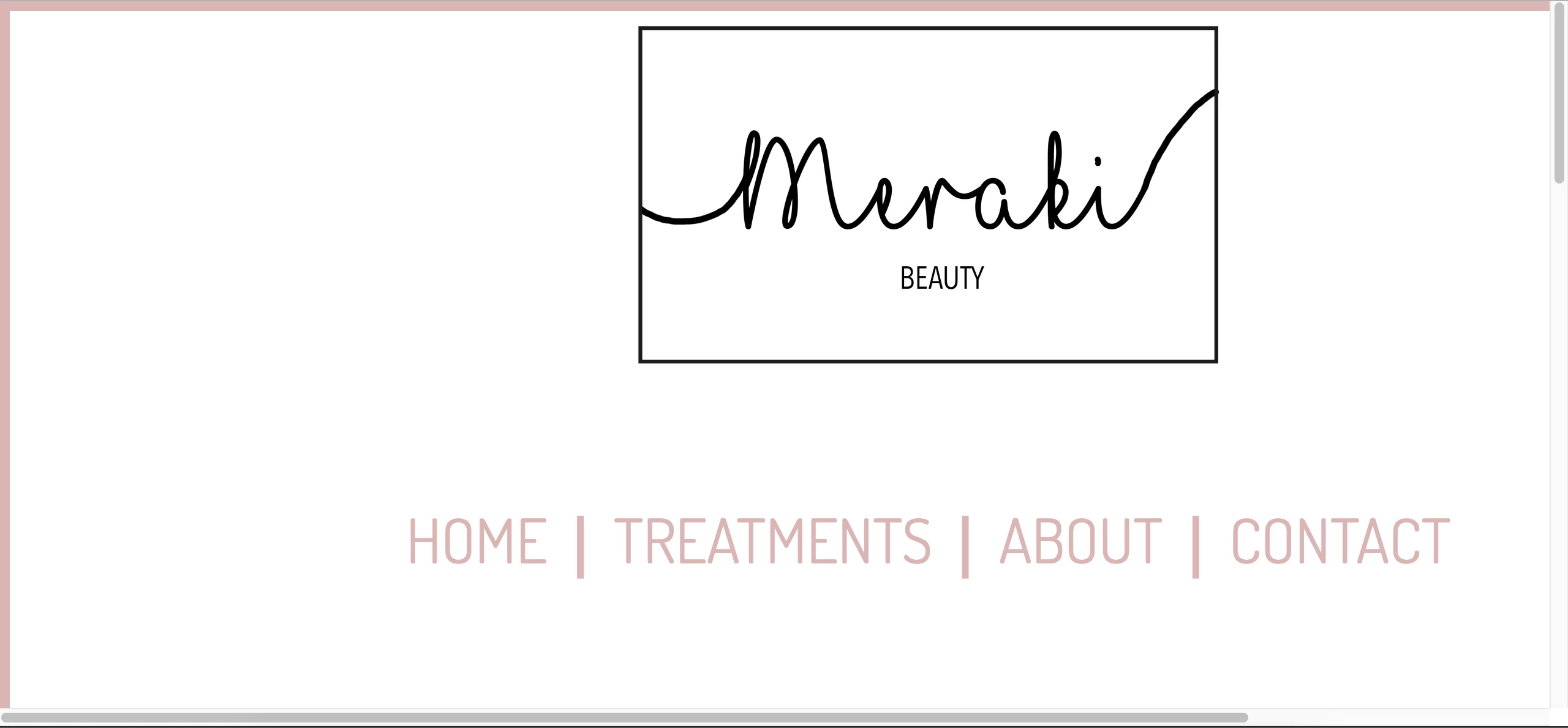
<img src="http://sarajacobsendesign.no/Logo/Logo%206.png" alt="Miraki logo"/>
<nav>
<ul>
<li><a href="Meraki.html" title="HOME">HOME</a></li> |
<li><a href="#">TREATMENTS</a></li> |
<li><a href="#">ABOUT</a></li> |
<li><a href="#">CONTACT</a></li>
</ul>
</nav>
</header>
<div class="content">
<img src="http://sarajacobsendesign.no/Treatments/Div/Div2.jpg" alt="Beautiful woman"/>
<h2>MERAKI</h2>
<p>(v.) to do something with soul creativity, or love: to put something of yourself in your work.</p>
</div>
<footer>2018 Meraki Beauty, Design by Sara Jacobsen</footer>
<!--/container--></div>
<!--Adobe Edge Web Fonts-->
<script>var __adobewebfontsappname__="dreamweaver"</script>
<script src="http://use.edgefonts.net/dosis:n2,n4:default;patrick-hand:n4:default;coming-soon:n4:default;comfortaa:n4:default;cedarville-cursive:n4:default;crafty-girls:n4:default;allerta:n4:default;antic:n4:default.js" type="text/javascript"></script>
</body>
</html>
Save and test in all devices and viewport widths. The revised code is valid, semantically correct and responsive. Let me know if you have questions.
Nancy

 AdChoices