Known Participant
February 5, 2023
Question

media Max width - suggestion?
  • February 5, 2023
  • 4 replies
  • 386 views

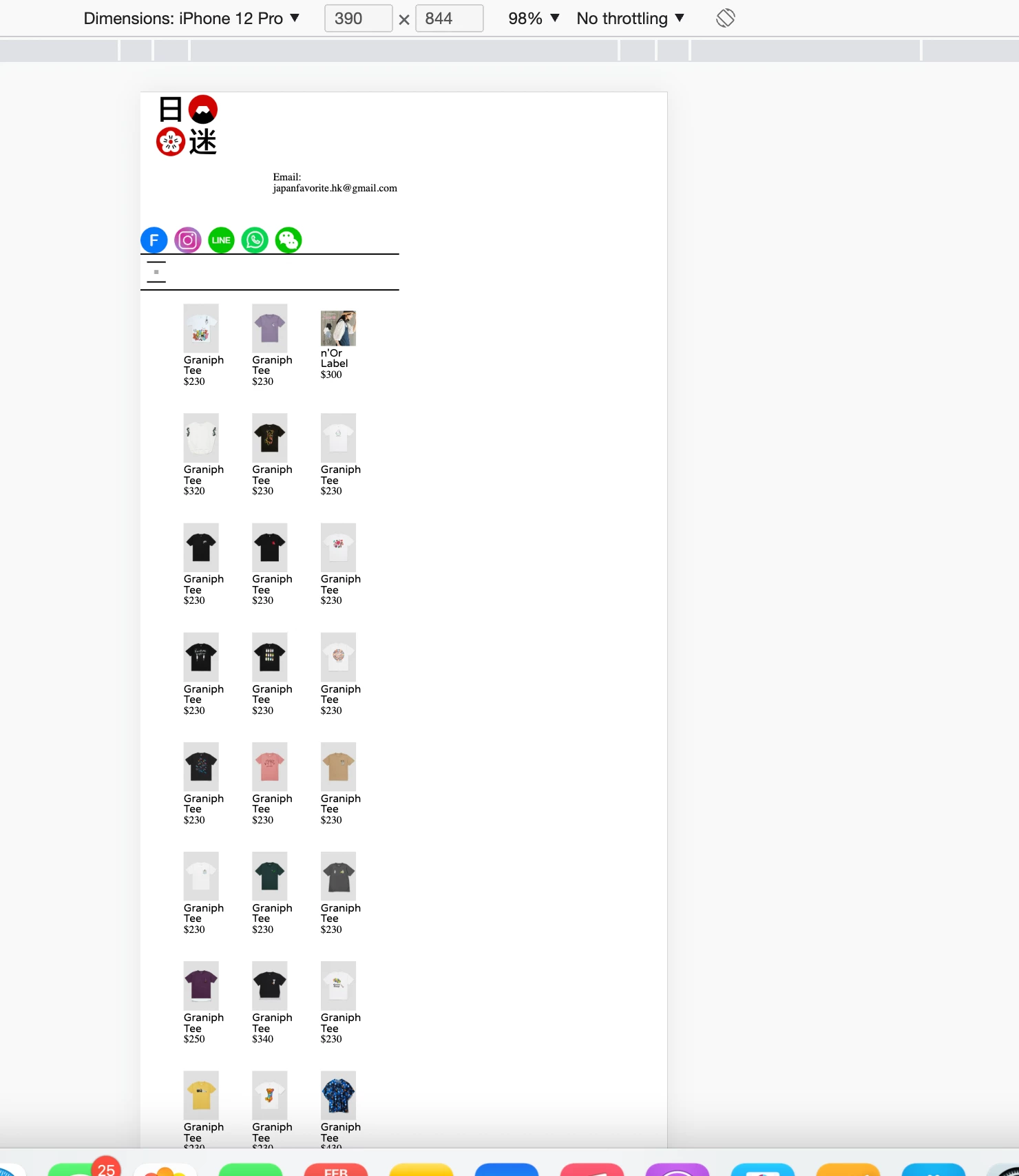
Hi, i am editing the css on the mobile device.

but the layout seem not in a scale, what should be the max width?

    This topic has been closed for replies.

    4 replies

    Legend
    February 5, 2023
    quote

    Hi, i am editing the css on the mobile device.

    but the layout seem not in a scale, what should be the max width?


    By @Hiu Ching26169588pka2


    Something else to consider, have you deployed the 'viewport ' meta tag in the head section of your pages code?


    Probably nothing to do with the actual media query but something else,  more likely an incorrect css attribute or corrupt html.

    Known Participant
    February 7, 2023

     i have "viewport" in head section


    Legend
    February 7, 2023
    quote

     i have "viewport" in head section


    By @Hiu Ching26169588pka2


    Not sure if that is complete - I've always used: 


    <meta name="viewport" content="width=device-width, initial-scale=1, maximum-scale=1">


    As a test can you also change the background-color of your container <div> css to yellow so you can easily identify IF it is actually 100% width of the browser window? If it is then I would assume you have another container nested inside that which holds the product cards and is only set to 50% or the product cards themselves are set to a smaller width than desired but that's unlikely to be the case as they would just run on. My guess is you have another container nested inside the main container which is only 50% wide or the viewport meta tag is incomplete............viewport meta tag seems the most likely issue.

    Nancy OShea
    Community Expert
    Community Expert
    February 5, 2023
    quotewhat should be the max width?

    By @Hiu Ching26169588pka2

    ==========

    Q: How long is a piece of string?

    A:  As long as what's required.


    I agree with @BenPleysier  about using Bootstrap breakpoints.  They will fit all standard devices and everything in between.


    // X-Small devices (portrait phones, less than 576px)
    // No media query for `xs` since this is Bootstrap's default 
    
    // Small devices (landscape phones, 576px and up)
    @media (min-width: 576px) { ... }
    
    // Medium devices (tablets, 768px and up)
    @media (min-width: 768px) { ... }
    
    // Large devices (desktops, 992px and up)
    @media (min-width: 992px) { ... }
    
    // X-Large devices (large desktops, 1200px and up)
    @media (min-width: 1200px) { ... }
    
    // XX-Large devices (larger desktops, 1400px and up)
    @media (min-width: 1400px) { ... }


    Nancy O'Shea— Product User & Community Expert
    Legend
    February 5, 2023
    quote

    but the layout seem not in a scale, what should be the max width?


    By @Hiu Ching26169588pka2


    Without seeing the pages code it's difficult to provide an answer. Can you post it here after it's been compiled by php, together with your css.


    768px would normally be what l use then 480px but it depends on the layout and when l need elements to reposition themselves so the media query width could be anything that is applicable to maintain a sensible layout.

    Known Participant
    February 7, 2023

    Here is my css 

    BenPleysier
    Community Expert
    Community Expert
    February 5, 2023

    I always use the breakpoints as suggested by Bootstrap: https://getbootstrap.com/docs/5.3/layout/breakpoints/


    Wappler is the DMXzone-made Dreamweaver replacement and includes the best of their powerful extensions, as well as much more!