ryestrada
Participant
October 17, 2018
Answered

Media Queries Question
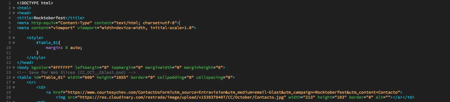
  • October 17, 2018
  • 3 replies
  • 428 views

Hello,

I am very confuse and I need help, I do not know much of coding. I made my design in photoshop and then slice it and was able to create this html. Everything works links and images but now I want to make it responsive because if you look it up on a mobile device it does not fit the scree. Does anyone have any suggestions. I have try many tutorials and read a lot of blogs and I don't seem to find an answer. I appreciate it.

Thank you

This is what I have tried

@media screen (max-width: 599px) {

img {

width: 100% !important;

}

    This topic has been closed for replies.
    Correct answer Jon Fritz

    Photoshop's table code is notoriously rigid and falls apart at the drop of a hat. You really can't use it for actual websites, especially if you plan to make them responsive. It just breaks far too easily.

    If you really want to make a responsive site, you're going to need to take some time to learn some of the more modern coding methods, or use the Bootstrap templates that come with DW and hope they look the way you want. Given that you don't know much about code, those templates are likely to be a bigger can of worms for you than the Photoshop to Dreamweaver workflow you're attempting now.

    If you have some time to get some of the basics of html and css under your belt, there are a lot of good places online that can help. W3schools.com has a few tutorials, while not "complete" they are decent enough to get you going...

    HTML Tutorial

    CSS Tutorial

    Responsive Web Design Media Queries

    3 replies

    Nancy OShea
    Community Expert
    Community Expert
    October 17, 2018

    Start over with one of the Responsive Templates in DW. 

    1. Define your local site folder.  Go to Site > New Site.   Give your site folder a name like C:\myTestSite.
    2. Go to File > New > Starter Templates.  See screenshot.

    After saving your document, DW will create assets folders for you which can be seen in your Files Panel.

    Add your own text and images to your index.html page. 

    Post back if you have any trouble.

    Nancy O'Shea— Product User & Community Expert
    ryestrada
    ryestradaAuthor
    Participant
    October 17, 2018

    Thank you for taking the time to reply. I really appreciate it.

    Rosy

    Jon Fritz
    Community Expert
    Jon FritzCommunity ExpertCorrect answer
    Community Expert
    October 17, 2018

    Photoshop's table code is notoriously rigid and falls apart at the drop of a hat. You really can't use it for actual websites, especially if you plan to make them responsive. It just breaks far too easily.

    If you really want to make a responsive site, you're going to need to take some time to learn some of the more modern coding methods, or use the Bootstrap templates that come with DW and hope they look the way you want. Given that you don't know much about code, those templates are likely to be a bigger can of worms for you than the Photoshop to Dreamweaver workflow you're attempting now.

    If you have some time to get some of the basics of html and css under your belt, there are a lot of good places online that can help. W3schools.com has a few tutorials, while not "complete" they are decent enough to get you going...

    HTML Tutorial

    CSS Tutorial

    Responsive Web Design Media Queries

    pziecina
    Legend
    October 17, 2018

    The simple answer is no it is not possible to make your code responsive.

    The more complexed answer is it may be possible if you know what you are doing, but it would not be worth the time and effort. Image slices are not the way to layout a web site anymore, because such pages are normally coded with fixed width/heigh values, meaning they do not scale.

    Even using % values can cause problems with image size, as browsers may round up or down an image size if the value falls on a pixel fractional value.