jzutter
Known Participant
January 10, 2017
Answered

Mobile version not changing on my responsive site

  • January 10, 2017
  • 6 replies
  • 517 views

the address is Bates Brothers Amusements: Basic  ​.

Two issues i'm having:

1. i cant get the mobile version of the site to display properly. I want it so the phonenuber, email logo and home logo on top drop below the follor us on facebook. Basically i want to wrap when the browser is in mobile size.

2. How do i center it all in the browser when in desktop view?

    This topic has been closed for replies.
    Correct answer Nancy OShea

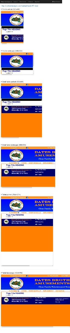
    That's not a responsive site.  It's not even close.  See screenshot.   There should be no horizontal scrollbars displayed in any viewport size.   You also have a lot of code errors in HTML & CSS.

    Showing results for http://zutterdesign.com/bates/basic17.html - Nu Html Checker

    W3C CSS Validator results for http://zutterdesign.com/bates/basic17.html (CSS level 3)

    I think you should start over with Bootstrap.

    Nancy

    6 replies

    jzutter
    jzutterAuthor
    Known Participant
    January 10, 2017

    The only thing I expected was to see a difference in size when I change them. I will try them again later.

    Nancy OShea
    Community Expert
    Community Expert
    January 10, 2017

    % width layouts don't re-scale the size of your content.  They merely change page widths.

    If you want to re-scale your content, look at CSS Viewport Units with SVG images.  Below is a simple proof of concept demo.

    Nancy OShea : Alt-Web Design & Publishing

    Nancy

    Nancy O'Shea— Product User & Community Expert
    jzutter
    jzutterAuthor
    Known Participant
    January 10, 2017

    I agree about the percentages but i had them as percentage and they didn't do anything thats why i went with px.

    Nancy OShea
    Community Expert
    Community Expert
    January 10, 2017

    I don't know what your expectations were.  A basic % width layout resizes to the available viewport.

    Centered Layout:

    <!doctype html>

    <html>

    <head>

    <meta charset="utf-8">

    <title>Centered Layouts</title>

    <meta name="viewport" content="width=device-width, initial-scale=1">

    <style>

    html {

    background: url(http://zutterdesign.com/bates/Images/pagefiles/pagebgrlarge.png) no-repeat;

    background-size:cover;

    }

    body {

    background:rgba(255,255,255,1.0);

    width: 70%;  /**adjust as desired**/

    min-width:320px;

    max-width: 1280px;

    border: 3px solid silver;

    margin: 0 auto;

    padding:2%;

    font-family: arial, helvetica, sans-serif;

    }

    .text-center {text-align:center}

    </style>

    </head>

    <body>

    <h1>Heading 1</h1>

    <h2>Heading 2</h2>

    <h3 class="text-center">heading 3</h3>

    <p>Lorem ipsum dolor sit amet, consectetur adipisicing elit. Iste quam natus facilis fugit fuga quidem dolore. Dolor reiciendis architecto, aut at excepturi veniam quas in quasi eum voluptate modi quia.</p>

    <h3 class="text-center">heading 3</h3>

    <p>Lorem ipsum dolor sit amet, consectetur adipisicing elit. Iste quam natus facilis fugit fuga quidem dolore. Dolor reiciendis architecto, aut at excepturi veniam quas in quasi eum voluptate modi quia.</p>

    <h3 class="text-center">heading 3</h3>

    <p>Lorem ipsum dolor sit amet, consectetur adipisicing elit. Iste quam natus facilis fugit fuga quidem dolore. Dolor reiciendis architecto, aut at excepturi veniam quas in quasi eum voluptate modi quia.</p>

    <h3 class="text-center">heading 3</h3>

    <p>Lorem ipsum dolor sit amet, consectetur adipisicing elit. Iste quam natus facilis fugit fuga quidem dolore. Dolor reiciendis architecto, aut at excepturi veniam quas in quasi eum voluptate modi quia.</p>

    </body>

    </html>

    Nancy O'Shea— Product User & Community Expert
    jzutter
    jzutterAuthor
    Known Participant
    January 10, 2017

    Nancy I still haven't given up on the way i was doing it with the code n css. The link is still the same as before just the files have up reuploaded to show where i am

    I got it so the mobile and and desktop version change when you adjust brower size. havent touched the tablet version yet.

    Can you help me with Centering the main div in the center of my broswer as well as centering content in other divs?

    Nancy OShea
    Community Expert
    Community Expert
    January 10, 2017

    Your CSS code is a real quagmire of media queries and pixel widths.  It might be simpler all around to disable it and just build with basic % widths.

    To center the <body>, give it a width of less than 100% and a margin-left and margin-right of 0.

    body {

         width:80%;

         margin: 0 auto;

    }

    Nancy O'Shea— Product User & Community Expert
    jzutter
    jzutterAuthor
    Known Participant
    January 10, 2017

    i did and will look at it closer.

    jzutter
    jzutterAuthor
    Known Participant
    January 10, 2017

    I know there are errors as i had it working responsive and now it doesn't. Thats why i am  look for help. 

    Im going to look into bootstap but not sure about it and if it will work.

    Nancy OShea
    Community Expert
    Community Expert
    January 10, 2017

    Yes, Bootstrap works.  In fact, I posted a Bootstrap layout for you the other day. It was in your other thread.  Did you look at it?

    Responsive Website with Fluid Grid Layout

    Nancy

    Nancy O'Shea— Product User & Community Expert
    Nancy OShea
    Community Expert
    Nancy OSheaCommunity ExpertCorrect answer
    Community Expert
    January 10, 2017

    That's not a responsive site.  It's not even close.  See screenshot.   There should be no horizontal scrollbars displayed in any viewport size.   You also have a lot of code errors in HTML & CSS.

    Showing results for http://zutterdesign.com/bates/basic17.html - Nu Html Checker

    W3C CSS Validator results for http://zutterdesign.com/bates/basic17.html (CSS level 3)

    I think you should start over with Bootstrap.

    Nancy

    Nancy O'Shea— Product User & Community Expert