


Navbar dropdown hidden in mobile
Hi I've created a website for my family's business. It's been successful so far apart from viewing it on a mobile device. The bootstrap navbar has links in desktop size on the right but these do not apear in mobile size, a button for a dropdown menu appears but as soon as i touch it its as if the menu is stuck behind the slideshow carousel. Any help would be much appreciated. I'm not too competent in dreamweaver. I've tried changing things in the css to position the navbar dropdown infront of the carousel. I'm assuming if it was working properly the carousel should be pushed down and the dropdown menu should appear directly below the nav bar?
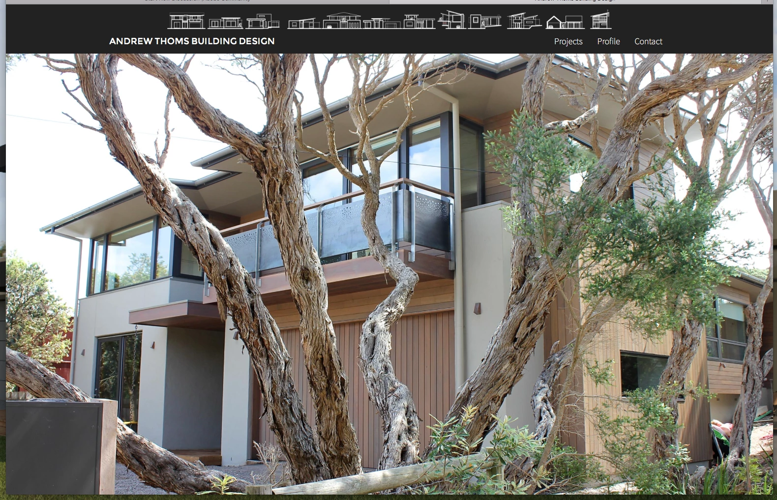
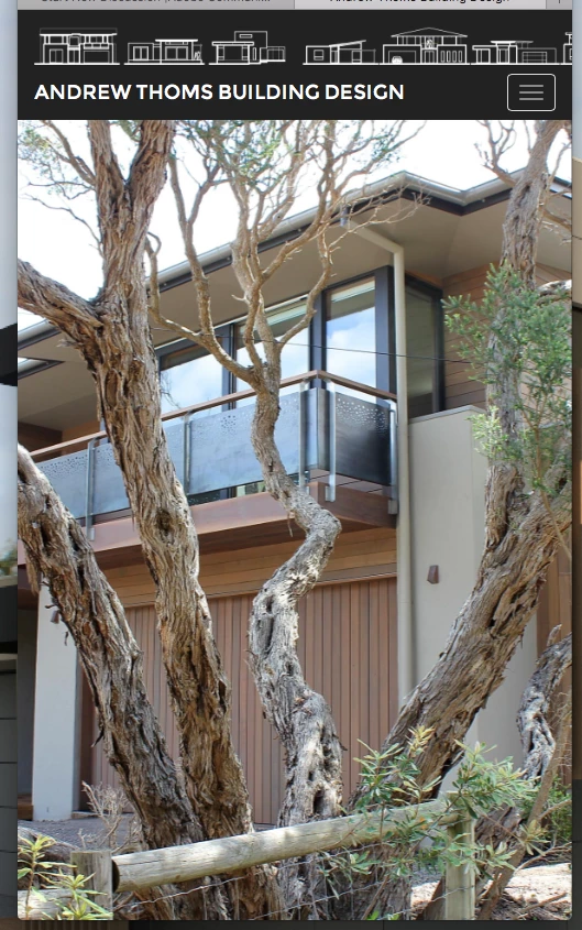
<!DOCTYPE html>
<html lang="en">
<head>
<meta charset="UTF-8">
<meta http-equiv="X-UA-Compatible" content="IE=edge">
<meta name="viewport" content="width=device-width, initial-scale=1">
<title>Andrew Thoms Building Design</title>
<meta name="description" content="Specialising in contemporary coastal designs thoughout Point Lonsdale, Ocean Grove, Barwon Heads, the Surf Coast and beyond " />
<meta name="keywords" content="Building Desginer, Building, Design, Wallington, Point Lonsdale, Barwon heads, Surf coast, Bellarine Peninsula, Torquay, Ocean grove, Queenscliff, Anglesea, Builders, Homes, Costal Architecture " />
<!-- Bootstrap -->
<link href="css/bootstrap.css" rel="stylesheet">
<link href="css/Styles.css" rel="stylesheet" type="text/css">
<!-- HTML5 shim and Respond.js for IE8 support of HTML5 elements and media queries -->
<!-- WARNING: Respond.js doesn't work if you view the page via file:// -->
<!--[if lt IE 9]>
<script src="https://oss.maxcdn.com/html5shiv/3.7.2/html5shiv.min.js"></script>
<script src="https://oss.maxcdn.com/respond/1.4.2/respond.min.js"></script>
<![endif]-->
<!--The following script tag downloads a font from the Adobe Edge Web Fonts server for use within the web page. We recommend that you do not modify it.--><script>var __adobewebfontsappname__="dreamweaver"</script><script src="http://use.edgefonts.net/source-sans-pro:n2,n6,n9,n7,n4,n3:default;montserrat:n4:default.js" type="text/javascript"></script>
</head>
<body class="background fill">
<div class="fill overflow">
<div class="container-fluid" id="wraper">
<nav class="navbar navbar-default" id="nav-inner">
<div class="container"><img src="images/Banner White.png" alt="" width="4656" height="206" class="bannerimage"/>
<!-- Brand and toggle get grouped for better mobile display -->
<div class="navbar-header">
<button type="button" class="navbar-toggle collapsed" data-toggle="collapse" data-target="#defaultNavbar1"><span class="sr-only">Toggle navigation</span><span class="icon-bar"></span><span class="icon-bar"></span><span class="icon-bar"></span></button>
<a class="navbar-brand" href="index.html">ANDREW THOMS BUILDING DESIGN</a></div>
<!-- Collect the nav links, forms, and other content for toggling -->
<div class="collapse navbar-collapse" id="dropdown">
<ul class="nav navbar-nav navbar-right" id="dropdown1">
<li><a href="projects.html" class="linktext">Projects</a></li>
<li><a href="profile.html" class="linktext">Profile</a></li>
<li><a href="contact.html" class="linktext">Contact</a></li>
</ul>
</div>
<!-- /.navbar-collapse -->
</div>
<!-- /.container-fluid -->
</nav>
</div>
<div class="container fill indexslideshow">
<div id="carousel1" class="carousel slide" data-ride="carousel">
<div class="carousel-inner" role="listbox">
<div class="item active">
<div class="fill" style="background-image:url('images/index-1.jpg');">
</div>
</div>
<div class="item">
<div class="fill" style="background-image:url('images/index-2.jpg');">
</div>
</div>
<div class="item">
<div class="fill" style="background-image:url('images/index-3.jpg');">
</div>
</div>
<div class="item">
<div class="fill" style="background-image:url('images/Index-4.jpg');">
</div>
</div>
</div>
</div>
</div>
</div>
<!-- jQuery (necessary for Bootstrap's JavaScript plugins) -->
<script src="js/jquery-1.11.2.min.js"></script>
<!-- Include all compiled plugins (below), or include individual files as needed -->
<script src="js/bootstrap.js"></script>
</body>
</html>
@charset "UTF-8";
.navbar.navbar-default {
border-radius: 0px;
background-color: #222222;
background-image: url(url);
-webkit-box-shadow: 0 0px;
box-shadow: 0 0px;
margin-bottom: 0px;
border-width: 0px;
color: #FFFFFF;
height: 0px;
}
html body .navbar-brand {
color: #FFFFFF !important;
font-family: montserrat;
font-style: normal;
font-weight: 400;
font-size: large;
}
.carouselwidth {
height: 100%;
min-width: 0px;
}
.background {
background-color: #222222;
height: 100%;
}
.image-fill {
width: 100%;
}
#wraper {
padding-left: 0px;
padding-right: 0px;
}
.linktext {
font-family: source-sans-pro;
font-style: normal;
font-weight: 200;
color: #FFFFFF !important;
font-size: large;
text-shadow: 0px 0px;
}
.bannerimage {
height: auto;
margin-top: 10px;
max-height: 40px;
max-width: 904px;
display: block;
margin-left: auto;
margin-right: auto;
}
.textwhite {
color: #FFFFFF;
}
.leftsidebar {
float: left;
max-width: 175px;
}
.carouseright {
padding-right: 0px;
padding-left: 0px;
margin-right: 0px;
color: #FFFFFF;
margin-left: 175px;
}
.left {
padding-left: 0px;
}
.thumbnailtext {
font-family: source-sans-pro;
font-style: normal;
font-weight: 300;
font-size: small;
margin-right: 0px;
margin-top: 0px;
margin-bottom: 0px;
margin-left: 0px;
color: #FFFFFF;
padding-bottom: 0px;
padding-top: 0px;
}
.thumbnailprop {
border-radius: 0px;
border-color: #222222;
padding-top: 0px;
padding-bottom: 0px;
float: left;
width: 14.2857%;
margin-bottom: 0%;
margin-top: 0%;
max-width: 129.14px;
max-height: 100px;
}
.captionprop {
padding-left: 0px;
padding-top: 0px;
padding-right: 0px;
padding-bottom: 0px;
text-align: center;
margin-top: 0px;
margin-bottom: 0px;
}
.currentpage {
color: #FFA500;
}
#seemore {
}
.moreprojects {
font-family: source-sans-pro;
font-style: normal;
font-weight: 200;
color: #FFFFFF;
text-align: center;
font-size: 32px;
}
.flickrlink {
font-family: source-sans-pro;
font-style: normal;
font-weight: 300;
text-align: center;
font-size: 20px;
color: #FFFFFF;
padding-bottom: 40px;
}
#h3 {
font-family: source-sans-pro;
font-style: normal;
font-weight: 300;
text-align: center;
font-size: 18px;
color: #FFFFFF;
padding-top: 0px;
padding-bottom: 0px;
}
.projectstext {
padding-top: 0px;
padding-bottom: 1px;
margin-top: 5px;
margin-bottom: 5px;
}
#paragraphtext {
font-family: source-sans-pro;
font-style: normal;
font-weight: 200;
font-size: 16px;
}
#h2 {
font-family: montserrat;
font-style: normal;
font-weight: 400;
font-size: 32px;
}
.heading1 {
font-family: source-sans-pro;
font-style: normal;
font-weight: 400;
font-size: 20px;
}
.designprocess {
background-color: #FFFFFF;
padding-top: px;
margin-top: 20px;
margin-left: 5%;
width: 30%;
padding-left: 0px;
float: left;
height: 500px;
}
.aboutme {
background-color: #FFFFFF;
/* [disabled]margin-left: 0px; */
margin-top: 50px;
padding-top: 0px;
padding-bottom: 0px;
margin-bottom: 50px;
}
.aboutmeparagraph {
text-align: justify;
max-width: 1200px;
/* [disabled]margin-bottom: 50px; */
margin-left: 20px;
margin-right: 20px;
}
#h2 {
}
.aboutmeheading {
margin-left: 150px;
margin-right: 150px;
text-align: center;
margin-top: 0px;
padding-top: 10px;
padding-bottom: 10px;
}
#paragraphtext {
}
#designprocessholder {
padding-left: 0px;
}
.profileslideshow {
/* [disabled]margin-right: 5%; */
width: 45%;
}
.slideshowholder {
width: 60%;
float: right;
margin-top: 20px;
margin-right: 5%;
height: 500px;
}
.carouselimagefill {
height: 100%;
/* [disabled]min-height: 100%; */
background-color: #FFFFFF;
}
.profilecarousel {
position:relative;
max-width: 767px;
margin:0 auto;
}
.profile {
position:relative;
max-width: 960px;
margin:0 auto;
}
.profileslides {
}
#profilebackground {
background-color: #FFFFFF;
}
#profileslidebackground {
background-color: #222222;
}
.bodytext {
font-family: source-sans-pro;
font-style: normal;
font-weight: 300;
font-size: 16px;
}
.profileinfo {
width: 33.3333%;
padding-left: 20px;
padding-top: 20px;
padding-right: 20px;
padding-bottom: 20px;
float: left;
}
.heading3 {
font-family: montserrat;
font-style: normal;
font-weight: 400;
}
.heading2 {
font-family: montserrat;
font-style: normal;
font-weight: 400;
font-size: 36px;
}
.googlemap {
}
#map {
margin-bottom: 0px;
padding-bottom: 0px;
bottom: 0px;
height: calc(100% - 360px);
}
.contactext {
margin-left: 50%;
margin-right: 0%;
padding-right: 15px;
padding-left: 15px;
padding-bottom: 15px;
padding-top: 15px;
}
.contact {
margin-top: 0px;
padding-top: 0px;
background-color: #FFFFFF;
top: 0px;
}
.captiontext {
}
html,body{height:100%;}
.carousel,.item,.active{height:100%;}
.carousel-inner{height:100%;}
.fill{
width: 100%;
height: 100%;
background-position: center;
background-size: cover;
padding-left: 0px;
padding-right: 0px;
}
.indexslideshow {
height: calc(100% - 100px);
position: absolute;
bottom: 0px;
z-index: -1
}
.projectslideshow {
height: calc(100% - 200px);
position: absolute;
bottom: 100px;
}
.projectsnavigation {
position: absolute;
bottom: 0px;
max-height: 100px;
max-width: 915px;
margin-left: auto;
margin-right: auto;
padding-right: 0px;
padding-left: 0px;
}
.projectsthumbnailimage {
max-height: 70px;
max-width: 126px;
}
#Image17 {
}
.navcont {
max-width: 915px;
margin-left: auto;
margin-right: auto;
padding-right: 0px;
padding-left: 0px;
}
.overflow {
}
.black {
background-color: #222222;
}
.innermap {
margin-bottom: 0px;
padding-bottom: 0px;
bottom: 0px;
}
.slideshowtext {
color: #000000;
font-family: montserrat;
font-style: normal;
font-weight: 400;
text-shadow: 1px 1px 2px #B1B1B1;
}

 AdChoices