kineticcreative123
Inspiring
January 15, 2019
Answered

Need help with responsive table stacking order

  • January 15, 2019
  • 3 replies
  • 1827 views

Hi everyone,

I am building a responsive table and am not having any luck getting it to stack the way I need it to. I've attached a screenshot of what I would like it to do and a link to what I have so far.

Thank you for any help you can give me.

http://offers.premierinc.com/table-delete_table-delete.html

    This topic has been closed for replies.
    Correct answer osgood_

    Hi Ben!

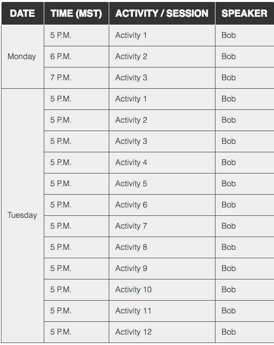
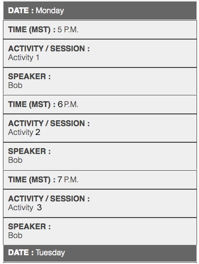
    Thank you for your help and your example. I see what you are saying. I have tried to install his extension manager but am running into issues. I will revisit and see why in a few. The issue I am having is being able to have all the "monday items to fall under monday" if that makes sense. I looked on github for over an hour and found nothing with that option.

    I deleted my original code link but put it back up. I would think it's a matter of how I have the rows and columns grouped?

    http://offers.premierinc.com/table-delete_table-delete.html

    This one was photoshopped.


    Try the code below, based on the Codepen example. I think that is what you want.

    There are some non-breaking spaces in the code - & nbsp; (make sure you ajoin the & and n ( ) - Forum wont show non-breaking spaces.

    <!DOCTYPE >

    <html>

    <head>

    <meta charset="UTF-8" />

    <title>Timetable</title>

    <style>

    .timetable {

    border-collapse: collapse;

    border: 1px solid #000;

    width: 60%;

    margin: 0 auto;

    }

    .timetable td {

    font-family: helvetica;

    border: 1px solid #000;

    padding: 10px;

    background-color: #f2f2f2;

    }

    .desktop th {

    font-family: helvetica;

    text-align: left;

    background-color: #000;

    color: #fff;

    padding: 10px;

    }

    .mobile {

    display: none;

    }

    .timetable .border_none {

    border-bottom: 1px solid #f2f2f2;!important

    }

    @media screen and (max-width: 768px)  {

    table, thead, tbody, th, td, tr {

    display: block;

    }

    .display-none {

    display: none;

    }

    .mobile {

    display: block;

    }

    .mobile th {

    font-family: helvetica;

    text-align: left;

    background-color: #666;

    color: #fff;

    padding: 10px;

    }

    tr {

    margin: 0 0 0 0;

    }

    tr:nth-child(odd) {

    background: #ccc;

    }

    .timetable td {

    border: none;

    border-bottom: 1px solid #eee;

    position: relative;

    padding-top: 6px;

    padding-bottom: 6px;

    padding-left: 50%;

    background-color: transparent;

    }

    .timetable td:before {

    position: absolute;

    top: 0;

    left: 6px;

    width: 45%;

    padding-right: 10px;

    padding-top: 6px;

    white-space: nowrap;

    }

    td:nth-of-type(2):before { content: "Time (MST)"; }

    td:nth-of-type(3):before { content: "Activity/Session"; }

    td:nth-of-type(4):before { content: "Speaker"; }

    }

    </style>

    </head>

    <body>

    <table class="timetable">

    <tr class="mobile">

    <th>Day: Monday</th>

    </tr>

    <tr class="display-none desktop">

    <th class="display-none ">Date</th>

    <th>Time</th>

    <th>Activity/Session</th>

    <th>Speaker</th>

    </tr>

    <tr>

    <td class="display-none border_none">& nbsp;</td>

    <td>5pm</td>

    <td>Activity 1</td>

    <td>Bob</td>

    </tr>

    <tr>

    <td class="border_none display-none">Monday</td>

    <td>6pm</td>

    <td>Activity 2</td>

    <td>Bob</td>

    </tr>

    <tr>

    <td class="display-none">& nbsp;</td>

    <td>7pm</td>

    <td>Activity 3</td>

    <td>Bob</td>

    </tr>

    <tr  class="mobile">

    <th>Day: Tuesday</th>

    </tr>

    <tr>

    <td class="display-none border_none">& nbsp;</td>

    <td>5pm</td>

    <td>Activity 1</td>

    <td>Bob</td>

    </tr>

    <tr>

    <td class="display-none border_none">& nbsp;</td>

    <td>5pm</td>

    <td>Activity 2</td>

    <td>Bob</td>

    </tr>

    <tr>

    <td class="border_none display-none">Tuesday</td>

    <td>5pm</td>

    <td>Activity 3</td>

    <td>Bob</td>

    </tr>

    <tr>

    <td class="display-none border_none">& nbsp;</td>

    <td>5pm</td>

    <td>Activity 4</td>

    <td>Bob</td>

    </tr>

    <tr>

    <td class="display-none border_none">& nbsp;</td>

    <td>5pm</td>

    <td>Activity 5</td>

    <td>Bob</td>

    </tr>

    <tr>

    <td class="display-none">& nbsp;</td>

    <td>5pm</td>

    <td>Activity 1</td>

    <td>Bob</td>

    </tr>

    </table>

    </body>

    </html>

    3 replies

    kineticcreative123
    Inspiring
    January 16, 2019

    Thanks for all your help everyone! I ended up using rowspans to get it to work. So in order to get the three events to drop under Monday I did something like this:

    <tr>

                    <th scope="row" rowspan="3">Wednesday <br>March 6</th>

                    <td>12:00 – 5:30 PM</td>

                    <td width="35%">Optional Golf Round (By Registration)</td>

                </tr>

                <tr>

                    <td>6:00 – 6:30 PM</td>

                    <td>Welcome / Opening Remarks</td>

                    <td width="35%">Michael J. Alkire, Chief Operating Officer, Premier</td>

                </tr>

                <tr>

                    <td style="background-color:#ebecee">6:30 – 8:30 PM</td>

                    <td style="background-color:#ebecee">Networking Reception / Dinner</td>

                    <td width="35%" style="border-left: 0px;background-color:#ebecee"></td>


                </tr>

    Check it out here:

    http://offers.premierinc.com/table-delete_table-delete.html

    I would like to figure out how to keep this visible on mobile though...

    DATETIME (MST)ACTIVITY / SESSIONSPEAKER
    Aiizaku
    Participant
    January 15, 2019

    You will get more flexiblity by making this into a <div> <li> or using Media queue w/ a CSS Grid system.  Tables are not responsive by nature.

    However you can add CSS overflow to the table which will contain the content in a box and add a scroll feature.

    <div style="overflow-x:auto;">

      <table>

        ...

      </table>

    </div>

    ALsp
    Legend
    January 15, 2019

    I didn't style it very elaborately, but check this out on a small device:

    http://projectseven.com/testing/adobe-forum/table/

    kineticcreative123
    Inspiring
    January 15, 2019

    Hi!

    Thank you very much you figured out how to get them to stack!! One question though. How can I bump up the "TIME (MST)" to the line above and show the text "SPEAKER"? Seems like it's trying to compensate for the MONDAY and TUESDAY. You can see in the screenshot. Thank you thank you!!

    BenPleysier
    Community Expert
    Community Expert
    January 15, 2019

    This one should also work Responsive Table Demo

    Wappler is the DMXzone-made Dreamweaver replacement and includes the best of their powerful extensions, as well as much more!