Known Participant
December 19, 2022
Question

No background color for expanded navbar on small devices

  • December 19, 2022
  • 3 replies
  • 906 views

I've got a problem with my bootstrap navbar: when I tets it in the development mode in Google chrome, and expand the togge-icon, there is no colored backgrond in the mobile-phone example, but tabelt-formats work fine.

Here are two images showing the difference:


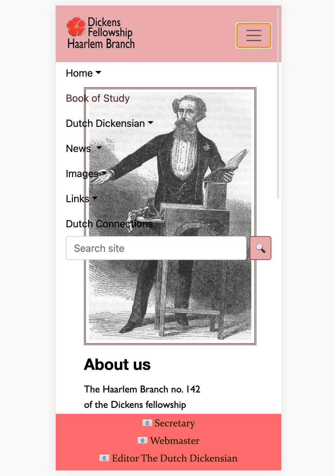
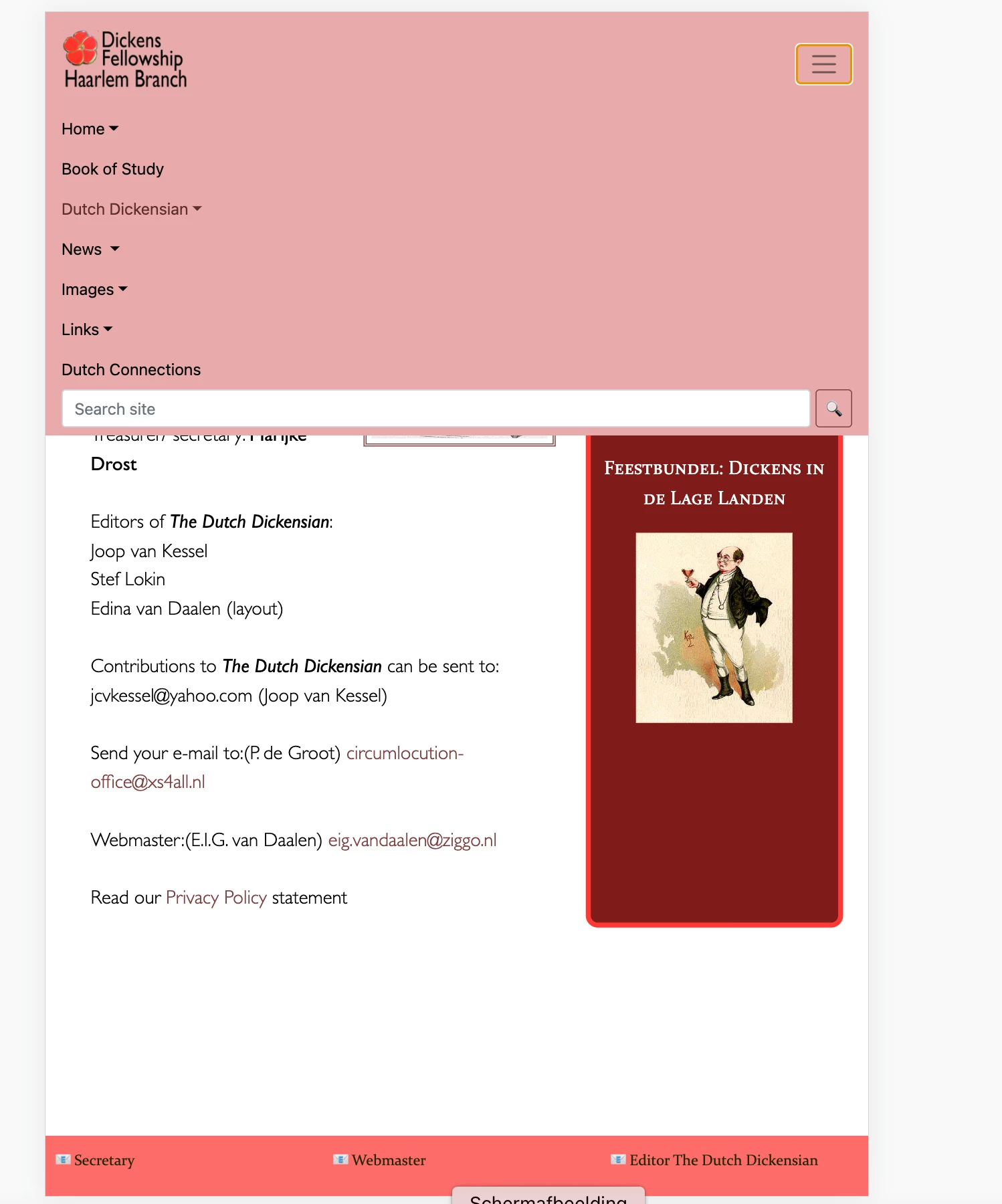
I don't understand how this can happen, since I didn't have that problem with a previous design. Can anyone take a look at my stylesheet and maby tell me what the solution is? Thanks.


    This topic has been closed for replies.

    3 replies

    Legend
    December 20, 2022


    quote

    I've got a problem with my bootstrap navbar: when I tets it in the development mode in Google chrome, and expand the togge-icon, there is no colored backgrond in the mobile-phone example, but tabelt-formats work fine.


    By @edinav24550678


    That's most likely because you have your navbar css height set to 90px in your media query for mobile phone in your css file. Setting the height won't allow the navbar container div to expand around its contents, so you dont see the full depth of color background behind the navbar content. The content spills out, leaving the navbar at 90px in height and hence the shorter than expected vertical background color.


    Known Participant
    December 21, 2022

    Hello Osgood,


    Your simple solution was the answer to my problem! I still got to learn not to mess to much with bootstrap-css, apparently.


    Regards,

    Edina

    Community Expert
    December 20, 2022

    Agreed without seeing the HTML it's tough to say. You can always right click in an affected area and choose Inspect. In your browser's inspector you will see what CSS attributes are impacting the desired area and may be able to see if an attribute is missing or being overwritten by something else. If you can share a link to the page in question we can help take a look for you.

    Known Participant
    December 20, 2022

    I thought the css stylehseet would be enough as a clue. But hereby I include the html-code of the page.


    I'l try out your advice.

    Nancy OShea
    Community Expert
    Community Expert
    December 19, 2022

    Without access to the corresponding HTML, it's impossible to say.


    Meanwhile, try this.  It works as expected in all devices.


    <!doctype html>
    <html lang="en">
    <head>
    <title>Bootstrap 5.1.3 Example</title>
    <meta charset="utf-8">
    <meta name="viewport" content="width=device-width, initial-scale=1">
    <!--latest minified Bootstrap CSS-->
    <link href="https://cdn.jsdelivr.net/npm/bootstrap@5.1.3/dist/css/bootstrap.min.css" rel="stylesheet">
    
    <style>
    /**Custom style for pink Navbar**/
    .bg-danger { background: deeppink !important }
    </style>
    
    </head>
    <body>
    <!--navbar-->
    <nav class="navbar navbar-expand-md navbar-light bg-danger ">
    <div class="container-fluid">
    <a class="navbar-brand" href="#">Logo</a>
    <button class="navbar-toggler" type="button" data-bs-toggle="collapse" data-bs-target="#collapsibleNavbar">
    <span class="navbar-toggler-icon"></span>
    </button>
    <div class="collapse navbar-collapse" id="collapsibleNavbar">
    <ul class="navbar-nav">
    <li class="nav-item">
    <a class="nav-link" href="#">Link</a>
    </li>
    <li class="nav-item">
    <a class="nav-link" href="#">Link</a>
    </li>
    <li class="nav-item">
    <a class="nav-link" href="#">Link</a>
    </li>
    <li class="nav-item dropdown">
    <a class="nav-link dropdown-toggle" href="#" role="button" data-bs-toggle="dropdown">Dropdown</a>
    <ul class="dropdown-menu">
    <li>
    <a class="dropdown-item" href="#">Link</a>
    </li>
    <li>
    <a class="dropdown-item" href="#">Another link</a>
    </li>
    <li>
    <a class="dropdown-item" href="#">A third link</a>
    </li>
    </ul>
    </li>
    </ul>
    </div>
    </div>
    </nav>
    <!--COMMENT-->
    <div class="container mt-3">
    <div class="row">
    <div class="col-md-10 mx-auto">
    <h3 class="mt-3">Bootstrap 5, Collapsible Navbar</h3>
    <p>In this example, the navigation bar is hidden on all small screens and replaced by a button in the top right corner.
    </p>
    <p>When  button is clicked, the  navigation bar will open to reveal vertically stacked links.</p>
    </div>
    </div>
    </div>
    <!--latest minified JS bundle-->
    <script src="https://cdn.jsdelivr.net/npm/bootstrap@5.1.3/dist/js/bootstrap.bundle.min.js">
    </script>
    </body>
    </html>


    Hope that helps.


    Nancy O'Shea— Product User & Community Expert
    Known Participant
    December 20, 2022

    Hello Nancy,


    Does it have to be 'bg-danger' or can I use the class '.navbar' or '.navbar-expand-lg' instead for the same result?

    Nancy OShea
    Community Expert
    Community Expert
    December 20, 2022

    Contextual color classes are baked into Bootstrap. 

    https://getbootstrap.com/docs/5.0/utilities/colors/

    For convenience I used bg-danger which is normally red and changed it to pink so you understand where the navbar background-color is coming from.  If you wish to change it, that's up to you.


    Nancy O'Shea— Product User & Community Expert