Hosun
Inspiring
June 15, 2019
Answered

padding

  • June 15, 2019
  • 1 reply
  • 989 views

Hi,

I am making a hamburger menu.

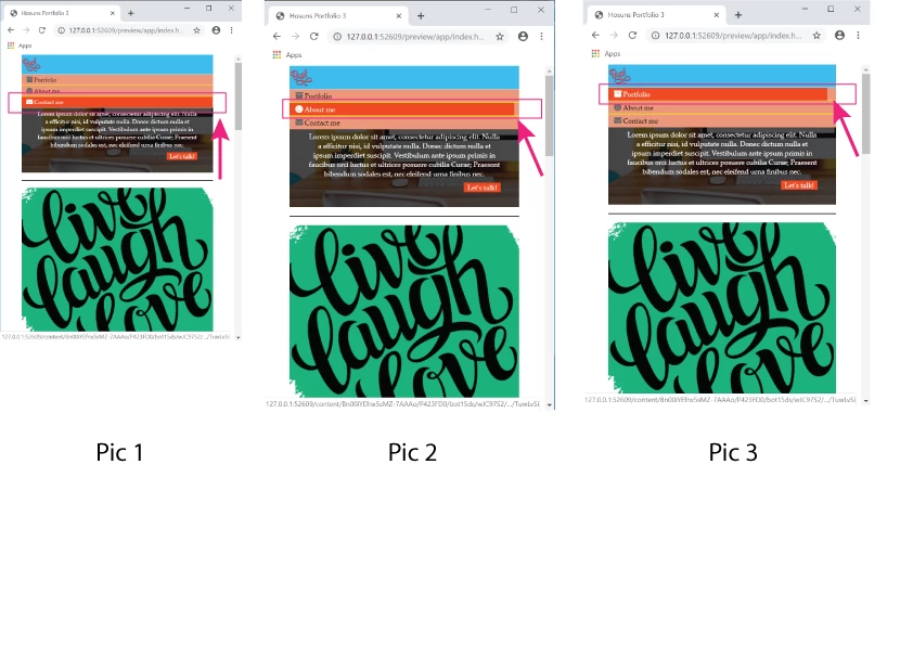
Upon hover, "orange" doesn't snap to "salmon", as seen in Pic 2 and Pic 3.

How can I make it happen?

Hosuns Portfolio 3

Hosun Kang

This topic has been closed for replies.
Correct answer B i r n o u

the A tag is an inline TAG, so the hover state just reflect the only string content of it... one of the approach that could fill up all the available space of the parent container, will be to change the display of the A Tag... using a display inline-block, or block value could do the job

an other approach will be to move the :hover pseudo element on th LI Tag instead of keeping it on the A Tag only

1 reply

B i r n o u
B i r n o uCorrect answer
Legend
June 15, 2019

the A tag is an inline TAG, so the hover state just reflect the only string content of it... one of the approach that could fill up all the available space of the parent container, will be to change the display of the A Tag... using a display inline-block, or block value could do the job

an other approach will be to move the :hover pseudo element on th LI Tag instead of keeping it on the A Tag only

Hosun
HosunAuthor
Inspiring
June 15, 2019

Hi,

Thank you very much for your reply.

I have one more question.

What is ul li a:focus ? (It makes no difference with or without it.)

ul li a:hover,

ul li a:focus {

color: white;

background-color: orangered;

}

Hosuns Portfolio 3

Hosun Kang

Legend
June 15, 2019

That is looking a bit of a mess at the moment and I'm sure you will run into issues further on. Can I suggest a bit of a clean up:

Replace your 'header' section with the 'header' section code below:

<header class="header">

<div class="logo">

<img src="images/byol-logo.png" alt="logo">

<div class="hamburger"><i class="fas fa-bars"></i></div>

</div>


<nav class="site-nav">

<ul>

<li><a href="#"><i class="fas fa-archive"></i>Portfolio</a></li>

<li><a href="#"><i class="fas fa-smile"></i>About me</a></li>

<li><a href="#"><i class="fas fa-envelope"></i>Contact me</a></li>

</ul>

</nav>

</header>

Remove any existing css which relates to the 'header and site-nav' section and use the css below:

.header {

display: flex;

justify-content: space-between;

align-items: center;

flex-wrap: wrap;

background-color: deepskyblue;

margin: 0% 1%;

padding: 7px 0;

}

.logo {

margin-left: 20px;

}

.hamburger {

margin-left: auto;

display: none;

color: #fff;

}

.site-nav ul {

display: flex;

margin: 0;

padding: 0;

}

.site-nav li {

display: flex;

list-style: none;

margin: 0;

padding: 0 15px;

}

.site-nav a  {

display: block;

padding: 0 2px;

color: black;

text-decoration: none;

}

.site-nav a:hover  {

color: white;

background-color: orangered;

}

.site-nav a i  {

color: dimgray;

margin-right: 5px;

}

.site-nav a:hover i {

color: white;

}

@media screen and (max-width: 500px) {

.header {

padding: 7px 0 0 0;

}

.logo {

display: flex;

align-items: center;

width: 100%;

padding: 5px 15px;

margin: 0;

}

.logo img {

width: 40px;

}

.hamburger {

display: block;

}

.site-nav {

background-color: darksalmon;

width: 100%;

}

.site-nav ul {

flex-direction: column;

}

.site-nav li {

padding: 0;

}

.site-nav a  {

font-size: 14px;

padding: 10px 15px;

width: 100%;

border-bottom: 1px solid yellow;

}

At this point you should be in a good position to hide the 'site-nav' section in the 500px media query and apply some scripting to the hamburger icon to show it on click.