Inspiring
April 28, 2021
Answered

Page from DW template not displaying properly on iPad

  • April 28, 2021
  • 2 replies
  • 378 views

I've created a page from a DW template, the page looks great on a desktop, on an iphone in both landscape and portrait and on the ipad in landscape but on the ipad in portrait orientation it looks like this. I suspect the banner at the top is the culprit but cannot see how I can change it.

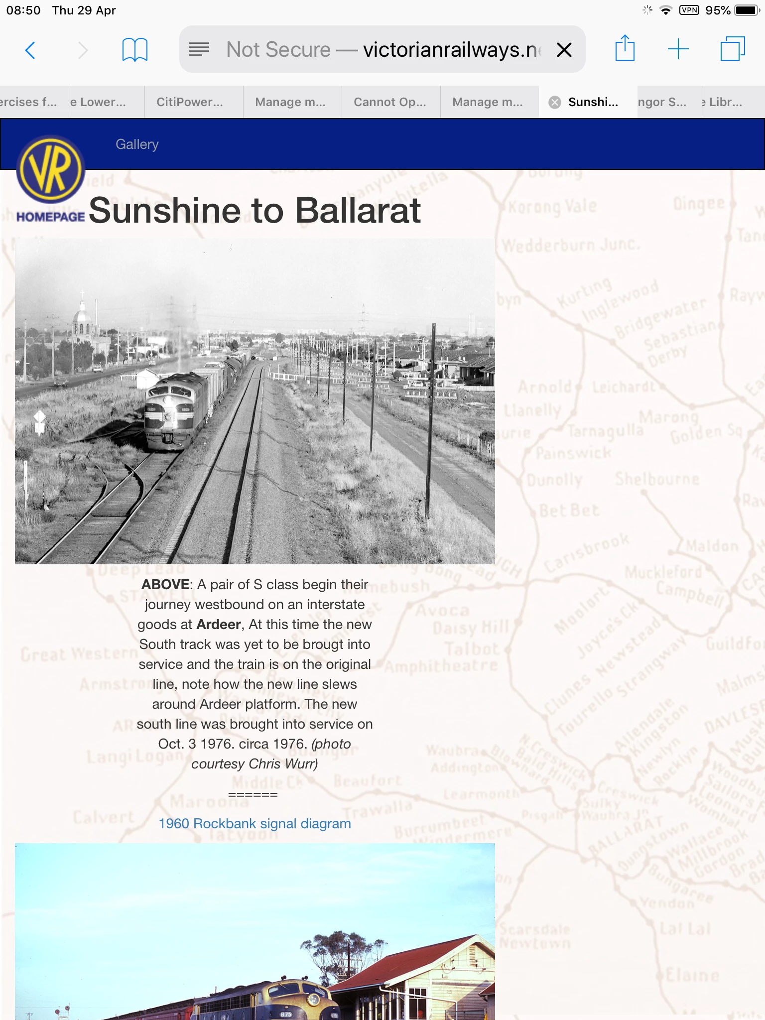
http://www.victorianrailways.net/photogallery/westsou/sunshine_ballarat/sunshine_ballarat.html


    This topic has been closed for replies.
    Correct answer Ben M

    The reason it is extending to the full width on desktop and smaller on other devices has to do with the bootstrap code you are using.  That area is 12-columns wide on a desktop and set to 8-columns wide on mobile noted by the classes col-sm-8, col-md-12.  If you just want it to be 12 for all, just use col-sm-12 and it won't shrink as you are seeing it.

    2 replies

    Nancy OShea
    Community Expert
    Community Expert
    April 28, 2021

    I think you have put yourself in the pickle jar with custom breakpoints that you probably don't need.  At any rate, try fixing your code errors and see if that helps.

    https://validator.w3.org/nu/?doc=http%3A%2F%2Fwww.victorianrailways.net%2Fphotogallery%2Fwestsou%2Fsunshine_ballarat%2Fsunshine_ballarat.html


    Nancy O'Shea— Product User & Community Expert
    Ben MCommunity ExpertCorrect answer
    Community Expert
    April 28, 2021

    The reason it is extending to the full width on desktop and smaller on other devices has to do with the bootstrap code you are using.  That area is 12-columns wide on a desktop and set to 8-columns wide on mobile noted by the classes col-sm-8, col-md-12.  If you just want it to be 12 for all, just use col-sm-12 and it won't shrink as you are seeing it.

    Nancy OShea
    Community Expert
    Community Expert
    April 29, 2021
    quote

    If you just want it to be 12 for all, just use col-sm-12 and it won't shrink as you are seeing it.

    ==========

    Right.  Col-12 is the default width in Bootstrap anyway.  And this is essentially a 1-col layout.


    The only time I use separate col- classes for sm, md & lg is when I have multiple columns on the same row that need to break to fewer cols on smaller devices. 


    Nancy O'Shea— Product User & Community Expert