ZikkyPikky
Participant
May 22, 2019
Answered

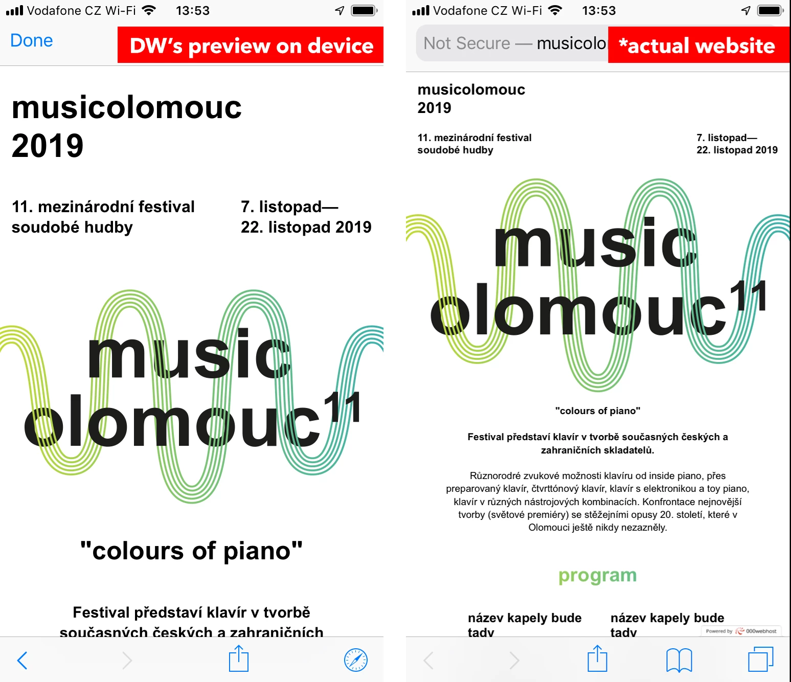
Preview on device is different than actual website.

  • May 22, 2019
  • 2 replies
  • 490 views

Hello,
I have a problem that I don't know how to resolve. When I preview my website on device (iPhone 6) using the Dreamweaver, the website acutally looks nice because I used some media queries. But when I publish my site to actual hosting the website looks completely different than the preview shown in Dreamweaver. Is there a way to preserve the same form as shown in the preview on device in Dreamweaver? I attached screenshots of my phone so you can see what I am talking about.


Thanks for help
Andrej

This topic has been closed for replies.
Correct answer BenPleysier

Have you included the following meta tag?

<meta name="viewport" content="width=device-width, initial-scale=1, shrink-to-fit=no">

2 replies

HARSHIKA_VERMA
Community Manager
Community Manager
May 22, 2019

Hi Andrej,

Thanks for reaching out. From what I understand, you have created a website in Dreamweaver which shows fine on Device Preview but changes after publishing. In addition to what Ben has suggested, please try these steps: -

  1. Try validating your code errors and fix the errors (if any) from the following links:-

     2. Once you are done, try to check your website on different browsers.

Let us know if it works.

Thanks,

Harshika

BenPleysier
Community Expert
BenPleysierCommunity ExpertCorrect answer
Community Expert
May 22, 2019

Have you included the following meta tag?

<meta name="viewport" content="width=device-width, initial-scale=1, shrink-to-fit=no">

Wappler is the DMXzone-made Dreamweaver replacement and includes the best of their powerful extensions, as well as much more!
ZikkyPikky
Participant
May 22, 2019

Oh my god, it was the exact thing which I haven't done.

Thank you so much for your help!

Andrej