
Problems moving navigation to the right
Hello I am trying to move the tabs for my navigation further right and am having trouble figuring out how to do that. Can someone please help me with this? I appreciate any help.
HTML
<!doctype html>
<html>
<head>
<meta charset="utf-8">
<title>Untitled Document</title>
<link href="webpage-layout.css" rel="stylesheet" type="text/css">
<link rel="preconnect" href="https://fonts.googleapis.com">
<link rel="preconnect" href="https://fonts.gstatic.com" crossorigin>
<link href="https://fonts.googleapis.com/css2?family=Vidaloka&display=swap" rel="stylesheet">
</head>
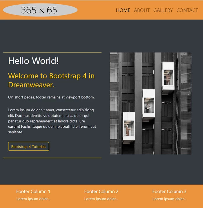
<nav>
<div class="container">
<a href="about.html">About </a>
<a href="gallery.html">Gallery</a>
<a href="contact.html">Contact</a>
</div>
<div id="logo">
<img src="working-graphics/logo.png" width="90" height="80">
</div>
</nav>
<body>
<main>
<h1 align="left">
Project One
</h1>
<div style="position:relative; height:60px;">
<img src="working-graphics/star.png"
style="position:absolute; top: -172px; left: 550px; right:30px; width:80px; height:80px; border:none;"
alt="picture of star">
</div>
<p style="font-size:50%;">This website is about one of my most inspirational artists, Gustav Klimt.</p>
<div class="btn-group">
<button class="button">Instagram</button>
<button class="button">Facebook</button>
<button class="button">Twitter</button>
</div>
</main>
</body>
</html>
CSS
@charset "utf-8";
html, body {
height: 100%;
display: flex;
align-items: center;
justify-content: left;
}
body {
Background: url("working-graphics/web1-home-background.jpg")
center center fixed;
background-size: auto;
}
header {
color: white;
}
main {
width: 600%;
color: #EAEAEA;
text-align:left;
padding-left: 180px;
font-family: 'Vidaloka', serif;
font-size: 3.2rem;
}
#logo{
position:absolute;
z-index: 1;
top: 4px;
left: 80px;
}
.container{
display: flex;
align-items:center;
justify-content: space-between;
float: right;
padding-right: 340px;
}
nav{
position: fixed;
left: 0;
top: 0;
width: 100%;
height: 10%;
text-align: center;
transition: 1s background-color;
overflow:hidden;
background-color: #EC933C;
}
nav a {
display: inline-block;
text-align: center;
color: white;
text-decoration: none;
float: right;
padding: 20px;
font-size: 2.5rem;
font-weight: bold;
font-family: 'Vidaloka', serif;
}
nav a:hover, nav a:active, nav a:focus {
color: black;
text-decoration: none;
transition: 1s background-color;
}
.footer {
position: fixed;
left: 0;
bottom: 0;
width: 100%;
background-color: #F18307;
color: white;
text-align: center;
text-size: 1.5rem;
font-family: 'Vidaloka', serif;
}
.navigation ul li a {
float: right;
font-size: 30px;
text-decoration: none;
color: white;
}
.btn-group .button {
background-color: black;
border: 3px;
color: white;
padding: 15px 30px;
text-align: center;
text-decoration: none;
display: inline-block;
font-size: 30px;
cursor: pointer;
top: 90%;
transition: .25s background-color;
}
.btn-group .button:not(:last-child) {
border-right: none;
}
.btn-group .button:hover {
background-color: #EC933C;
}
header img {
float: left;
padding: 8px;
}

 AdChoices