<!DOCTYPE html>
<html lang="en">
<head>
<title>Bootstrap Example</title>
<meta charset="utf-8">
<meta name="viewport" content="width=device-width, initial-scale=1">
<link rel="stylesheet" href="https://maxcdn.bootstrapcdn.com/bootstrap/3.3.7/css/bootstrap.min.css">
<script src="https://ajax.googleapis.com/ajax/libs/jquery/3.3.1/jquery.min.js"></script>
<script src="https://maxcdn.bootstrapcdn.com/bootstrap/3.3.7/js/bootstrap.min.js"></script>
</head>
<body>
<div class="container">
<div class="row">
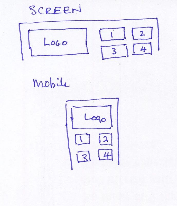
<div class="col-sm-12 col-lg-6">
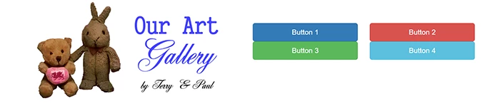
<img class="img-responsive" src="http://ourartgallery.azurewebsites.net/_img/OurArtGalleryLogo.gif" alt="Logo">
</div>
<div class="col-sm-12 col-lg-6">
<!--nested divs-->
<div class="row" style="margin-top:10vh">
<div class="col-sm-6">
<a href="#" class="btn btn-lg btn-block btn-primary">Button 1</a> </div>
<div class="col-sm-6">
<a href="#" class="btn btn-lg btn-block btn-danger">Button 2</a> </div>
<div>
<div class="col-sm-6">
<a href="#" class="btn btn-lg btn-block btn-success">Button 3</a> </div>
<div class="col-sm-6">
<a href="#" class="btn btn-lg btn-block btn-info">Button 4</a> </div>
</div>
</div>
</div>
</div>
</div>
</body>
</html>


 AdChoices