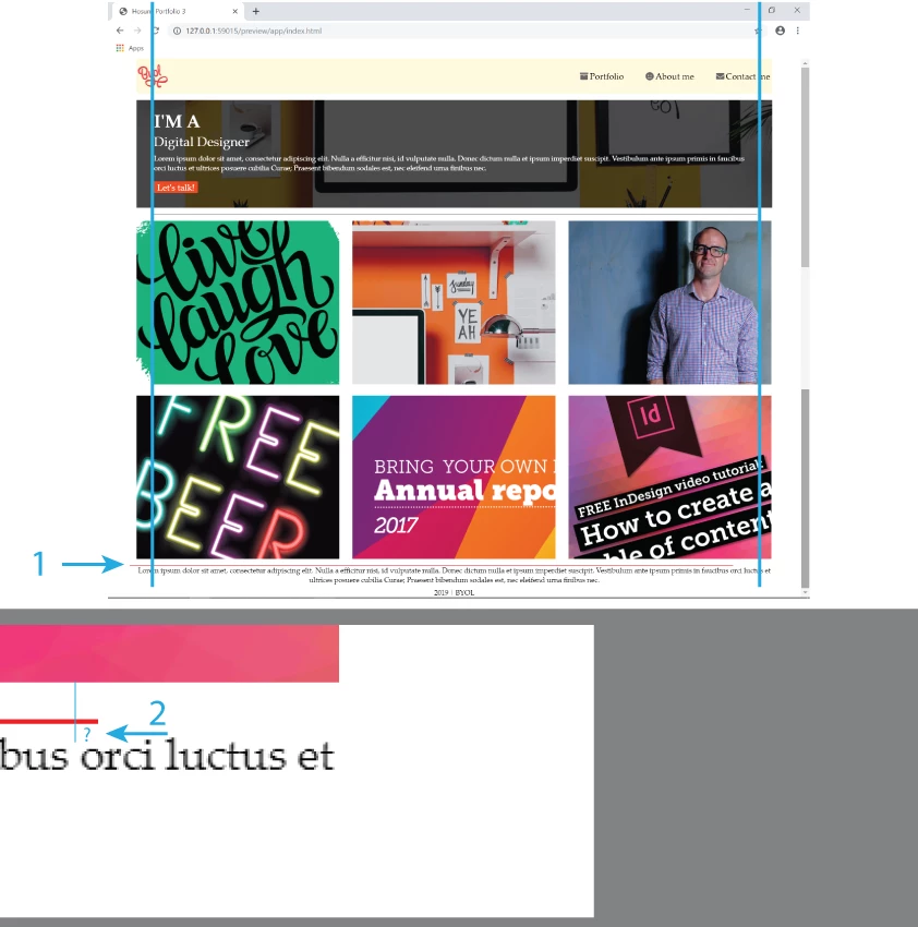
It's much cleaner to wrap your thumbnail images in a 'section' element:
<section class="thumbnails">
<div><img src="images/thumbnail1-love.png" alt="pic1"></div>
<div><img src="images/thumbnail2-office.jpg" alt="pic2"></div>
<div><img src="images/thumbnail3-dan.jpg" alt="pic3"></div>
<div><img src="images/thumbnail4-beer.jpg" alt="pic4"></div>
<div><img src="images/thumbnail5-report.png" alt="pic5"></div>
<div><img src="images/thumbnail6-indesign.png" alt="pic6"></div>
</section>
Then use the css below to position them, plus its easy to apply the top and bottom border to the 'section' rather than using 'before' and 'after'
.thumbnails {
display: flex;
flex-wrap: wrap;
justify-content: space-between;
border-top: 1px solid #000;
border-bottom: 1px solid red;
padding: 10px 0 0 0;
margin: 0 1% 15px 1%;
}
.thumbnails img {
max-width: 100%;
height: auto;
display: block;
}
.thumbnails div {
width: 32%;
margin: 0 0 15px 0;
}
/*Tablet View*/
@media (max-width: 1024px) {
.thumbnails div {
width: 48%;
}
}
/*Mobile View*/
@media (max-width: 500px) {
.thumbnails div {
width: 100%;
}
}


 AdChoices