I don't want to complicate things for you in your thinking, but none of us would do what you are trying to do. That doesn't mean you should not go ahead and do what your teacher asks.
- The background might have been better done in Illustrator and saved as a SVG or GIF. Smaller file, sharper image.
- The text should really be TEXT, not a graphic. Search engines can't read Photoshop text. Also, the text would be easier to edit later, and that is very important.
- Then the easel with the elephant would be a separate image with a transparent background so it would look the way you want on the aqua background. That image also could have been better done in Illustrator and saved as SVG or GIF.
- Having the elements separate this way would make it easier to render the design for different devices. This is very important.
I've been doing web design for 20 years and have never used Photoshop slices on a real website, though I did play with them when the feature was first introduced.




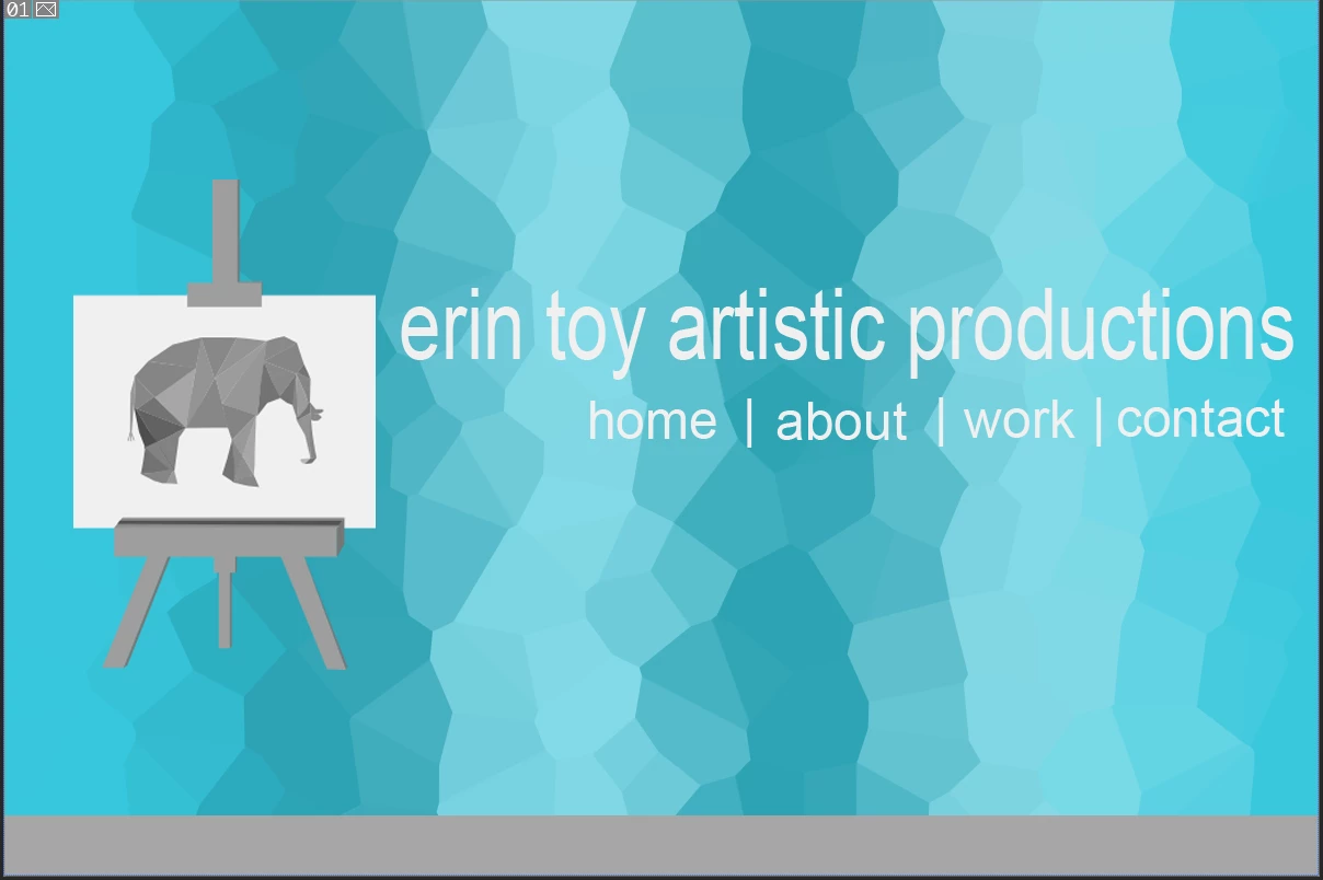 Hello, I created this layout on Photoshop and our professor wants us to create a dreamweaver website using Photoshop slices. Does anyone know how to create this in Dreamweaver? I understand creating the div boxes the size of the slices but I'm struggling on what should be relative or absolute positioning and I'm not sure what the float should be. Thanks!
 AdChoices