
resizing panel width for tablet and mobile
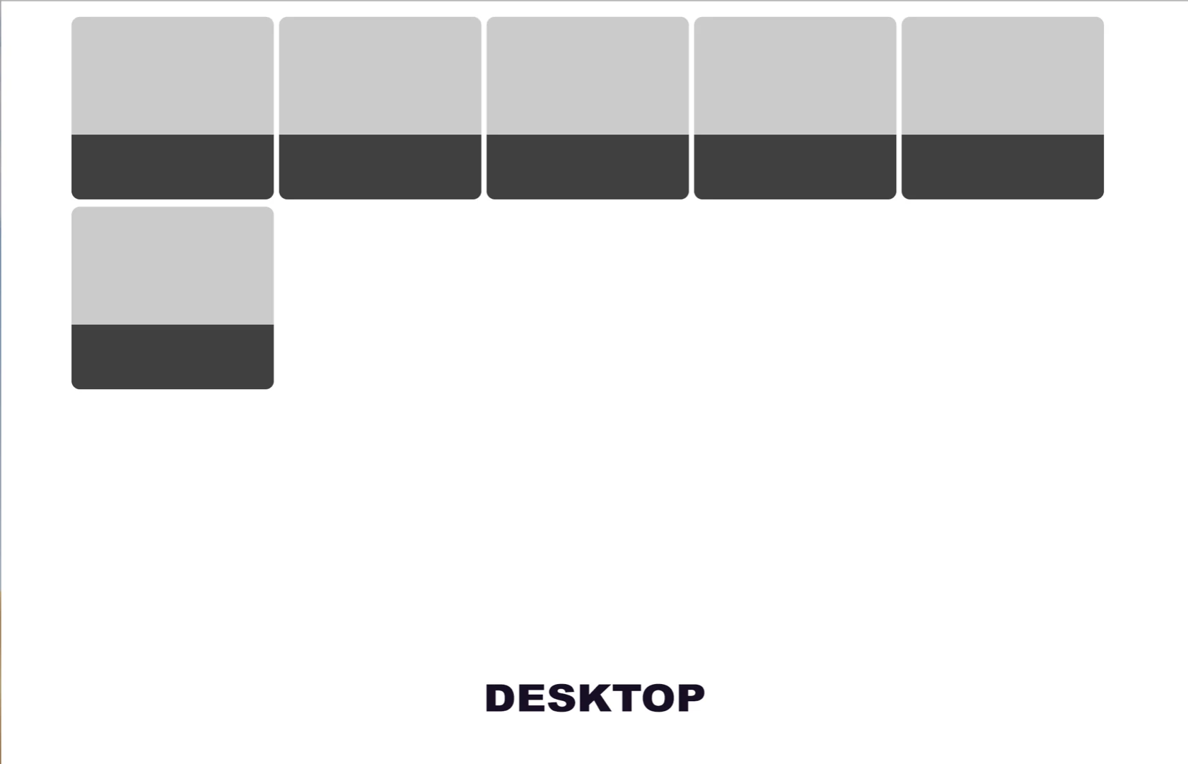
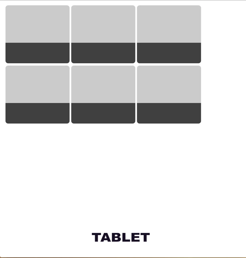
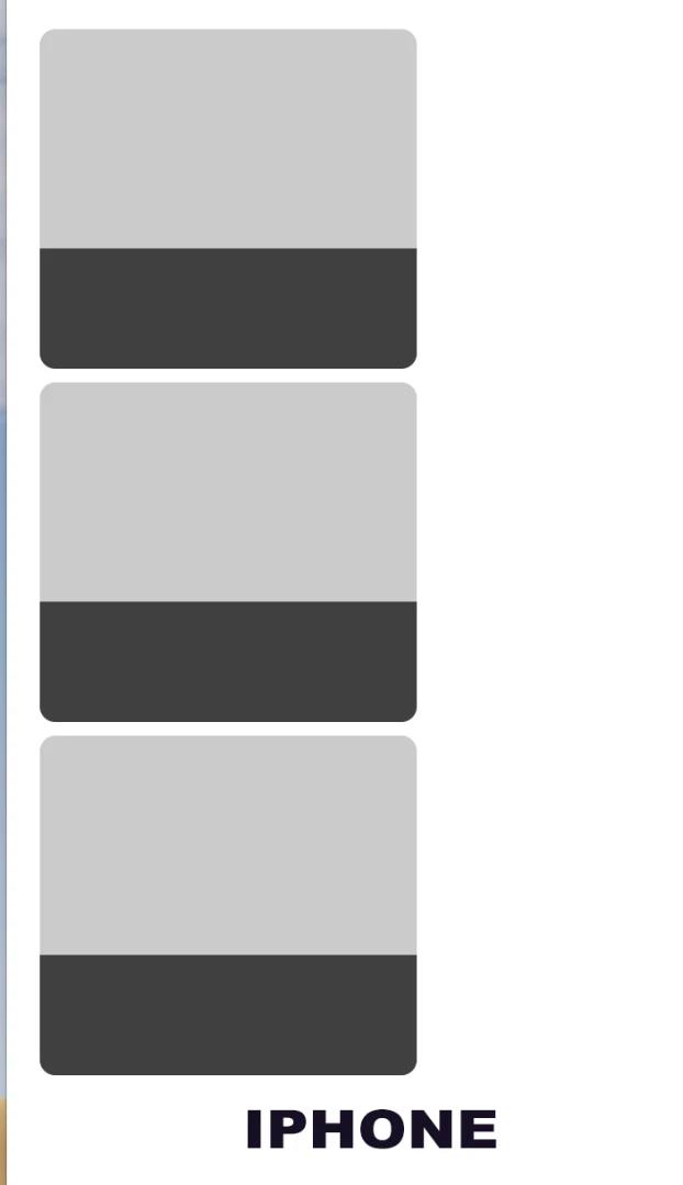
I have created boxes which flow so as you make the screen smaller they goto the next line which is OK on DESKTOP But on TABLET AND IPHONE I want to alter the width of the squares to fill the area better for the TABLET
and on the iPhone screen so I need to reduce the width so I can get two squares side by side.
In GLOBAL (desktop) - .item .productbox control the size of the squares and the spacing
BUT when I try to add .item .productbox as a media query for tablet and mobile sizes it does not alter the size of the panel??
1) On a tablet, I want to alter the width so it's three up but fills the screen nearly
2) On Mobile, I want to have it two side by side with a slight gap
Not sure what I'm doing wrong?
Hope you can help
Thanks
Tim
---------------
---------------
<!doctype html>
<html lang="en-GB">
<head>
<meta charset="UTF-8">
<meta name="viewport" content="width=device-width, initial-scale=1.0">
<meta name="viewport" content="width=device-width, minimal-ui">
<title>Untitled Document</title>
<link rel="stylesheet" href="css/search-results-panels-list.css" />
<!-- jQuery library -->
<script src="http://code.jquery.com/jquery-3.3.1.min.js"></script>
<script src="https://code.jquery.com/ui/1.12.1/jquery-ui.js"></script>
<style>
.search-grey-panel {
width: 118%;
height: 0px;
padding-top: 10px;
padding-bottom: 55px;
padding-left: 14px;
margin-left: -22px;
margin-top: 58px;
margin-bottom: -19px;
background-color: rgba(0,0,0,0.68);
}
.list-grey-panel {
margin-top: 98px;
}
.login-button-index {
color: rgba(0,0,0,1.00);
font-style: italic;
font-size: 21px;
width: 70px;
margin-right: -30px;
margin-left: -1px;
}
.search-event-name {
font-size: 16px;
margin-top: 1px;
width: 170px;
color: rgba(255,255,0,1.00);
text-align: left;
padding-left: 6px;
padding-top: 0px;
line-height: 20px;
padding-bottom: 3px;
height: 0px;
}
.alert-panel-green {
width: 118%;
height: 0px;
padding-top: 0px;
padding-bottom: 55px;
padding-left: 14px;
margin-left: -22px;
margin-top: -223px;
margin-bottom: -19px;
background-color: rgba(28,186,84,1.00);
}
.yellow-text {
color: #F2FF00;
}
.line2 {
font-size: 15px;
margin-top: -26px;
margin-left: 7px;
width: 170px;
color: rgba(255,255,255,1.00);
text-align: left;
}
.heart-small {
height: 50px;
margin-left: 119px;
margin-right: -9px;
padding-left: 12px;
margin-top: -13px;
}
li.item {
position: relative;
overflow: hidden;
}
:root {
--gutter: 20px;
}
.hs > li,
.item {
scroll-snap-align: center;
padding: calc(var(--gutter) / 2 * 1.5);
display: table;
flex-direction: column;
justify-content: center;
align-items: center;
background-color: #CBCBCB;
border-radius: 8px;
max-width: 1px;
background-size: cover;
background-repeat: no-repeat;
}
.item2 {
scroll-snap-align: center;
padding: calc(var(--gutter) / 2 * 1.5);
display: table;
flex-direction: column;
justify-content: center;
align-items: center;
background-color: #CBCBCB;
border-radius: 8px;
max-width: 1px;
background-size: cover;
background-repeat: no-repeat;
width: 259px;
height: 145px;
min-width: 174px;
}
.item {
min-width: 174px;
height: 145px;
margin-left: 1px;
padding-right: 5px;
}
.productShell {
background: #fff;
margin-top: -19px;
margin-right: auto;
margin-left: auto;
margin-bottom: 0;
padding-top: 5px;
padding-right: 5px;
padding-left: 5px;
padding-bottom: 5px;
overflow: hidden;
text-align: left;
max-width: 1013px;
}
.productBox {
float: left;
margin: 3px;
}
.productBox aside {
cursor: pointer;
background: #fffff;
position: absolute;
z-index: 2;
}
.productBox aside h4 {
color: #fff;
text-transform: uppercase;
text-align: right;
font-weight: normal;
font-size: 24px;
margin: 0;
padding: 15px;
bottom: 0;
position: absolute;
}
.productBox img {
position: absolute;
z-index: 1;
}
.productBox, .productBox aside, .productBox img {
width: 270px;
height: 270px;
}
.productBox.small, .productBox.small aside, .productBox.small img {
width: 193px;
height: 176px;
}
}
scroll bar start
}
box-sizing: border-box;
}
{
box-sizing: border-box;
}
<style type="text/css">
.form-style-5{
max-width: 500px;
padding: 10px 20px;
background: #f4f7f8;
margin: 10px auto;
padding: 20px;
background: #f4f7f8;
border-radius: 8px;
font-family: Georgia, "Times New Roman", Times, serif;
}
box-sizing: border-box;
}
@media (max-width:410px){
test {
color: #FD0004;
}
}
scroll bar start
}
box-sizing: border-box;
}
{
box-sizing: border-box;
}
.form-container {
}
}
box-sizing: border-box;
}
}
@media (max-width:768px) and (min-width:610px){
test {
color: #F1A1A3;
}
}
scroll bar start
}
box-sizing: border-box;
}
{
box-sizing: border-box;
}
</style>
<!--Container Start-->
<div class="main-container">
<div class="header-search-container">
<br>
<div class="productShell">
<div class="productBox small">
<aside>
<li class="item">
<div class="search-grey-panel list-grey-panel">
<div class="module line-clamp"></div>
</div>
</li>
</aside>
</div>
<div class="productBox small">
<aside>
<li class="item">
<div class="search-grey-panel list-grey-panel">
<div class="module line-clamp"></div>
<p class="line2 text-white2"> </p></div>
</li>
</aside>
</div>
<div class="productBox small color-orange">
<aside>
<li class="item">
<div class="search-grey-panel list-grey-panel">
<div class="module line-clamp"></div>
<p class="line2 text-white2"> </p></div>
</li>
</aside>
</div>
<div class="productBox small">
<aside>
<li class="item">
<div class="search-grey-panel list-grey-panel">
<div class="module line-clamp"></div>
<p class="line2 text-white2"> </p></div>
</li>
</aside>
</div>
<div class="productBox small">
<aside>
<li class="item">
<div class="search-grey-panel list-grey-panel">
<div class="module line-clamp"></div>
<p class="line2 text-white2"> </p></div>
</li>
</aside>
</div>
<div class="productBox small">
<aside>
<li class="item">
<div class="search-grey-panel list-grey-panel">
<div class="module line-clamp"></div>
<p class="line2 text-white2"> </p></div>
</li>
</aside>
</div>
</div>
</div>
<!--container ends-->
</html>
----------------------
----------------------

 AdChoices