This topic is closed to new replies. Start a new post to keep the conversation going.
osgood_Correct answer
Legend
June 6, 2019

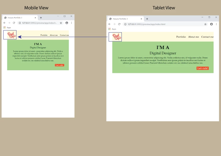
Just set the width of the logo in the mobile media query:

@media (max-width: 500px) {

.logo {

width: 40px;

}

}

4 replies

osgood_Correct answer
Legend
June 6, 2019

Just set the width of the logo in the mobile media query:

@media (max-width: 500px) {

.logo {

width: 40px;

}

}

Translate
Hosun
HosunAuthor
Inspiring
June 6, 2019

Hi,

Thank you very much for your reply.

Does width and height change "in proportion"?

Hosun Kang

Translate
Legend
June 6, 2019

Hosun  wrote

Hi,

Thank you very much for your reply.

Does width and height change "in proportion"?

Hosun Kang

Yes height and width change in proportion, you only need to set a width or a height.

Normally I don't use fixed width for images but I think logos are a good example of where a fixed size can work well. Set the size you think looks good for desktop/tablet/smartphone

Translate
BenPleysier
Community Expert
Community Expert
June 6, 2019
Wappler is the DMXzone-made Dreamweaver replacement and includes the best of their powerful extensions, as well as much more!