Participant
September 15, 2020
Question

Responsive burger menu

  • September 15, 2020
  • 2 replies
  • 412 views

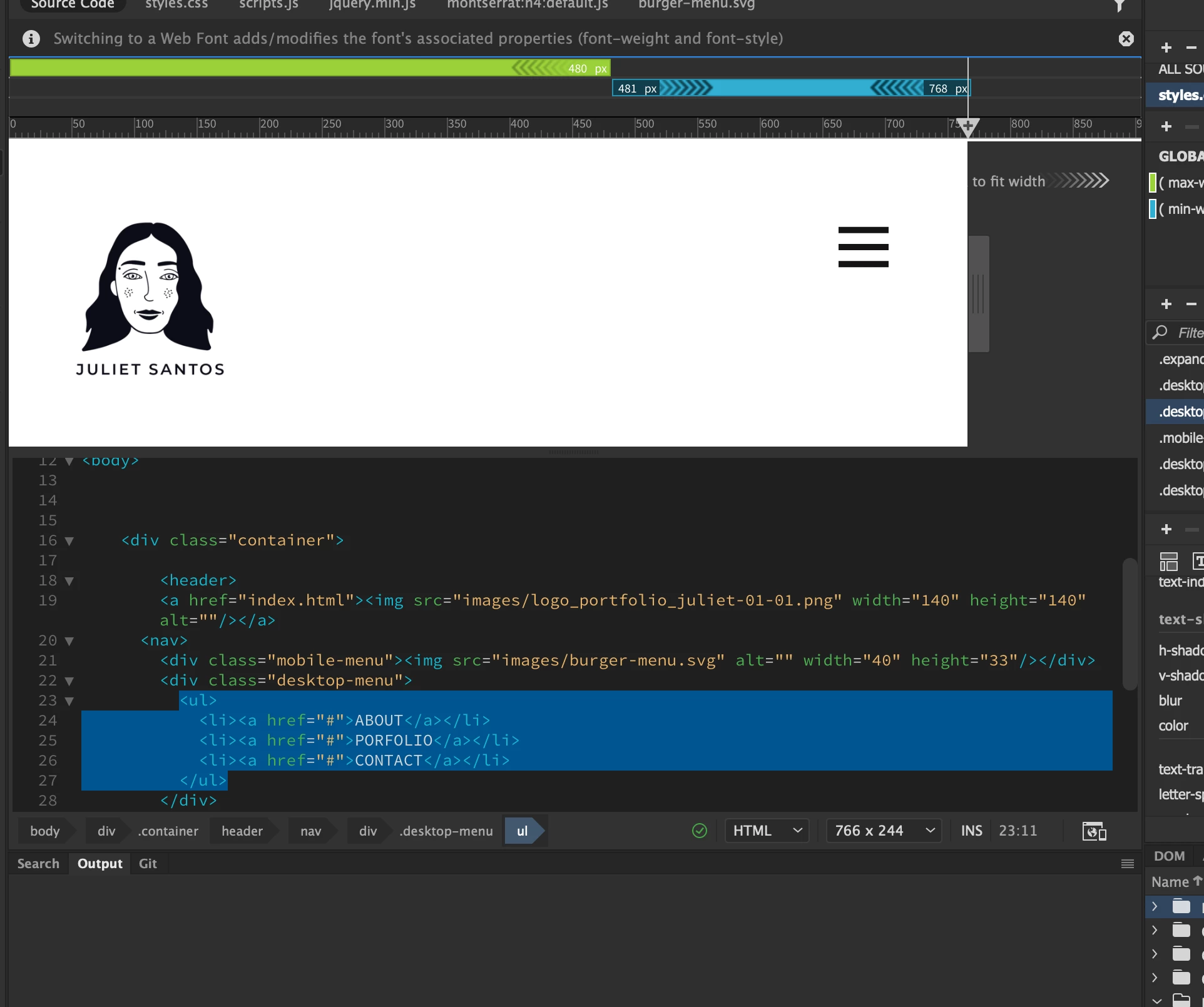
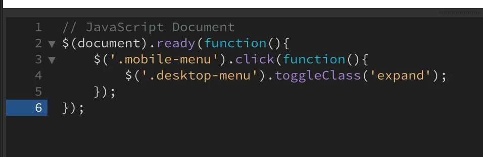
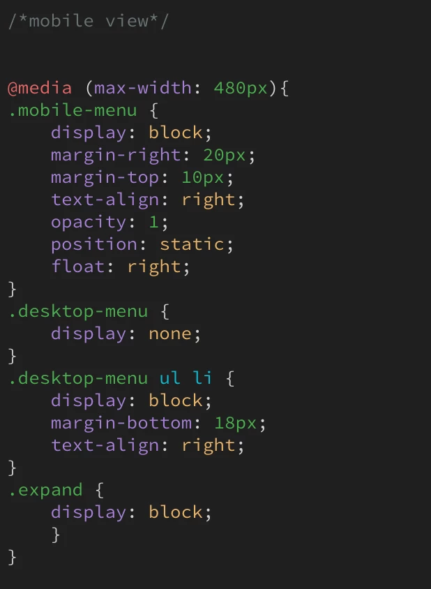
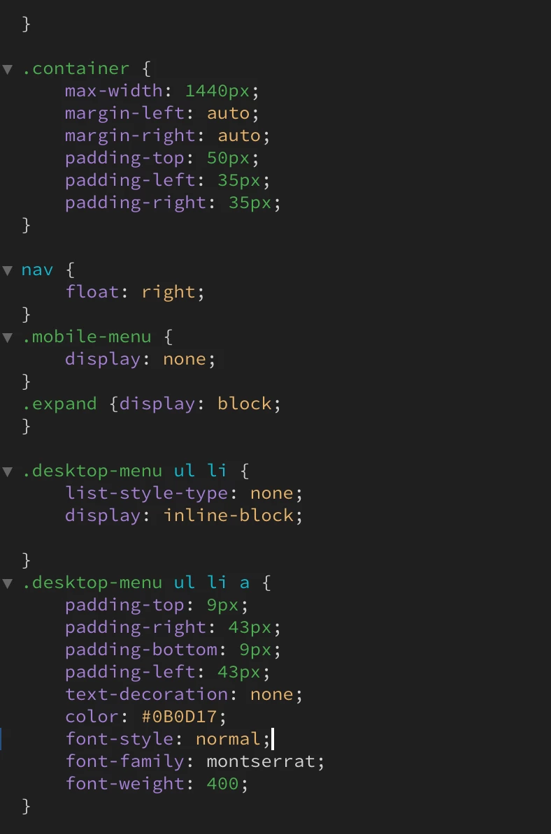
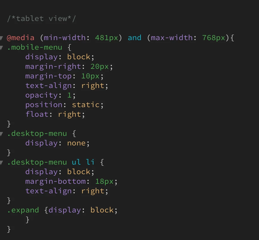
hi, everyone Im a first-timer on Dreamweaver and i wanted to make a burger menu..im using jquery. everything works but the menu dropping and showing the options. please can someone help me out?


    This topic has been closed for replies.

    2 replies

    Legend
    September 15, 2020

    Technically it should work if as already has been stated by Nancy you have the jQuery library linked to the page BEFORE the block of jQuery code that toggles your mobile menu.

    Participant
    September 15, 2020

    Hi guys thanks for the help! 

    good news i got it to work. 

    I had put my js script before the reference cnd reference..when I was supposed to put it after. 

    Thank you Nancy and osgood_


    Nancy OShea
    Community Expert
    Community Expert
    September 15, 2020

    If using a jQuery plugin, did you include a link to the jQuery Core JS Library as well as all other required scripts?  Can you upload your work to your remote server and post the URL?  Without seeing your page in context, it's impossible to troubleshoot.


    That said, you don't need JS/jQuery to build responsive navigation.  This example is pure CSS.

    <!DOCTYPE html>
    <html lang="en">
    <head>
    <meta charset="UTF-8">
    <meta name="viewport" content="width=device-width, initial-scale=1.0">
    <meta http-equiv="X-UA-Compatible" content="ie=edge">
    <title>CSS Flexbox Navigation</title>
    <link rel="stylesheet" href="https://cdnjs.cloudflare.com/ajax/libs/font-awesome/5.9.0/css/all.css">
    <link href="https://fonts.googleapis.com/css?family=Fira+Sans&display=swap" rel="stylesheet">
    <style>
    * { box-sizing: border-box; }
    body {
    font-family: 'Fira Sans', sans-serif;
    margin: 0;
    }
    /**Global link styles**/
    a {
    color: white;
    font-weight: 300;
    letter-spacing: 2px;
    text-decoration: none;
    background:rgba(6,133,100,1.00);
    padding: 20px 5px;
    display: inline-block;
    width: 100%;
    text-align: center;
    }
    a:hover {background:rgba(6,133,100,0.60)}
    
    /**Desktop, laptop devices**/
    .main {
    max-width: 1200px;
    margin: 0 auto;
    padding: 0 3em 1.5em;
    }
    .navigation ul {
    list-style: none;
    margin: 0;
    padding: 0;
    display: flex;
    }
    .navigation li { flex: 3; }
    .navigation .user { flex: 1; }
    
    /**Tablet devices**/
    @media all and (max-width: 1000px) {
    .navigation ul { flex-wrap: wrap; }
    .navigation li { flex: 1 1 50%; }
    .navigation .user { flex: 1 1 33.33%; }
    }
    
    /**Mobile devices**/
    @media all and (max-width: 480px) {
    .navigation li { flex-basis: 100%; }
    .navigation .user { flex-basis: 50%; }
    }
    </style>
    </head>
    <body>
    <div class="main">
    <nav class="navigation">
    <ul>
    <li><a href="#">Home</a></li>
    <li><a href="#">About Us</a></li>
    <li><a href="#">Team</a></li>
    <li><a href="#">Services</a></li>
    <li><a href="#">Blog</a></li>
    <li><a href="#">Contact</a></li>
    <!--Font Awesome Icons-->
    <li class="user"><a href="#"><i class="fas fa-user"></i></a></li>
    <li class="user"><a href="#"><i class="fas fa-shopping-cart"></i></a></li>
    <li class="user"><a href="#"><i class="fas fa-sign-out-alt"></i></a></li>
    </ul>
    </nav>
    </div>
    </body>
    </html>


    Nancy O'Shea— Product User & Community Expert
    Participant
    September 15, 2020

    Hi Nancy, im using this link for jquery but it could be the wrong....<script src="https://ajax.googleapis.com/ajax/libs/jquery/3.2.1/jquery.min.js"></script> 


    sadly I only recently bought the domain so it isn't active yet so I cant send you an URL :(. 

    Thank you so much for being so helpful! I'll look into doing rather with CSS as I am rather new and JS/Jquery isn't something I'm used too.