
Responsive site behaves differently on local Chrome device preview, versus actual upload to iPhone?
Currently, in my attempt to simply remove a side nav bar and side strip background image, when viewed on mobile, it fails to remove on the actual iPhone, but does go away on the local Chrome developer tools device preview.
Why isn’t uploading the responsive css and the html page to the actual site’s server, why isn’t that resulting in the same preview seen in Chrome’s device preview, as well as within Dreamweaver itself (when I grab the side panel, and close the window within the max-width, set in the @media queries)?
The changes being ignored are the display=none change and the background image changes.
1. This is the test site I’m attempting to implement responsiveness to:
http://www.solarinkgraphics.com/index_TEST.html
2. This is the responsive css:
@charset "UTF-8";


/*       MOBILE  /  iPhone      */
@media screen and (max-width:400px){
#header {
    position: fixed;
    left: auto;
    top: .875em;
    z-index: 200;
    width: 360px;
    height: auto;
    display: none !important;
}
.LeftContentClass {
    display: none !important;
}
.oneColElsCtr #container {
    position: relative;
    min-height: 100%;
    width: 360px;
    background-color: transparent;
    border: 0;
    margin-top: -.875em;
    background-image: url("../images/white.jpg") !important;
}
body {
    background-color: #FFFFFF;
        background-image: url("../images/white.jpg") !important;

}
}


/*     TABLET  /  iPad       */
@media screen and (min-width:401px) and (max-width:768px){
3. This is the beginning of the HTML with the meta placed to help the responsive css:
<!DOCTYPE HTML PUBLIC "-//W3C//DTD HTML 4.01 Transitional//EN" "http://www.w3.org/TR/html4/loose.dtd">
<html><!-- InstanceBegin template="/Templates/NewTemplate02.dwt" codeOutsideHTMLIsLocked="false" -->
<head>
<meta http-equiv="Content-Type" content="text/html; charset=UTF-8">


<!-- InstanceBeginEditable name="doctitle" -->
<title>GRAPHIC DESIGN • PRODUCTION ART • LOGOS • PRINT • WEB | Neal Derek Lawson is Solar Ink</title>
 <meta name="viewport" content="width=device-width, initial-scale=1.0">
<link href="css/responsiveWebSite.css" rel="stylesheet" type="text/css" media="screen">
<!-- InstanceEndEditable -->
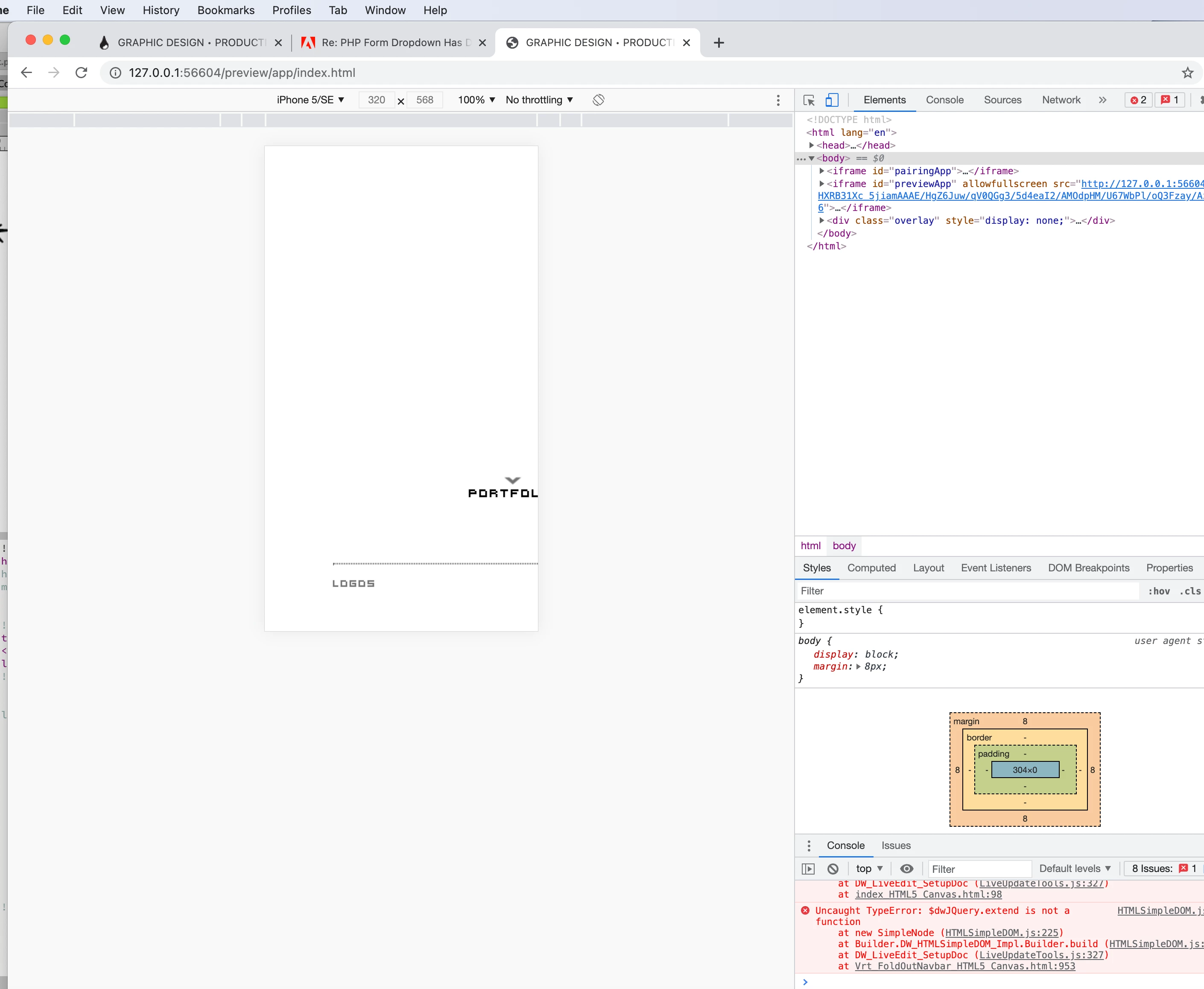
4. View from Chrome’s device preview (shows the side panel and background image removed):
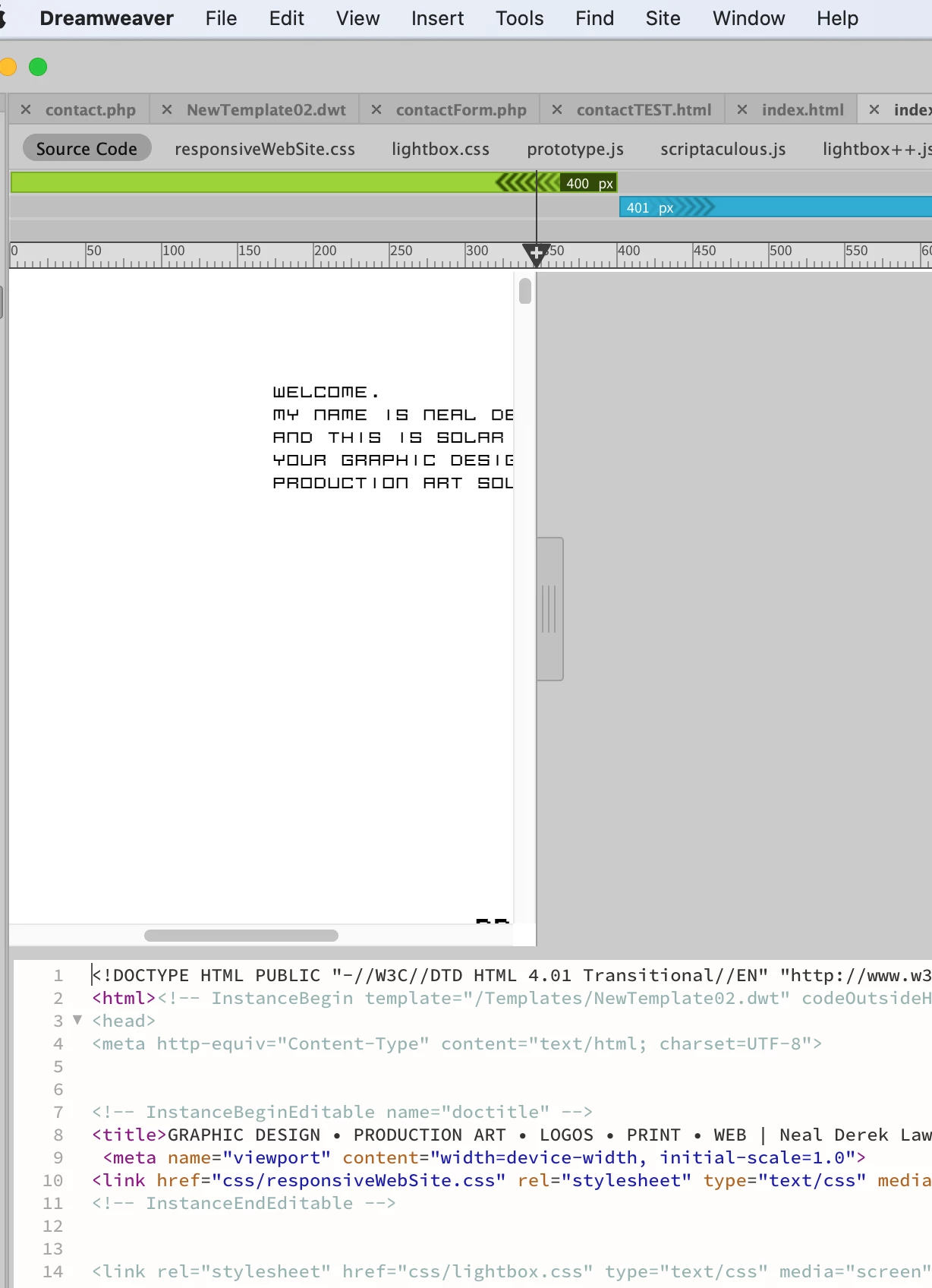
5. View from Dreamweaver’s preview (shows the side panel and background image removed):
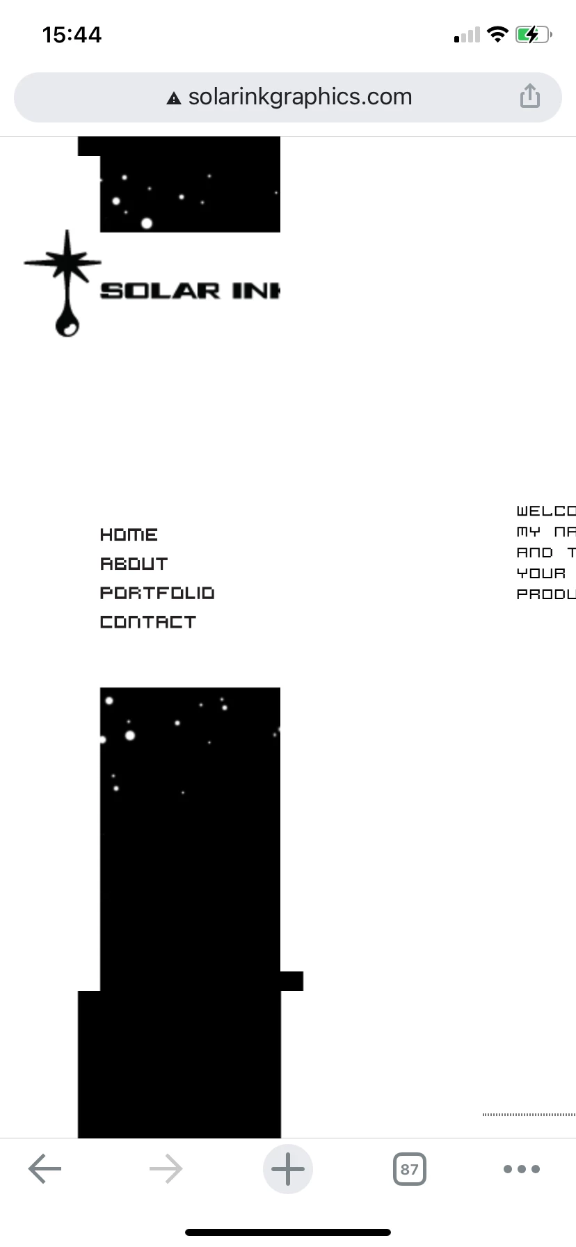
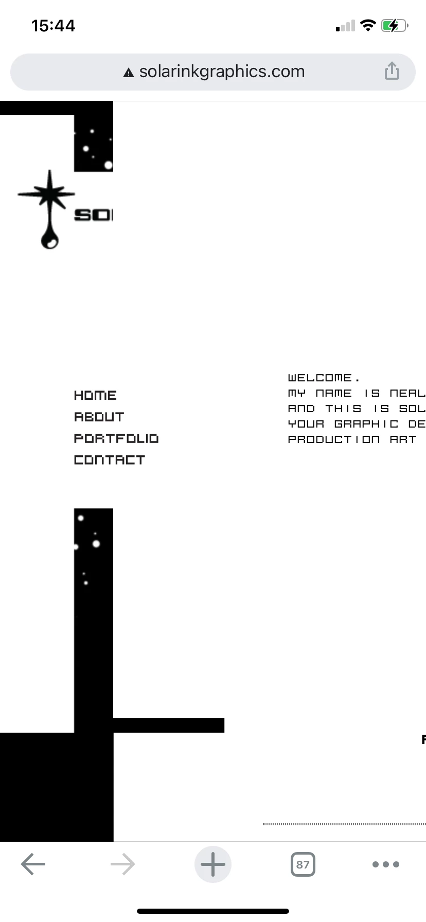
6. iPhone’s view of actual site, after html and css uploaded (side nav and strip are still visible):
6.1
6.2
6.3


 AdChoices