Here:
@charset "UTF-8";
/* Body */
body {
font-family: Cambria, "Hoefler Text", "Liberation Serif", Times, "Times New Roman", serif;
background-color: #FFFFFF;
margin: 0;
}
/* Container */
.container {
width: 90%;
margin-left: auto;
margin-right: auto;
background-color: #FFFFFF;
}
/* Header */
header {
width: 100%;
height: 8%;
background-color: #5D5E5D;
border-bottom: 1px solid #353635;
}
.logo {
color: #fff;
font-weight: bold;
margin-left: auto;
letter-spacing: 4px;
margin-right: auto;
text-align: center;
padding-top: 15px;
line-height: 2em;
font-size: 22px;
}
.hero_header {
color: #FFFFFF;
text-align: center;
margin: 0;
letter-spacing: 4px;
}
/* About Section */
.text_column {
width: 90%;
text-align: left;
font-weight: lighter;
line-height: 25px;
float: left;
padding-left: 20px;
padding-right: 20px;
color: #A3A3A3;
}
.gallery {
clear: both;
display: inline-block;
width: 100%;
background-color: #FFFFFF;
/* [disabled]min-width: 400px;
*/
padding-bottom: 35px;
padding-top: 0px;
margin-top: -5px;
margin-bottom: 0px;
}
.thumbnail {
width: 23%;
text-align: center;
float: left;
margin-top: 35px;
background-color: #F8F8F8;
padding-bottom: 20px;
margin-left: 1%;
margin-right: 1%;
border-radius: 3px;
padding-top: 20px;
border-bottom: 4px solid #6DC7D0;
}
.gallery .thumbnail h4 {
margin-top: 5px;
margin-bottom: 5px;
color: #52BAD5;
text-align: left;
padding-left: 20px;
padding-right: 20px;
}
.gallery .thumbnail p {
margin: 0;
color: #B3B3B3;
text-align: left;
padding-left: 20px;
}
/* More info */
.intro {
background-color: #FFFFFF;
padding-bottom: 35px;
}
.column {
width: 50%;
text-align: center;
padding-top: 30px;
float: left;
}
.aktuell {
width: 100%;
float: left;
color: #000000;
font-family: Gotham, "Helvetica Neue", Helvetica, Arial, sans-serif;
text-align: center;
background-color: #98E176;
}
.aktuell_texte {
width: 100%;
float: left;
color: #000000;
font-family: Gotham, "Helvetica Neue", Helvetica, Arial, sans-serif;
text-align: left;
background-color: #98E176;
font-weight: normal;
position: static;
}
.intro .column h3 {
color: #FFFFFF;
text-align: center;
}
.intro .column p {
color: #FAF5F5;
}
.cards {
width: 100%;
height: auto;
max-width: 400px;
max-height: 200px;
opacity: 0.8;
}
.intro .column p {
padding-left: 30px;
padding-right: 30px;
text-align: justify;
line-height: 25px;
font-weight: normal;
margin-left: 20px;
margin-right: 20px;
width: 80%;
margin-top: 4%;
}
.button {
width: 200px;
margin-top: 40px;
margin-right: auto;
margin-bottom: auto;
margin-left: auto;
padding-top: 20px;
padding-right: 10px;
padding-bottom: 20px;
padding-left: 10px;
text-align: center;
vertical-align: middle;
border-radius: 0px;
text-transform: uppercase;
font-weight: bold;
letter-spacing: 2px;
border: 3px solid #FFFFFF;
color: #FFFFFF;
transition: all 0.3s linear;
}
.button:hover {
background-color: #6DC7D0;
color: #FFFFFF;
cursor: pointer;
}
.copyright {
text-align: center;
padding-top: 20px;
padding-bottom: 20px;
background-color: #717070;
color: #FFFFFF;
text-transform: uppercase;
font-weight: lighter;
letter-spacing: 2px;
border-top-width: 2px;
}
footer {
background-color: #B3B3B3;
padding-top: 60px;
padding-bottom: 60PX;
}
.intro {
display: inline-block;
background-color: #000000;
}
.profile {
width: 50%;
}
.gallery .thumbnail .tag {
color: #5D5E5D;
padding-bottom: 4px;
padding-top: 4px;
text-align: left;
padding-left: 20px;
padding-right: 20px;
}
/* Mobile */
@media (max-width: 320px) {
.logo {
width: 100%;
text-align: center;
margin-top: 13px;
margin-right: 0px;
margin-bottom: 0px;
margin-left: 0px;
}
.text_column {
width: 100%;
text-align: justify;
padding: 0;
}
.intro .column p {
width: 80%;
margin-left: 0px;
}
.text_column {
padding-left: 20px;
}
.thumbnail {
width: 100%;
}
.column {
width: 100%;
margin-top: 0px;
}
.hero_header {
padding-left: 10px;
padding-right: 10px;
line-height: 22px;
text-align: center;
}
}
/* Small Tablets */
@media (min-width: 321px)and (max-width: 767px) {
.logo {
width: 100%;
text-align: center;
margin-top: 13px;
margin-right: 0px;
margin-bottom: 0px;
margin-left: 0px;
}
.text_column {
width: 100%;
text-align: left;
padding: 0;
}
.thumbnail {
width: 100%;
}
.column {
width: 100%;
margin-top: 0px;
}
.thumbnail {
width: 100%;
}
.text_column {
padding-left: 20px;
padding-right: 20px;
width: 90%;
}
.column {
width: 100%;
margin-left: 0px;
margin-right: 0px;
}
.profile {
width: 100%;
}
.intro .column p {
width: 90%;
text-align: center;
padding-left: 0px;
}
}
/* Small Desktops */
@media (min-width: 768px) and (max-width: 1096px) {
.text_column {
width: 100%;
}
.thumbnail {
width: 48%;
}
.text_column {
width: 90%;
margin: 0;
padding: 20px;
}
.intro .column p {
width: 80%;
}
}
.actuell {
}
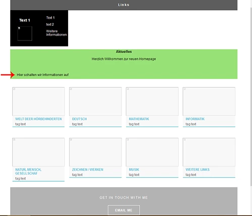
You have coding errors that can adversely effect layout. I took the liberty of cleaning up redundant styles and code errors for you. I removed the floats that didn't belong and moved the text indicated by a red arrow over to the right with 2% padding.
Copy & paste the following code into a new, blank document.
<!doctype html>
<html lang="de">
<head>
<meta charset="UTF-8">
<meta http-equiv="X-UA-Compatible" content="IE=edge">
<meta name="HSM_Muenchenbuchsee" content="width=device-width, initial-scale=1">
<title>Light Theme</title>
<style>
body {
background-color: #FFFFFF;
margin: 0;
font-family: Gotham, "Helvetica Neue", Helvetica, Arial, sans-serif;
}
h1 { font-size: 24px; }
.container {
width: 90%;
margin: 0 auto;
background-color: #FFFFFF;
}
header {
width: 100%;
height: 8%;
background-color: #5D5E5D;
border-bottom: 1px solid #353635;
}
.logo {
color: #fff;
font-weight: bold;
margin: 0 auto;
letter-spacing: 4px;
text-align: center;
padding: 15px 0;
line-height: 2em;
font-size: 22px;
}
.hero_header {
color: #FFFFFF;
text-align: center;
margin: 0;
letter-spacing: 4px;
}
.text_column {
width: 90%;
text-align: left;
font-weight: lighter;
line-height: 25px;
padding-left: 20px;
padding-right: 20px;
color: #A3A3A3;
}
.gallery {
display: inline-block;
width: 100%;
background-color: #FFFFFF;
min-width: 400px;
padding: 0 0 35px 0;
margin: 0;
}
.thumbnail {
width: 23%;
text-align: center;
float: left;
margin: 35px 1% 0 1%;
background-color: #F8F8F8;
padding-bottom: 20px 0 20px 0;
border-radius: 3px;
border-bottom: 4px solid #6DC7D0;
}
.gallery .thumbnail h4 {
margin-top: 5px;
margin-bottom: 5px;
color: #52BAD5;
text-align: left;
padding-left: 20px;
padding-right: 20px;
}
.gallery .thumbnail p {
margin: 0;
color: #B3B3B3;
text-align: left;
padding-left: 20px;
}
.intro {
background-color: #FFFFFF;
padding-bottom: 35px;
}
.column {
width: 50%;
text-align: center;
padding-top: 30px;
float: left;
}
.aktuell {
width: 100%;
color: #000000;
font-family: Gotham, "Helvetica Neue", Helvetica, Arial, sans-serif;
text-align: center;
background-color: #98E176;
}
.aktuell_texte {
color: #000000;
font-family: Gotham, "Helvetica Neue", Helvetica, Arial, sans-serif;
text-align: left;
background-color: #98E176;
padding: 1% 3%;
}
.intro .column h3 {
color: #FFFFFF;
text-align: center;
}
.cards {
width: 100%;
height: auto;
max-width: 400px;
max-height: 200px;
opacity: 0.8;
}
.intro .column p {
padding-left: 30px;
padding-right: 30px;
text-align: justify;
line-height: 25px;
font-weight: normal;
margin-left: 20px;
margin-right: 20px;
width: 80%;
margin-top: 4%;
color: #FAF5F5;
}
.button {
width: 200px;
margin: 40px auto;
padding: 20px 10px 20px 10px;
text-align: center;
text-transform: uppercase;
font-weight: bold;
letter-spacing: 2px;
border: 3px solid #FFFFFF;
color: #FFFFFF;
transition: all 0.3s linear;
}
.button:hover {
background-color: #6DC7D0;
color: #FFFFFF;
cursor: pointer;
}
.copyright {
text-align: center;
padding: 20px 0 20px;
background-color: #717070;
color: #FFFFFF;
text-transform: uppercase;
font-weight: lighter;
letter-spacing: 2px;
}
footer {
background-color: #B3B3B3;
padding-top: 60px;
padding-bottom: 60PX;
}
.intro {
display: inline-block;
background-color: #000000;
}
.profile { width: 50%; }
.gallery .thumbnail .tag {
color: #5D5E5D;
padding: 4px 20px 4px 20px;
text-align: left;
}
/* Mobile */
@media (max-width: 320px) {
.logo {
width: 100%;
text-align: center;
margin: 13px 0;
}
.text_column {
width: 100%;
text-align: justify;
padding: 0;
}
.intro .column p {
width: 80%;
margin-left: 0px;
}
.text_column { padding-left: 20px; }
.thumbnail { width: 100%; }
.column {
width: 100%;
margin-top: 0px;
}
.hero_header {
padding-left: 10px;
padding-right: 10px;
line-height: 22px;
text-align: center;
}
}
/* Small Tablets */
@media (min-width: 321px)and (max-width: 767px) {
.logo {
width: 100%;
text-align: center;
margin: 13px 0;
}
.text_column {
width: 100%;
text-align: left;
padding: 0;
}
.thumbnail { width: 100%; }
.column {
width: 100%;
margin-top: 0px;
}
.thumbnail { width: 100%; }
.text_column {
padding-left: 20px;
padding-right: 20px;
width: 90%;
}
.column {
width: 100%;
margin: 0;
}
.profile { width: 100%; }
.intro .column p {
width: 90%;
text-align: center;
padding-left: 0px;
}
}
/* Small Desktops */
@media (min-width: 768px) and (max-width: 1096px) {
.text_column { width: 100%; }
.thumbnail { width: 48%; }
.text_column {
width: 90%;
margin: 0;
padding: 20px;
}
.intro .column p { width: 80%; }
}
</style>
</head>
<body>
<div class="container">
<header class="header">
<h1 class="logo">Links</h1>
</header>
<section class="intro">
<div class="column">
<h3>Text 1</h3>
<img src="../Bilder_Layout/wuerfel_original.jpg" alt="" class="profile"> </div>
<div class="column">
<p>Text 1</p>
<p>text 2</p>
<p>Weitere Informationen</p>
</div>
</section>
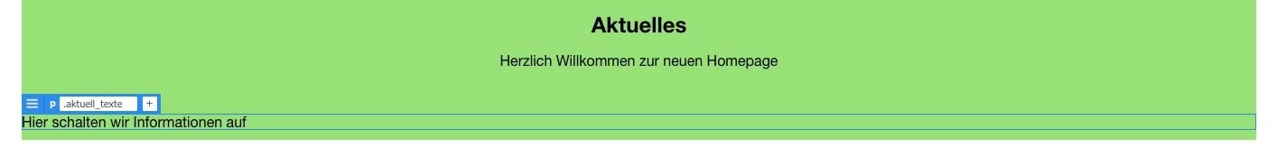
<div class="aktuell">
<h1 class="actuell">Aktuelles</h1>
<p>Herzlich Willkommen zur neuen Homepage</p>
<br>
<p class="aktuell_texte">Hier schalten wir Informationen auf</p>
</div>
<div class="gallery">
<div class="thumbnail"> <a href="#"><img src="../images/bkg_06.jpg" alt="" width="2000" class="cards"/></a>
<h4>WELT DEER HÖRBEHINDERTEN</h4>
<p class="tag">tag text </p>
</div>
<div class="thumbnail"> <a href="#"><img src="../images/bkg_06.jpg" alt="" width="2000" class="cards"/></a>
<h4>DEUTSCH</h4>
<p class="tag">tag text </p>
</div>
<div class="thumbnail"> <a href="#"><img src="../images/bkg_06.jpg" alt="" width="2000" class="cards"/></a>
<h4>MATHEMATIK</h4>
<p class="tag">tag text </p>
</div>
<div class="thumbnail"> <a href="#"><img src="../images/bkg_06.jpg" alt="" width="2000" class="cards"/></a>
<h4>INFORMATIK</h4>
<p class="tag">tag text </p>
</div>
</div>
<div class="gallery">
<div class="thumbnail"> <a href="#"><img src="../images/bkg_06.jpg" alt="" width="2000" class="cards"/></a>
<h4>NATUR, MENSCH, GESELLSCHAF </h4>
<p class="tag">tag text </p>
</div>
<div class="thumbnail"> <a href="#"><img src="../images/bkg_06.jpg" alt="" width="2000" class="cards"/></a>
<h4>ZEICHNEN / WERKEN</h4>
<p class="tag">tag text </p>
</div>
<div class="thumbnail"> <a href="#"><img src="../images/bkg_06.jpg" alt="" width="2000" class="cards"/></a>
<h4>MUSIK</h4>
<p class="tag">tag text </p>
</div>
<div class="thumbnail"> <a href="#"><img src="../images/bkg_06.jpg" alt="" width="2000" class="cards"/></a>
<h4>WEITERE LINKS</h4>
<p class="tag">tag text </p>
</div>
</div>
<footer id="contact">
<p class="hero_header">GET IN TOUCH WITH ME</p>
<div class="button">EMAIL ME </div>
</footer>
<div class="copyright">©hsm2019</div>
</div>
</body>
</html>


 AdChoices