Participant
November 25, 2017
Answered
Troubles with Tables
- November 25, 2017
- 3 replies
- 691 views
Please download the attached file to view this post

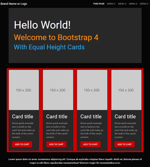
Below is a quick example of what you could do with a Bootstrap 4 responsive layout and a few CSS classes. No tables or HTML formatting required.
<!doctype html>
<html lang="en">
<head>
<meta charset="utf-8">
<title>Bootstrap 4.0, Equal Height Cards Demo</title>
<meta name="viewport" content="width=device-width, initial-scale=1">
<meta http-equiv="X-UA-Compatible" content="IE=edge">
<!--BOOTSTRAP CYBORG THEME-->
<link rel="stylesheet" href="https://maxcdn.bootstrapcdn.com/bootswatch/4.0.0-beta.2/cyborg/bootstrap.min.css">
<style>
html, body {height: 100% }
</style>
</head>
<body>
<!--begin top nav bar-->
<nav class="navbar navbar-expand-lg navbar-dark bg-default">
<!-- Brand -->
<a class="navbar-brand" href="#">Brand Name or Logo</a>
<!-- Toggler/collapsibe Button -->
<button class="navbar-toggler" type="button" data-toggle="collapse" data-target="#collapsibleNavbar"> <span class="navbar-toggler-icon"></span> </button>
<!-- Navbar links -->
<div class="collapse navbar-collapse" id="collapsibleNavbar">
<ul class="navbar-nav ml-auto">
<li class="nav-item active"> <a class="nav-link" href="#">THIS PAGE</a> </li>
<li class="nav-item"> <a class="nav-link" href="#">MENU 2</a> </li>
<li class="nav-item"> <a class="nav-link" href="#">MENU 3</a> </li>
<li class="nav-item"> <a class="nav-link" href="#">MENU 4</a> </li>
<li class="nav-item"> <a class="nav-link" href="#">MENU 5</a> </li>
</ul>
</div>
<!--/TOP NAV--></nav>
<div class="container">
<div class="jumbotron center-block">
<h1 class="text-white">Hello World!</h1>
<h2 class="text-warning">Welcome to Bootstrap 4</h2>
<h3 class="text-primary">With Equal Height Cards</h3>
</div>
<div class="row bg-danger">
<!--BEGIN 4 COLUMNS & CARDS-->
<div class="col-sm-6 col-lg-3 py-2">
<div class="card h-100"> <img class="card-img-top" src="https://dummyimage.com/150x200" alt="Card image">
<div class="card-body">
<h4 class="card-title">Card title</h4>
<p class="card-text">Some quick example text to build on the card title and make up the bulk of the card's content.</p>
<a href="#" class="btn btn-danger">ADD TO CART</a>
<!--/card-body--></div>
<!--/card--></div>
<!--/col--></div>
<!--/row--></div>
<hr>
<footer class="row">
<p class="text-center text-light">Lorem ipsum dolor sit amet, consectetur adipisicing elit. Cumque ab explicabo voluptas libero impedit. Modi vel, dolores placeat id magni ut odit libero repudiandae necessitatibus? Dolorem magni illo necessitatibus error.</p>
</footer>
<!--/container--></div>
<!--First jQuery then Popper then Bootstrap-->
<script src="https://code.jquery.com/jquery-3.2.1.min.js" integrity="sha256-hwg4gsxgFZhOsEEamdOYGBf13FyQuiTwlAQgxVSNgt4=" crossorigin="anonymous"></script>
<!--Popper JS-->
<script src="https://cdnjs.cloudflare.com/ajax/libs/popper.js/1.11.0/umd/popper.min.js" integrity="sha384-b/U6ypiBEHpOf/4+1nzFpr53nxSS+GLCkfwBdFNTxtclqqenISfwAzpKaMNFNmj4" crossorigin="anonymous"></script>
<!--Latest Bootstap 4 JS-->
<script src="https://maxcdn.bootstrapcdn.com/bootstrap/4.0.0-beta/js/bootstrap.min.js" integrity="sha384-h0AbiXch4ZDo7tp9hKZ4TsHbi047NrKGLO3SEJAg45jXxnGIfYzk4Si90RDIqNm1" crossorigin="anonymous"></script>
</body>
</html>
Already have an account? Login
No account yet? Create an account
Enter your E-mail address. We'll send you an e-mail with instructions to reset your password.

 AdChoices