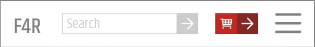
Below is example coding of what you require - Bootstrap 4. Bootstrap uses 'rows' to organise elements.
Would I personally use Bootstrap in production, never in a million years, its a poor way to produce code as you end up with a zillion classes names and <divs>splattered all over your html making it virtually impossible to diagnose what is happening. The more I explore Bootstrap the more evil it becomes. For instance what insane workflow would force you to wrap an h5 tag in a <div> just to negate the padding and margin when you then apply the utilities classes of d-sm-none d-lg-block to it other wise it wont adher to flex-center..........totally insane. You can really tell that whoever came up with the framework has zero experience of web-developing on a day to day basis otherwise it wouldnt be so poor......or could it be its original intention was to develop back-end apps wher it really doesnt matter what they look like.....go figure.
<!DOCTYPE html>
<html>
<head>
<title>Title of the document</title>
<!-- Latest compiled and minified Bootstrap CSS -->
<link rel="stylesheet" href="https://maxcdn.bootstrapcdn.com/bootstrap/4.0.0-beta/css/bootstrap.min.css" integrity="sha384-/Y6pD6FV/Vv2HJnA6t+vslU6fwYXjCFtcEpHbNJ0lyAFsXTsjBbfaDjzALeQsN6M" crossorigin="anonymous">
</head>
<body>
<div class="container ">
<nav id="navbar" class="navbar fixed-top navbar-expand-lg navbar-light bg-light d-flex flex-column">
<div class="row col-12 justify-content-between">
<div class="col-4">
<a class="navbar-brand" href="#">Furniture4Rent</a>
</div>
<div class="col-8 d-flex justify-content-end align-items-center">
<form>
<div class="input-group">
<input type="search" placeholder="Search" aria-label="Search">
<button class="btn btn-outline-secondary" type="submit">Go</button>
<div class="d-flex align-items-center"><h5 class="d-sm-none d-lg-block font-weight-normal p-0 m-0 mx-2">01234 567890</h5></div>
</div>
</form>
<a href="#" class="mx-2">Cart</a>
<button class="navbar-toggler" type="button" data-toggle="collapse" data-target="#navbarSupportedContent1" aria-controls="navbarSupportedContent1" aria-expanded="false" aria-label="Toggle navigation"> <span class="navbar-toggler-icon"></span> </button>
</div>
</div>
<!-- end row -->
<div class="row col-12 justify-content-end">
<div class="collapse navbar-collapse" id="navbarSupportedContent1">
<ul class="navbar-nav ml-auto">
<li class="nav-item active"> <a class="nav-link" href="#">Home <span class="sr-only">(current)</span></a> </li>
<li class="nav-item"> <a class="nav-link" href="#">Link</a> </li>
<li class="nav-item dropdown"> <a class="nav-link dropdown-toggle" href="#" id="navbarDropdown1" role="button" data-toggle="dropdown" aria-haspopup="true" aria-expanded="false"> Dropdown </a>
<div class="dropdown-menu" aria-labelledby="navbarDropdown1"> <a class="dropdown-item" href="#">Action</a> <a class="dropdown-item" href="#">Another action</a>
<div class="dropdown-divider"></div>
<a class="dropdown-item" href="#">Something else here</a> </div>
</li>
<li class="nav-item"> <a class="nav-link disabled" href="#">Disabled</a> </li>
</ul>
</div>
</div>
<!-- end row -->
</nav>
</div>
<!-- end container -->
<script src="https://code.jquery.com/jquery-3.3.1.slim.min.js" integrity="sha384-q8i/X+965DzO0rT7abK41JStQIAqVgRVzpbzo5smXKp4YfRvH+8abtTE1Pi6jizo" crossorigin="anonymous"></script>
<script src="https://cdnjs.cloudflare.com/ajax/libs/popper.js/1.14.0/umd/popper.min.js" integrity="sha384-cs/chFZiN24E4KMATLdqdvsezGxaGsi4hLGOzlXwp5UZB1LY//20VyM2taTB4QvJ" crossorigin="anonymous"></script>
<script src="https://stackpath.bootstrapcdn.com/bootstrap/4.1.0/js/bootstrap.min.js" integrity="sha384-uefMccjFJAIv6A+rW+L4AHf99KvxDjWSu1z9VI8SKNVmz4sk7buKt/6v9KI65qnm" crossorigin="anonymous"></script>
</body>
</html>


 AdChoices