Inspiring
October 19, 2017
Answered

txt to wrap under embedded movie

  • October 19, 2017
  • 1 reply
  • 442 views

Hi,

I would like the text to flow and wrap under the 2nd "column" (which really isn't a column) where the movie exists. The second "column" begins in the div that cites the embed-responsive for the movie. Otherwise, on med & some small breakpoints, the text remains in a single column and there is a large gap under the movie.  When it gets to tablet and phone, it is completely fine as is... same with the larger & largest breakpoints.

<div class="col-sm-6">

    <div class="text-left">

      <h3 class="info">Lorem ipsum dolor sit amet, consectetur adipiscing elit, sed do eiusmod tempor incididunt ut labore et dolore magna aliqua. Ut enim ad minim veniam, quis nostrud exercitation ullamco laboris nisi ut aliquip ex ea commodo consequat. Duis aute irure dolor in reprehenderit in voluptate velit esse cillum dolore eu fugiat nulla pariatur. Excepteur sint occaecat cupidatat non proident, sunt in culpa qui officia deserunt mollit anim id est laborum.</p>

<p>More information here:</p>

           <p>minim veniam <span style="color:#ccc;">•</span>  sint occaecat <span style="color:#ccc;">•</span> mollit anim <span style="color:#ccc;">•</span> aute irure <span style="color:#ccc;">•</span> in culpa    <a href="document.pdf" title="download" target="_blank"> Download Document</a></p>

    </div>

    <div class="embed-responsive embed-responsive-16by9">

    <iframe src="https://player.vimeo.com" width="640" height="360" frameborder="0" webkitallowfullscreen mozallowfullscreen allowfullscreen></iframe>

    </div>

    <p class="text-center"><span style="color:#ccc;">view the movie</span></p>            

   </div>

Thank you.

    This topic has been closed for replies.
    Correct answer Nancy OShea

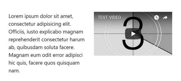
    Sorry.  You can't float text around a responsive block level video.

    In this example, I used 2 columns on medium devices instead of small.

    <!doctype html>

    <html lang="en-US">

    <head>

    <meta charset="utf-8">

    <title>Bootstrap 4 Demo</title>

    <meta name="viewport" content="width=device-width, initial-scale=1">

    <meta http-equiv="X-UA-Compatible" content="IE=edge">

    <link href="https://maxcdn.bootstrapcdn.com/bootstrap/4.0.0-beta/css/bootstrap.min.css" rel="stylesheet" integrity="sha384-/Y6pD6FV/Vv2HJnA6t+vslU6fwYXjCFtcEpHbNJ0lyAFsXTsjBbfaDjzALeQsN6M" crossorigin="anonymous">

    </head>

    <body>

    <div class="container">

    <div class="row">

    <div class="col-md-6">

    <p>Lorem ipsum dolor sit amet, consectetur adipisicing elit. Officiis, iusto explicabo magnam reprehenderit consectetur harum ab, quibusdam soluta facere. Magnam eum odit error adipisci hic quis, facere quos quisquam nam.</p>

    </div>

    <div class="col-md-6">

    <div class="embed-responsive embed-responsive-16by9">

    <iframe width="560" height="315" src="https://www.youtube.com/embed/C0DPdy98e4c" frameborder="0" allowfullscreen></iframe>

    </div>

    </div>

    <!--/row--></div>

    <!--/container--></div>

    <!--latest jQuery 3-->

    <script src="https://code.jquery.com/jquery-3.2.1.min.js" integrity="sha256-hwg4gsxgFZhOsEEamdOYGBf13FyQuiTwlAQgxVSNgt4=" crossorigin="anonymous"></script>

    <!--Popper JS-->

    <script src="https://cdnjs.cloudflare.com/ajax/libs/popper.js/1.11.0/umd/popper.min.js" integrity="sha384-b/U6ypiBEHpOf/4+1nzFpr53nxSS+GLCkfwBdFNTxtclqqenISfwAzpKaMNFNmj4" crossorigin="anonymous"></script>

    <!--latest Bootstrap 4 JS-->

    <script src="https://maxcdn.bootstrapcdn.com/bootstrap/4.0.0-beta/js/bootstrap.min.js" integrity="sha384-h0AbiXch4ZDo7tp9hKZ4TsHbi047NrKGLO3SEJAg45jXxnGIfYzk4Si90RDIqNm1" crossorigin="anonymous"></script>

    </body>

    </html>

    1 reply

    Nancy OShea
    Community Expert
    Nancy OSheaCommunity ExpertCorrect answer
    Community Expert
    October 19, 2017

    Sorry.  You can't float text around a responsive block level video.

    In this example, I used 2 columns on medium devices instead of small.

    <!doctype html>

    <html lang="en-US">

    <head>

    <meta charset="utf-8">

    <title>Bootstrap 4 Demo</title>

    <meta name="viewport" content="width=device-width, initial-scale=1">

    <meta http-equiv="X-UA-Compatible" content="IE=edge">

    <link href="https://maxcdn.bootstrapcdn.com/bootstrap/4.0.0-beta/css/bootstrap.min.css" rel="stylesheet" integrity="sha384-/Y6pD6FV/Vv2HJnA6t+vslU6fwYXjCFtcEpHbNJ0lyAFsXTsjBbfaDjzALeQsN6M" crossorigin="anonymous">

    </head>

    <body>

    <div class="container">

    <div class="row">

    <div class="col-md-6">

    <p>Lorem ipsum dolor sit amet, consectetur adipisicing elit. Officiis, iusto explicabo magnam reprehenderit consectetur harum ab, quibusdam soluta facere. Magnam eum odit error adipisci hic quis, facere quos quisquam nam.</p>

    </div>

    <div class="col-md-6">

    <div class="embed-responsive embed-responsive-16by9">

    <iframe width="560" height="315" src="https://www.youtube.com/embed/C0DPdy98e4c" frameborder="0" allowfullscreen></iframe>

    </div>

    </div>

    <!--/row--></div>

    <!--/container--></div>

    <!--latest jQuery 3-->

    <script src="https://code.jquery.com/jquery-3.2.1.min.js" integrity="sha256-hwg4gsxgFZhOsEEamdOYGBf13FyQuiTwlAQgxVSNgt4=" crossorigin="anonymous"></script>

    <!--Popper JS-->

    <script src="https://cdnjs.cloudflare.com/ajax/libs/popper.js/1.11.0/umd/popper.min.js" integrity="sha384-b/U6ypiBEHpOf/4+1nzFpr53nxSS+GLCkfwBdFNTxtclqqenISfwAzpKaMNFNmj4" crossorigin="anonymous"></script>

    <!--latest Bootstrap 4 JS-->

    <script src="https://maxcdn.bootstrapcdn.com/bootstrap/4.0.0-beta/js/bootstrap.min.js" integrity="sha384-h0AbiXch4ZDo7tp9hKZ4TsHbi047NrKGLO3SEJAg45jXxnGIfYzk4Si90RDIqNm1" crossorigin="anonymous"></script>

    </body>

    </html>

    Nancy O'Shea— Product User & Community Expert
    Nancy OShea
    Community Expert
    Community Expert
    October 19, 2017

    Optionally, you could change column widths on bigger devices.

    As an example:

    <div class="col-md-6 col-lg-5 col-xl-4">

    <p>Lorem ipsum dolor sit amet, consectetur adipisicing elit. Officiis, iusto explicabo magnam reprehenderit consectetur harum ab, quibusdam soluta facere. Magnam eum odit error adipisci hic quis, facere quos quisquam nam.</p>

    </div>

    <div class="col-md-6 col-lg-7 col-xl-8">

    <div class="embed-responsive embed-responsive-16by9">

    <iframe width="560" height="315" src="https://www.youtube.com/embed/C0DPdy98e4c" frameborder="0" allowfullscreen></iframe>

    </div>

    </div>

    Nancy O'Shea— Product User & Community Expert