Hosun
Inspiring
September 17, 2019
Answered

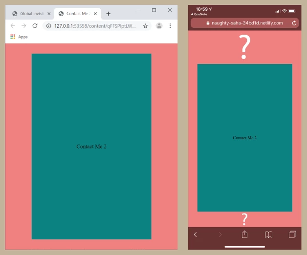
Vertical alignment on i-Phone

  • September 17, 2019
  • 6 replies
  • 884 views

Hi,


Clicking the far-right icon in <header> opens Contact Me 2.


I am positioning the box in <main> without header and footer.


Alignment looks fine on laptop.

But there is an issue of vertical alignment on iPhone.


Is there any solution?


https://naughty-saha-34bd1d.netlify.com/


Hosun Kang


    This topic has been closed for replies.
    Correct answer osgood_

    Hi Hosun,


    The link Ben provided should give you an idea.

    https://css-tricks.com/the-trick-to-viewport-units-on-mobile/


    In your case add the css calc solution to the page-wrapper css:


    .page-wrapper {
      height: 100vh;
      height: calc(var(--vh, 1vh) * 100);
    }


    Then add the javscript at the foot of the page just before the closing </body> tag:


    <script>
    let vh = window.innerHeight * 0.01;
    document.documentElement.style.setProperty('--vh', `${vh}px`);
    
    window.addEventListener('resize', () => {
    let vh = window.innerHeight * 0.01;
    document.documentElement.style.setProperty('--vh', `${vh}px`);
    });
    </script>


    See if that does anything!


    6 replies

    osgood_Correct answer
    Legend
    September 17, 2019

    Hi Hosun,


    The link Ben provided should give you an idea.

    https://css-tricks.com/the-trick-to-viewport-units-on-mobile/


    In your case add the css calc solution to the page-wrapper css:


    .page-wrapper {
      height: 100vh;
      height: calc(var(--vh, 1vh) * 100);
    }


    Then add the javscript at the foot of the page just before the closing </body> tag:


    <script>
    let vh = window.innerHeight * 0.01;
    document.documentElement.style.setProperty('--vh', `${vh}px`);
    
    window.addEventListener('resize', () => {
    let vh = window.innerHeight * 0.01;
    document.documentElement.style.setProperty('--vh', `${vh}px`);
    });
    </script>


    See if that does anything!


    Legend
    September 17, 2019

    I didn't know the issue existed on iPhone either. Not had any clients complain to-date so what will be will be, I guess. I'm positive I have used 100vh and vertically centered containers - maybe next time I will include the js work-around solution as a precaution. It's mainly a cosmetic issue, I think, so its not likely that a client would complain, plenty of other weird stuff going on out there!


    More 'leg-end' than 'legend'.

    Hosun
    HosunAuthor
    Inspiring
    September 17, 2019
    Hi, Thank you very much for your help. I think setting "window.innerHeight" for my iPhone would solve my issue, rather than adding your code. Could you tell me how to do? I guess every iPhone has a different value. Housn Kang
    BenPleysier
    Community Expert
    Community Expert
    September 17, 2019

    osgood_ (LEGEND)!


    Still trying to get my head around this new forum with replies disappearing before my eyes.


    However, to further the discussion regarding 100% vs 100vh, I do not think that this is the crux of the problem. The problem is that the viewport is partly hidden by the toolbar. Aparently, this has been done on purpose, initially adopted by Safari and subsequently copied by the other mobile browsers.

    Wappler is the DMXzone-made Dreamweaver replacement and includes the best of their powerful extensions, as well as much more!
    Legend
    September 17, 2019

    Ben, does this just apply if you use 100vh or would setting the height of the container to 100% resolve the issue?


    I found the below but without an iPhone to make some tests it makes little sense to me:

    https://medium.com/@susiekim9/how-to-compensate-for-the-ios-viewport-unit-bug-46e78d54af0d


    BenPleysier
    Community Expert
    Community Expert
    September 17, 2019
    Wappler is the DMXzone-made Dreamweaver replacement and includes the best of their powerful extensions, as well as much more!
    BenPleysier
    Community Expert
    Community Expert
    September 17, 2019

    The problem is the tool bar(s). Have a look at


     and

    Using window.innerHeight in a javascript function should solve the problem.


    Edit: Forgot this on my OLD iphone:

     
    Wappler is the DMXzone-made Dreamweaver replacement and includes the best of their powerful extensions, as well as much more!
    Legend
    September 17, 2019

    Hi Hosun,

    Can you try the below code option. After that I've run out of ideas why the iPhone when using Flex won't show the vertically positioning correctly. What browser is it you are using?


    <!doctype html>
    <html>
    <head>
    <meta charset="utf-8">
    <title>Contact Me 2</title>
    <style>
    * {
    margin: 0px;
    padding: 0px;
    box-sizing: border-box;
    }
    .page-wrapper {
    display: flex;
    flex-direction: column;
    height: 100vh;
    } 
    
    main {
    background-color: lightcoral;
    display: flex;
    flex: 1;
    }
    .test {
    align-self: center;
    width: 60%;
    margin: 0 auto;
    text-align: center;
    background-color: #008080;
    padding: 160px 0;
    }
    </style>
    	
    <meta name="viewport" content="width=device-width, initial-scale=1">
    <meta http-equiv="X-UA-Compatible" content="IE=edge">
    </head>
    <body>
    <div class="page-wrapper">
    <main>
    <div class="test">Contact Me 2</div>
    </main>
    </div>
    </body>
    </html>


    The only other thing I can think of is the iPhone doesnt like the height: 100vh on the page-wrapper css;


    So you could test with:


    body {
    height: 100%;
    }
    html {
    height: 100%;
    }

    .page-wrapper {
    display: flex;
    flex-direction: column;
    height: 100%;
    }