Answered
What is the correct panel icon size?
I've got an extension panel ready to package up and distribute, but one thing still bugs me a bit--the icon:
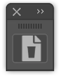
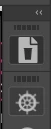
I have set it up as a 23x23 .png file since that is what I have seen posted in other discussions. I've also supplied retina versions at 46x46 for @15739213 and 69x69 for @11199216. (I like to future-proof.)
As you can see in the image above, the icon appears slightly offset to the right. Is 23x23 not the correct size anymore and, if not, what should I make my icons?
Side Quests
- I've tried making the icon .svg files instead, as they would theoretically remain nice and sharp all the way up to the largest interface scale (since Illustrator CC 2019 allows for this now). However, I have thus far been unable to get SVGs to work consistently. Certainly not with a non-filled 23x23 square to surrounding the art.
- I've got my manifest.xml file set up to use the four types listed in the Cookbook: Normal, RollOver, DarkNormal, and DarkRollOver. This accounts for two brightness levels. However, with Illustrator CC 2019 (and possibly earlier versions), there are 4 levels of interface Brightness in Preferences->User Interface: Light, MediumLight, MediumDark, and Dark. Are these not yet implemented in CEP?
Thanks for any help!