
Issue in setting 'allowDeselction' property of ButtonBarButton component
I would like to have tabs like individual buttons with some spacing between each button. It should function as normal tab navigator tabs.
So, I took a spark ButtonBar component and made changes to the ButtonBarSkin to look as I said above. The default behavior of the ButtonBar is Only one button in the ButtonBar control can be in the selected state. That means when you select a button in a ButtonBar control, the button stays in the selected state until you select a different button.
But, If I click on the already selected button, the selection goes off. I don't need such behavior. I want the button to be in the selected state even If I click it again as like in a tab bar control.
While I explored the buttonbarskin, I got to know that the buttonbarbutton is being used for defining the custom item renderer for buttonbar control. The ButtonBarButton component has a "allowDeselection"property which is by default true which means the selected button in the buttonbar can be deselected by clicking again. If set to false,the user must select a different button to deselect the currently selected button.
So, while declaring the buttonbarbutton component in the ButtonBarSkin, Im setting theallowDeselection property to false. Even then, the value is being set as true. While debugging the code, the thing I found weird is, the declared value i.e., false is set first and again it is being set as true for all the firstbutton, middlebutton and lastbutton of the buttonbar. I don't know how the property is getting set as true even I'm setting it to false while defining in buttonbarskin.
the code snippet is as follows :
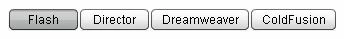
ButtonBar control
<s:ButtonBar skinClass="skin.ButtonBarSkinCopy">
<mx:ArrayCollection>
<fx:String>Flash</fx:String>
<fx:String>Director</fx:String>
<fx:String>Dreamweaver</fx:String>
<fx:String>ColdFusion</fx:String>
</mx:ArrayCollection>
</s:ButtonBar>
ButtonBarSkinCopy.mxml
<?xml version="1.0" encoding="utf-8"?>
<!--
ADOBE SYSTEMS INCORPORATED
Copyright 2008 Adobe Systems Incorporated
All Rights Reserved.
NOTICE: Adobe permits you to use, modify, and distribute this file
in accordance with the terms of the license agreement accompanying it.
-->
<!--- The default skin class for the Spark ButtonBar component. The buttons on the ButtonBar component
use the ButtonBarLastButtonSkin, ButtonBarFirstButtonSkin and ButtonBarMiddleButtonSkin classes.
@see spark.components.ButtonBar
@see spark.components.ButtonBarButton
@langversion 3.0
@playerversion Flash 10
@playerversion AIR 1.5
@productversion Flex 4
-->
<s:Skin xmlns:fx="http://ns.adobe.com/mxml/2009" xmlns:s="library://ns.adobe.com/flex/spark"
alpha.disabled="0.5">
<fx:Metadata>
<![CDATA[
/**
* @copy spark.skins.spark.ApplicationSkin#hostComponent
*/
[HostComponent("spark.components.ButtonBar")]
]]>
</fx:Metadata>
<s:states>
<s:State name="normal" />
<s:State name="disabled" />
</s:states>
<fx:Declarations>
<!---
@copy spark.components.ButtonBar#firstButton
@default spark.skins.spark.ButtonBarFirstButtonSkin
@see spark.skins.spark.ButtonBarFirstButtonSkin
-->
<fx:Component id="firstButton">
<s:ButtonBarButton allowDeselection="false" skinClass="skin.CustomButtonBarButtonSkin" />
</fx:Component>
<!---
@copy spark.components.ButtonBar#middleButton
@default spark.skins.spark.ButtonBarMiddleButtonSkin
@see spark.skins.spark.ButtonBarMiddleButtonSkin
-->
<fx:Component id="middleButton" >
<s:ButtonBarButton allowDeselection="false" skinClass="skin.CustomButtonBarButtonSkin" />
</fx:Component>
<!---
@copy spark.components.ButtonBar#lastButton
@default spark.skins.spark.ButtonBarLastButtonSkin
@see spark.skins.spark.ButtonBarLastButtonSkin
-->
<fx:Component id="lastButton" >
<s:ButtonBarButton allowDeselection="false" skinClass="skin.CustomButtonBarButtonSkin"/>
</fx:Component>
</fx:Declarations>
<!--- @copy spark.components.SkinnableDataContainer#dataGroup -->
<s:DataGroup id="dataGroup" width="100%" height="100%">
<s:layout>
<s:ButtonBarHorizontalLayout gap="2"/>
</s:layout>
</s:DataGroup>
</s:Skin>
And CustomButtonBarButtonSkin.mxml is just a copy of ButtonBarButtonSkin. No change is done in the ButtonBarButtonSkin.mxml.
Kindly, Please share your views.

 AdChoices