November 27, 2016
Question

Problem with the apostrophe in Minion Pro regular

  • November 27, 2016
  • 2 replies
  • 2642 views

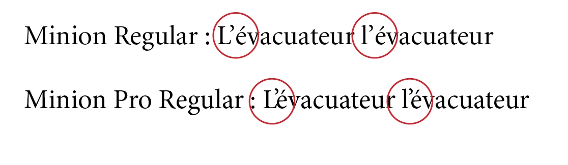
Is there somebody as encounter an apostrophe kerning problem using Minion Pro. On my side that's a big problem. The apostrophe with eacute “é” and “e” is so tight that’s cause an huge problem. I know that's a known issue, and lots of post had already discussed about it. But, I did not found yet a solution. Is Adobe has plan to update Minion Pro?. Any help will be welcome. Thanks in advance. André

This topic has been closed for replies.

2 replies

andres70122810
Participant
January 31, 2018

I finally found a way to solve this problem. As suggested by Ellis, I switch to a Optical Kerning and I change the  spacing letter to -10. Everything is well set.

Marvest
Inspiring
November 27, 2016

Switching Kerning from Metric to Optical takes care of the problem but I don't know if that will cause any issues to your workflow.

November 28, 2016

I've already try that, but for me is not a good way. In that case, the letter spacing is to loose. It would be good for a small text but not for a 150 pages document. Do an individual apostrophe kerning is not a good way either, because we have over thousand apostrophe in the document. I also know the problem come from the font itself. The kerning is too tight between apostrophe and “é,e”. Best of all, would be that Adobe  release a corrected update. In the meantime, I try to find a solution. Thanks for you answer.

jmlevy
Community Expert
Community Expert
January 11, 2017

Do you use this typeface with InDesign? You could set up GREP styles to automatically apply the right kerning, or best use the script that Peter Kahrel wrote:

http://www.kahrel.plus.com/indesign/kern.html

There is a link to download the script at the bottom of the page.