Known Participant
May 8, 2022
Answered

Recommended font to accompany SignPainter

  • May 8, 2022
  • 1 reply
  • 3378 views

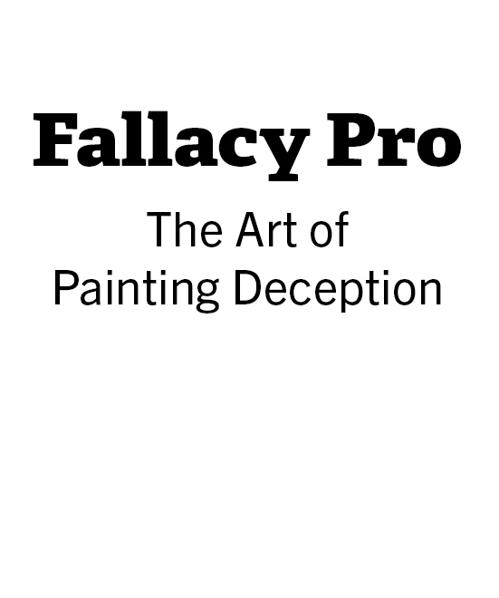
I thought the font SignPainter would be a good choice to complement this book's subtitle. The irony is that I used SignPainter for the subtitle, not the title.


I'd like to use a different font for the subtitle; presumably a sans-serif font. But do I want something robust that really stands out, or something more artistic? Can anyone recommend some fonts that complement SignPainter? The font I chose just doesn't look right to me.


Then again, SignPainter might not have been a good choice, either, If you have have any better suggestions, I'd like to hear them.


Thanks.

    Correct answer J E L

    Hi @Geobop First, is "Fallacy Pro" the title of the book? And "The Art of Painting Deception" is the subtitle? If so, for my taste, I don't like the Sign Painter script font for the title and author name. Typically, book titles are not set in script or italics because that's considered a secondary font style. There are no hard and fast rules, of course.


    Also, the use of different colors for each letter in the first word only is a bit contrived. Overall, I think there are too many colors on the cover. I realize it's a book about paint and color. So you want some wonderful colors that pop and are yet harmonized. The cherries stand out compared to all the other elements. Is that the "deception" the topic relates to? If so, maybe this graphic should be more prominently placed instead of with the arm tucked behind the subtitle?


    As for other font choices, Adobe gives some very good pairing suggestions as a place to start. https://fonts.adobe.com/recommendations

    https://fonts.adobe.com/collections


    Just off the top of my head, maybe try Adelle for the title https://fonts.adobe.com/fonts/adelle,

    and Trade Gothic Next for the subtitle: https://fonts.adobe.com/fonts/trade-gothic-next

    1 reply

    J E L
    Community Expert
    J E LCommunity ExpertCorrect answer
    Community Expert
    May 15, 2022

    Hi @Geobop First, is "Fallacy Pro" the title of the book? And "The Art of Painting Deception" is the subtitle? If so, for my taste, I don't like the Sign Painter script font for the title and author name. Typically, book titles are not set in script or italics because that's considered a secondary font style. There are no hard and fast rules, of course.


    Also, the use of different colors for each letter in the first word only is a bit contrived. Overall, I think there are too many colors on the cover. I realize it's a book about paint and color. So you want some wonderful colors that pop and are yet harmonized. The cherries stand out compared to all the other elements. Is that the "deception" the topic relates to? If so, maybe this graphic should be more prominently placed instead of with the arm tucked behind the subtitle?


    As for other font choices, Adobe gives some very good pairing suggestions as a place to start. https://fonts.adobe.com/recommendations

    https://fonts.adobe.com/collections


    Just off the top of my head, maybe try Adelle for the title https://fonts.adobe.com/fonts/adelle,

    and Trade Gothic Next for the subtitle: https://fonts.adobe.com/fonts/trade-gothic-next

    GeobopAuthor
    Known Participant
    May 16, 2022

    Wow, great tips.

    The cherries and strawman reprsent the popular fallacies known as cherry picking and the strawman fallacy.

    I hired professionals to design covers for half a dozen books I'm working on. I've learned so much, I wanted to take another stab at designing some additional covers myself, but I don't know if I'll ever get there.

    Fonts are a special mystery, though the pieces are beginning to fall into place. I was just thinking of hiring someone to recommend fonts for my various books and websites, so the links you have gave me will be a big help.

    Thanks.

    J E L
    Community Expert
    Community Expert
    May 16, 2022

    Great, I'm glad these are helpful resources for you! Let us know how it goes for you and what fonts you end up using for this project. ~ Jain