Type issue - 'T' arms issue
Hey guys!
So I am relatively new to typography and I am having an issue I have been stuck on for quite a while so any help would be so much appreciated..
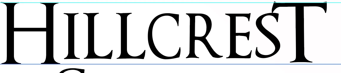
I am making a logo with text, the a 'T' after an 'S' at the end of a sentence. The arms of the 'T' make a large space between the 'S' and the 'T'. When moved closer the arms of the 'T' touch the 'S' and it looks terrible.
I have tried taking off the arms of the 'T" to make them smaller, this just made it look odd. I have tried making the 'T' skinnier using the transform tool, this also looked weird..
I have tried looking online for different fonts with 'T's that would suit but I am finding it crazy difficult...
I tried drawing a 'T' out manually on paper and scanning it on.. I couldn't get it right and it still looked funny, I am starting to think it will never work and what I want to do it completely unachievable.
I will attach photos so my rambling makes a little sense.
Any help would be so so much appreciated xx