Participant
August 10, 2012
Question

Typographic alignment questions
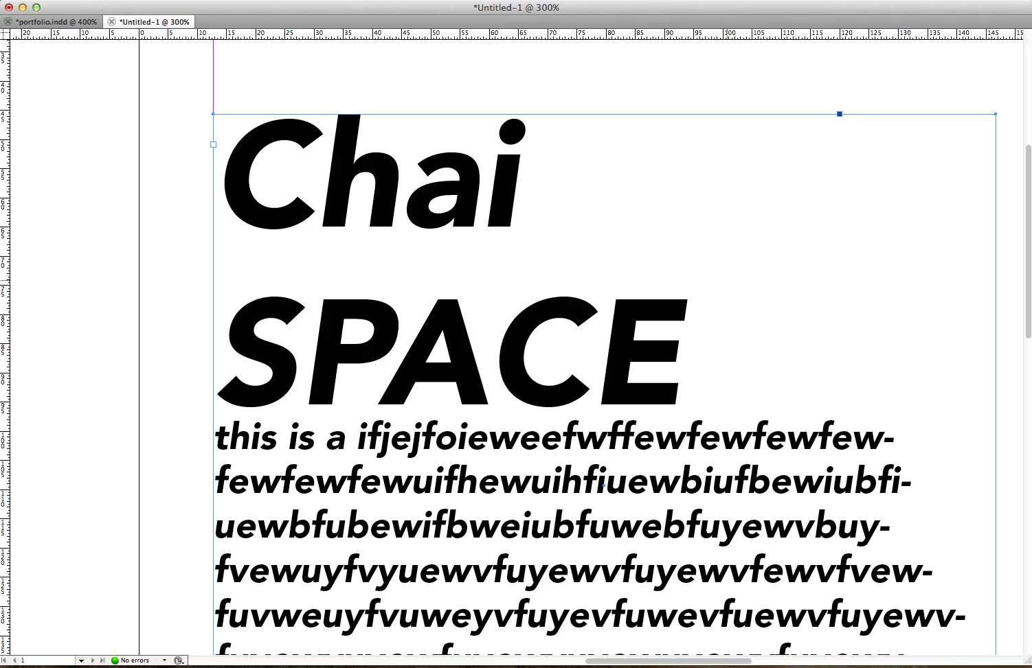
  • August 10, 2012
  • 1 reply
  • 1552 views

hi guys,

as you see in the below image,

what should be the Typographic alignment of ltalic? ( the frist letter C & S)

    This topic has been closed for replies.

    1 reply

    Jacob Bugge
    Community Expert
    Community Expert
    August 13, 2012

    Sam,

    In this case with general left alignment, it would make sense to have the heading left aligned.

    You may (or ought to be able to) expect the detailed alignment to correspond to what is inbuilt in the font when used with left alignment (or justification) in applications such as Illustrator, InDesign, and hopefully word processors.

    You may use that as a reference.

    Basically, in a case like the one shown, the pointed/narrow left side shapes such as the S, t, and f, will extend (a little/tiny bit) further left than the rounded shapes such as the C and the u, to give the appearance of left alignment (the appearance of everything starting at one and the same vertical line).

    Appearance being the key word, you may say that what looks right is right (if you look in the right way).

    This may be sufficiently woolly.