Participant
January 21, 2021
Question

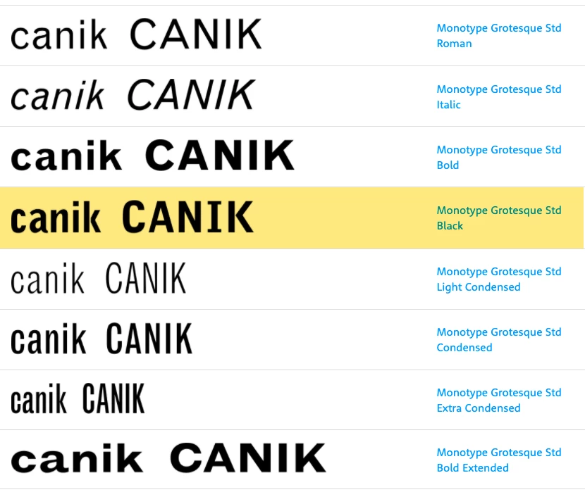
Why is the Monotype Grotesque Black different from the rest of the font?

  • January 21, 2021
  • 2 replies
  • 672 views
Why is the for the Monotype Grotesque Black different from the rest of the font? I’m curious to know and hope you’ll be able to help me. 


    This topic has been closed for replies.

    2 replies

    Participant
    February 2, 2021

    The Monotype Grotesque fonts were not designed to work as a family, originally. There were separate designs preapred in the early 20th century as metal type, usally identified by a number rather than a distinct name. Over the years — and especially once the fonts were digitized — the fonts were bundled together as a family, but not one where the memebrs are as clsoely related as they are in families that were designed as a set. It's more like a group of cousins than a family of sibliins.

    Legend
    January 21, 2021

    It doesn't look so different to me. "Black" is a font style that is ultra-heavy and bold, designed only for use in large sizes (posters, headlines etc.)  It isn't expected to be mixed with the regular font at the same size. The exact design choices were made 100 years ago.

    Participant
    January 21, 2021

    Thank you for your reply. When you look at the ‘K’ and ‘I’, it seems to be from a different font altogether.