Copy link to clipboard
Copied
I've just installed DC and the new interface looks great, but I would like to be able to change the window background colour from white without having to go to fullscreen mode. It's grey in other versions of Acrobat.
At the moment, it's very hard to see what the page size is when it's a white page on a white background.
Copy link to clipboard
Copied
Hi Josh, All,
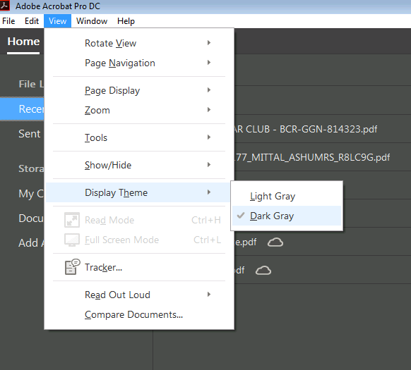
Acrobat DC update released today (10th May, 2016) introduces a new darker theme. Please open Acrobat DC application and go to Help > Check for updates to apply the latest update (2015.016.20039).
Next, go to View > Display Theme > Dark Gray and restart Acrobat.

More details here: What's new in Adobe Acrobat DC
Please try this out and let us know your feedback.
Thanks,
-ashu
Copy link to clipboard
Copied
Indeed, the same error which was made with the new Microsoft Office, why was this style coppied from Microsoft?. Way too much brightness this way on bigger screens. Also I am not entirely happy with all the pastel gray tints in the menus, it almost looks like all options are disabled. Really... why??
Copy link to clipboard
Copied
Yes the new interface is awful, it needs to have the simple interface colour change ability built in like Photoshop, Muse, Illustrator, InDesign etc, simple but effective. It would also keep all the Adobe CC products consistent with user's working preferences.
Dreamweaver also need this change as well as Acrobat!
For now I have uninstalled Acrobat DC and returned to 11pro (thanks bigfish2224) 🙂
Copy link to clipboard
Copied
I just installed Acrobat DC. My version has the darker grey background but everything is still shades of grey. Vision experts warn against spending time reading low contrast documents and this product is made for people who spend that time. I agree with the rest of these posts, please change this and give back color settings.
Since you seem to be partial to very brief answers this is the question to which I would like an answer: Is there any hope of getting color settings or are we just going to have to give up and go back to an earlier product?
Thank you.
Copy link to clipboard
Copied
Make sure you apply the latest update to Acrobat DC. Changes were made to darken the background and add to the contrast in a more recent update. We are also considering adding an option to set the window and furniture colors similar to the way it is done is the CC applications.
- Dov
Copy link to clipboard
Copied
oh really - so thats good news - where can i find this setting to darken the background?
Copy link to clipboard
Copied
Install the updates.
Copy link to clipboard
Copied
I just checked for any updates and I apparently have the newest. I do have the darker grey background but just as on this page, the white is not really white, but light grey, the text is a shade of grey, the border is a soft grey and the banner at the top is dark grey - which in combination is really hard on the eyes, especially in offices where the user does not have a lot of control over the light source. I am really excited to hear this though: "We are also considering adding an option to set the window and furniture colors similar to the way it is done is the CC applications." I hope you can make that happen soon!
Copy link to clipboard
Copied
I applied check for Updates in the Adobe Acrobat DC Pro & background still grey on sides when program opened & see no difference/changes? Anyone know when Adobe will update this feature so you can select/change the background color from grey around the sides of program when open? Thanks!
Copy link to clipboard
Copied
Approximately 50+ users have requested the ability to control the unreadable gray background color mandated by Adobe, because THEY KNOW WHAT'S BEST FOR US. As an indication to their level of concern, they don't even respond to the request, don't justify it, simply take the position of "take it or leave it". Nice way of looking out for faithful users! I wish we had a competitive choice, but they know we're stuck & continue to shove this down our throats. This thread has been going on for a year now & still NO RESPONSE. All you need to know. JIM
Copy link to clipboard
Copied
A pro application should give the final user the chance to set what he needs. There cannot be a default background suitable for all kinds of works for all the users. So please give a chance to set one's favorite settings, which may also vary from work to work. Otherwise I will be forced to change software. I cannot work with this eye-burning background.
Copy link to clipboard
Copied
Seeing as this isn't implemented yet, I will revert back to Acrobat XI for now until this feature becomes available.
For anyone that's interested in going back to Acrobat XI:
Copy link to clipboard
Copied
Just downloaded Acrobat Pro DC... the light grey background is terrible and I'm disappointed to hear that there is no option to change it. Adobe, please stop making arbitrary UI changes for sh!ts & giggles, it'll piss off your users. What is your rationale for going to a 20% grey background? You realize that most PDF documents have white backgrounds, right?
#fail
Copy link to clipboard
Copied
Adobe please. I could not agree with Fellow9 more. The minute I downloaded Adobe Acrobat DC and took a look at the horrible borders and background, I am really tempted to go back to Adobe Acrobat X, support or no support. Can Adobe and Microsoft please stop trying to please the Apple crowd. They live in their own little world and they belong there. Let us PC users control our own destiny.
Copy link to clipboard
Copied
Well, thank you Adobe for listening! I just opened Acrobat Pro DC (Version 2015.009.20069) and I have my mid-grey background color back! Nice contrast with my document edges, much more used to that and much easier on the eyes!
Thanks for listening, I don't know if this thread made a difference but a big thanks to the developers and product managers of the !Acrobat Pro DC team.
BTW, I attended AdobeMax last week and it was an AMAZING experience...anyone thinking about going next year, just do it! See you in 2016 in San Diego!
Copy link to clipboard
Copied
Also just to add, love the multitabs for documents!
Copy link to clipboard
Copied
I must agree - revert the dark background or preferably add option to customize theme colors ASAP - the light background realy sucks!!!
Copy link to clipboard
Copied
Did you install the updates?
Copy link to clipboard
Copied
I agree with the OP: the washed out light color is pretty bad. Please update or allow customizing.
Copy link to clipboard
Copied
And my background for my layout is light gray so you can't see it's borders against the light gray background in Acrobat. Is it that hard to change it to whatever color you choose?
Copy link to clipboard
Copied
Is there an answer to this question yet? I can't stand color. Totally can't see where my scanned docs from the background. But I don't know how to go back to the older version. Can someone help delete this version and install the old version? Thanks.
Copy link to clipboard
Copied
There does seem to be a continuing disconnect between the developers at Adobe and real world end users (who ultimately pay their salaries). As many others have said this supposedly Pro product should be highly customisable and I find the white background to the tools a real nightmare. The beta testing programme for this and the recent upgrade to Lightroom must have been limited to a very small cross section of users!
Copy link to clipboard
Copied
Curious if Adobe has implemented any fix to the background color issue. Agree with many of the earlier posts that the current 'white-washed' background is very hard on the eyes, particularly when the display is bright.
RMenon
Copy link to clipboard
Copied
Please allow a dark background in settings for convert to PDF for AutoCAD drawings. Most are on a black background so all the line and text colors are light and washed out on a white background. Please make this a priority as it causes eyestrain that may result in our using a different product.
Copy link to clipboard
Copied
I'm using Turksh version of Adobe DC but there is no updates about background colors and it really hurts my eyes, it is impossible work with this !
Copy link to clipboard
Copied
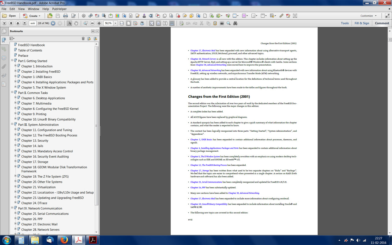
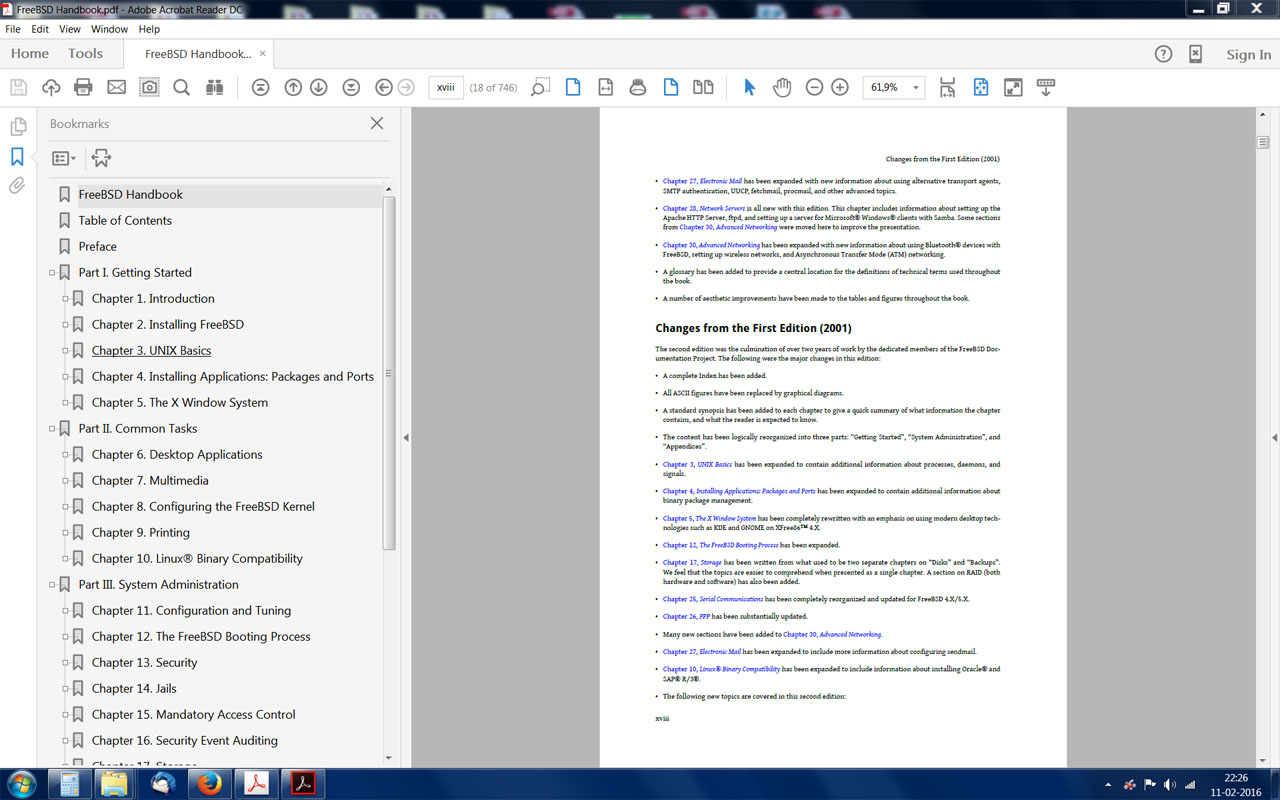
Acrobat DC is completely unsuitable for graphic professionals who spend a lot of time looking at a computer screen. The background is too light. In fact, the whole interface is too light and does not make an adequate contrast with the documents. Also, the new buttons and tabs occupy too much screen space. The bookmarks are also too big, with only a few fitting the window height. I include an example of the same document on the same computer screen. Please note that the 11 version even has a row with additional tool icons. This is on a 1920x1200 screen. In screens with lower numbers of pixels you can fit even less tool icons on the screen! And just look at the ridiculous space the exact same bookmarks now take on screen.


In sum: the new one looks like a toy. I fear that our once beloved Adobe will go the way of Microsoft and such. It certainly does not seem to care for its customers' needs as it once did, now it all seems a matter of the fashion of the day. There are incomprehensible bugs and inconveniences for the user that have stayed there for years without being corrected. It's a shame. Would it be so difficult to put Acrobat Pro on a par with, say, InDesign or Photoshop? Would it be so difficult to let the users customize the interface color and appearance? This way, everybody would be happy. There are a lot of professionals that use desktop computers or notebooks for their work, not everything is phones, tablets and touch screens in general!
We recently purchased two licenses for Acrobat Pro. We insisted that those licenses be for Acrobat Pro XI and we obtained it. We intend to purchase three more licenses for another department, and if it is not possible to obtain the licenses for version XI we will simply postpone the purchase and hope that Adobe will come to its senses. Or else look around the competition for a proper professional PDF editor. Please Adobe, do something about this!
Find more inspiration, events, and resources on the new Adobe Community
Explore Now