


Copy link to clipboard
Copied
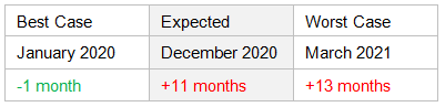
I read that symbols like the minus and plus signs may not be read as such by screen readers. I have a large number of table cells with entries such as "+1 month" and "-2 months" and the author does not want to change the tables. Because of this, I plan to add alternate text. These minus and plus numbers are best, expected, worst case scenarios from a milestone.
- Would it make sense to have the alternate text be, for example, "minus one month", "plus 11 months"...? Or should I write something like "one month early", "11 months past"...?
- The author wants to keep the red and green text and I plan to increase the contrast based on a color contrast checker. Colors seem like a nice-to-have, but not necessary to convey information difference, so I am not pushing for a change. Would I be shortchanging red-green colorblind users?


Copy link to clipboard
Copied
- on plus and minus signs:
If a screen reader (whether due to the way it is implemented or whether due to the way it is configured by its user) does not present minus or plus signs, that is a shortcoming in the screen reader (or its setup), and needs to be fixed in the screen reader (or its setup).
Just think about minus or plus signs in a spread sheet application (such as Microsoft Excel). Would anyone really begin to request that each and every plus or minus sign in a spread sheet gets some extra help from a mechanism like alternate text?
- on colored text:
for sighted users (excluding certain groups of color blind users) having the text in your example in red or green does help them access the content faster and more reliably. As long as everybody else has a means to also get to the content, the coloring does not hurt (at least as long as contrast against background is sufficient, and as long as the text does not refer to such text as 'green text' versus 'red text'). Taking accessibility into account should avoid reducing usability for some (even if not everybody can benefit from such aspects in the same way).
Just my 2 cents...
 5
Replies
5
5
Replies
5
Copy link to clipboard
Copied
- on plus and minus signs:
If a screen reader (whether due to the way it is implemented or whether due to the way it is configured by its user) does not present minus or plus signs, that is a shortcoming in the screen reader (or its setup), and needs to be fixed in the screen reader (or its setup).
Just think about minus or plus signs in a spread sheet application (such as Microsoft Excel). Would anyone really begin to request that each and every plus or minus sign in a spread sheet gets some extra help from a mechanism like alternate text?
- on colored text:
for sighted users (excluding certain groups of color blind users) having the text in your example in red or green does help them access the content faster and more reliably. As long as everybody else has a means to also get to the content, the coloring does not hurt (at least as long as contrast against background is sufficient, and as long as the text does not refer to such text as 'green text' versus 'red text'). Taking accessibility into account should avoid reducing usability for some (even if not everybody can benefit from such aspects in the same way).
Just my 2 cents...
Copy link to clipboard
Copied
Very good points—thank you.
Thinking more about the plus and minus signs, I see the logic. I've read a bit more and found that some screen readers may not read plus and minus signs by default, but the user could change that so that those signs are announced. That may not be true of every screen reader, but as long as I've tagged to meet standards (and there is no client special request), it would be fine without the additional alternate text.

Copy link to clipboard
Copied
Agree with Olaf. It's generally a problem with the screen reader or the user's settings.
But another factor is which character (or glyph) was used to indicate the minus sign. If the keyboard's hyphen was used (top row to the right of the zero key), then the hyphen won't be voiced to the user: most screen reader default settings don't announce hyphens. Think of them as silent. And artificial intelligence isn't really intelligent enough at this time to figure out that you mean a minus, not a hyphen in your table.
In your screen capture, they look like hyphens, not true minus symbols (they're short). Change them to the universal Unicode minus symbol and they should be voiced correctly. Minus sign = Unicode 2212.
You can find it through InDesign's glyph panel. And you can globally replace it in your file via find/replace.
Hope this helps.
| PubCom | Classes & Books for Accessible InDesign, PDFs & MS Office |
Copy link to clipboard
Copied
You were right, they were just hyphens. That’s a good catch. 
Copy link to clipboard
Copied
Just a few aspects to take into account:
- the Unicode code point U+002D is defined as "hyphen or minus"
- when using a character with a Unicode code point of U+2212 ("minus sign"), such as in "−123"
- in Microsoft Excel (I tried an older version - Mac 2011), OpenOffice Calc (I tried v4 from 2015) or a Google Docs spreadsheet the value will not work as a number anymore, and calculations (or creating charts) will cease to work
- in Apple Numbers "hyphen or minus" and "minus sign" seem to be working equally well
- in programming code (JavaScript, C++ or whatever) it will not work as a minus sign
- it is difficult for most users to enter a "minus sign" (do you know how to you enter it on a smart phone ot tablet?)
- how many people will you be able to train over time to use a "minus sign" over a "hyphen or minus" sign?
- how useful is it when a user relying on assistive technology (or even just about any user) will copy a piece of text "-123" into his favorite spread sheet program or source code editor and find it doesn't work?
Given that most text to speech technologies have figured out when to present either a hyphen (by typically not voicing it) or a minus sign (by voicing 'minus') I consider it to be a waste of time/resources/energy to insist on using U+2212 ("minus sign") for minus signs, and even detrimental in many important circumstance.
Go with the flow (there is a reason U+002D is defined as "hyphen or minus"), and let technology (and the engineers behind it) figure out to support users in the best possible fashion. Use your time/resources/energy for really important stuff.
Just my 2 cents...

Find more inspiration, events, and resources on the new Adobe Community
Explore Now
 AdChoices