

- Home
- Acrobat
- Discussions
- Re: Baskerville font changes when exporting from W...
- Re: Baskerville font changes when exporting from W...
Baskerville font changes when exporting from Word using Acrobat PDFMaker

Copy link to clipboard
Copied
Hey,
When I export using the Acrobat Word plugin (not the export to PDF Word native function), my Baskerville font changes pretty substantially.


The first is in Word, the second is in Adobe. The second is much more pixelated. Any sense of why? I exported using Press Quality.


 5
Replies
5
5
Replies
5

Copy link to clipboard
Copied
It would help us greatly to assist you if you provided the following:
(1) Information as to platform (Windows or MacOS), version of Microsoft Word, and version of Acrobat.
(2) Posted copies of the above sample document as well as the PDF files (both from Microsoft and PDFMaker). You can't post attachments here, but you could point us to where you have posted the files online. (Hint: Acrobat provides a mechanism for posting files).
(3) Information as to exactly which “Baskerville” font you are using. Type 1, TrueType, OpenType CFF?
- Dov
Copy link to clipboard
Copied
Windows, Word 2016, Acrobat DC.
Copy link to clipboard
Copied
I got your files (see attached), but both the files match in layout exactly. And the original Word document is not formatted with Baskerville, but rather with Microsoft's Georgia font. Perhaps you uploaded the wrong files?!?!?!?
- Dov
Copy link to clipboard
Copied
Whoops, quite right on the Georgia. Reattached http://ge.tt/4XunlJp2
Maybe it's my screen? But the second font (the PDF) seems more grainy (but also darker).


Copy link to clipboard
Copied
Good news and bad news…
I've downloaded both your Word document and the PDF file you created from same. I also created a separate PDF file from your Word document.
On my Windows 10 system with Word 2016 and Acrobat DC, there is no visual difference whatsoever between the rendition of the text between what appears in Word's document window versus what I see in either of the Acrobat windows.
However, my display is a professional 4K, very high resolution monitor.
There are two issues here that play into display issues:
The first is your selection of font. In general, Baskerville is an exceptionally difficult font to use on screen. It has exceptionally thin lines and delicate features that are even challenging for high resolution offset printing, much less screen display.
The second might be the preferences you have set in Acrobat for screen display.
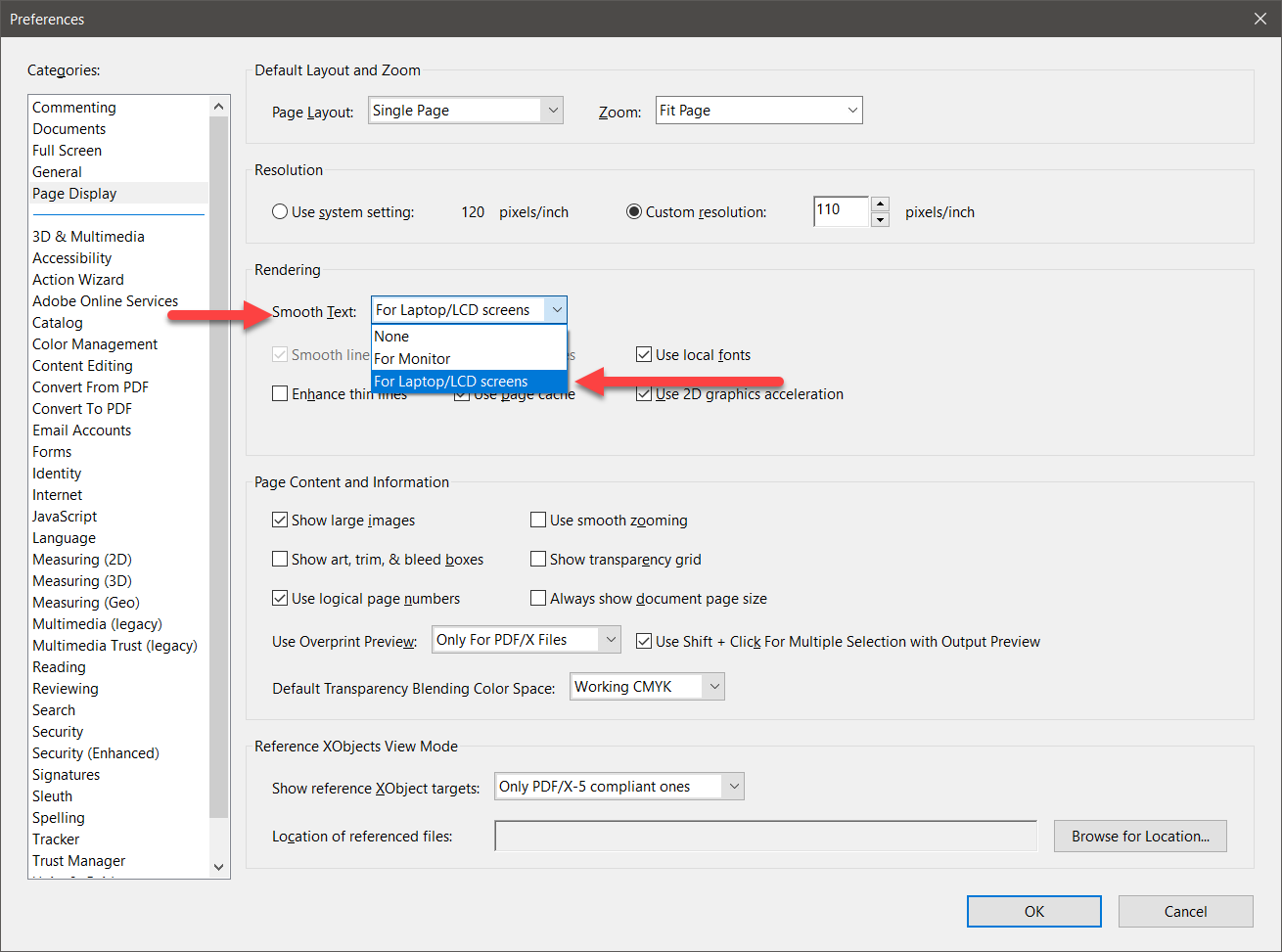
Under Preferences, select the Page Display category. Under Smooth Text, make sure you select For Laptop/LCD screens and press OK. If Smooth Text was set for None, I can indeed see some graininess/jaggedness in the rendition of the Baskerville text. On a lower resolution monitor (which you probably have), that graininess/jaggedness would probably be much worse.
Bottom line is you should try adjusting the Acrobat preferences but in the more general case, select a font that is far better-suited for screen display and even digital printing on devices less than 1200 dpi.
- Dov

Get ready! An upgraded Adobe Community experience is coming in January.
Learn more
 AdChoices