Copy link to clipboard
Copied
Adobe needs to make the enhance thin lines option a document specific property; like initial view magnification or layout.
Too often does this view preference cause elegant subtle lines to be viewed as bulky eye sores. As a designer when I set a line weight at .25 pt or .125 pt, That's the line weight I want it to be viewed at! on screen or on print. It does not make sense to need to ask clients to change their adobe acrobat preferences to uncheck enhance thin lines off, so that they can view a document properly.
.PDF documents need to have the ability to be initially viewed with the enhance thin lines option unchecked.
Who's with me? How do we get adobe to make this important change?
Copy link to clipboard
Copied
>I recognise that as programs evolve they optimise for different types of users.
>My preference would be "Not to have" the Enhance thin lines option.
>
Exactly. For you, you'd like it not to do that. For other users, they want it to happen. That's why it's a preference ![]()
FWIW: That setting was created to work around a problem in some 3rd party PDF creation applications for office-class applications where the lines of a spreadsheet or table would disappear when viewed in Acrobat becuse they were "too thin". Given that were more of those out there than 'outlined text'-based PDFs, we set the defaults to match the more common case.
As to issues with Illustrator' PDF export - I am not aware of any problems with text export in that application. If you know of a thread or a specific bug number, I am happy to investigate.
Copy link to clipboard
Copied
I am also running into this issue, and there is a bug with this "feature" that causes undesired results. I am generating PDFs from HTML using Qt and Webkit, and tables with thin borders experience the issue others above are bringing up.
The major issue here is that the feature behaves differently depending on the color! Thin black lines are actually improved by the "enhance thin lines" feature, however any variation of gray renders completely differently.
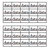
This is how my test html page renders in Google Chrome. The top table has 1px borders colored #000000. The bottom table has 1px borders colored #010101.

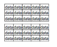
Using the open source wkhtmltopdf, I convert this to PDF. This is how it looks with "enhance thin lines" off at 100% zoom.

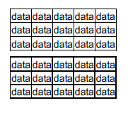
And again, with "enhance thin lines" on at 100% zoom.

This feature actually seems to work really well for the top table, as those lines look much nicer than with the feature off, however anything but "standard colors" renders horrendously. What I mean by "standard colors" are the 8 colors you get when the R, G, and B components are either #00 or #FF (i.e. #FF00FF works fine but #FF00FE does not). Those colors render perfectly fine (in fact better with the "enhance thin lines" turned on), but the slightest deviation from those colors yields unpredictable behavior.
Copy link to clipboard
Copied
Thanks so much for sharing that article, thin line. I was able to find a workaround based on it. I turned all of my lines from being a path specified by stroke weight to being shapes of the same width as the stroke. I did this by selecting all the problem paths and doing a Flatten Transparencies on them. Thanks again!
Copy link to clipboard
Copied
I strongly believe that the line enhancement should be a preference that can be saved with a document by the author. I imagine the preference can be split into two in the user preferences panel: a global default that's used when one isn't specified by the document, and another one to optionally override the document-level preference set by the author. When Acrobat is first installed, the global default would be set to enable the thin line enhancement, but the document-level override would not be selected. This would satisfy a lot more people; most end users wouldn't know the difference since their office applications/spreadsheet outputs would be unaffected, and those of us with technical illustrations, etc. could share PDFs without having to tell everyone to disable this preference manually.
The workaround for converting strokes to outlines can require a lot of extra work and increases the file size needlessly.
I have two examples where line enhancement is highly undesirable: grid lines on graphs and hatching on CAD drawings. These elements make the graphic look terrible at lower zoom levels with enhancement. In these cases, it's highly preferable that the thin lines disappear/fade rather than be enhanced.
I may be mistaken, but it seems that Acrobat Reader for Android doesn't implement thin line enhancement at all, or at least does so much more intelligently.
Copy link to clipboard
Copied
Another example where thin line enhancement looks awful is vector logo designs that contain rectangles (often as the letter I or L). If you have a small logo in the corner of the document, it makes the logo look unbalanced and wrong. Granted, this is easier to fix manually than the issues you list (by adding points to the vector or slightly modifying the rectangles to be imperfect) but this shouldn't be necessary.
Copy link to clipboard
Copied
Acrobat reader must be the worst PDF viewer nowadays. I've tried 4 different PDF viewers and they all displayed PDF generated with wkhtmltopdf exactly as intended, but not Acrobat.... It has to "enhance" everything to look as horrible as possible. Here are some pictures of exactly the same PDF rendered by Foxit Reader and Acrobat Reader.
Foxit Reader
Acrobat Reader
Copy link to clipboard
Copied
Without seeing the PDF in question – it’s impossible to actually compare the results and determine which is actually more correct according to the spec.
However, the general issue is simply what to do with values that are not on even “pixels” (eg. 0.5)…The PDF Standard (ISO 32000-1) does not give specific guidance (on purpose!) nd you will find that pretty much everyone who has ever written a graphics engine has their own preference on the topic.
Copy link to clipboard
Copied
I can send the PDF in question to you personally if you can give me your email.
I know that Foxit Reader (and all the other PDF viewers) renders the PDF in question correctly because I know how html which was used to produce the PDF using wkhtmltopdf is rendered in Chrome browser.
The top border (the one in the header) is supposed to be exactly 1 pixel and that's how it's rendered in Foxit reader. Your "enhance" thin lines feature makes at least double, if not triple the size.
Also, as you can see in the image I posted, Acrobat reader is unable to render dashed line in the line graph. I don't think that's related to half pixels either...
Copy link to clipboard
Copied
You can send it to leonardr@adobe.com<mailto:leonardr@adobe.com>
If Enhance Thin lines impacts the rendering, then it is because the line width is < 1 PDF user unit (which is not pixels or points, as the web understands it).
Copy link to clipboard
Copied
Here to complain about the same thing. Acrobat is so commonly used that I end up compromising a good number of my designs to work around this feature. It's costly in time and research (as the user has no immediate way of knowing why their lines have been bastardized), and I'm going to be real with you, there's a way for us and the thine-line graph puppet masters you supposedly made this feature for to be happy. Make it a document preference that's enabled by default. Then us smarter folks can switch it off when we have to make stuff with subtle lines.
Copy link to clipboard
Copied
Can't believe its 2018 and we're still having this conversation.
Adobe is a creative set of tools, and one of its own tools for showing off said creativity is breaking the designs of the paying creatives.
Reading this thread is frustrating, as Adobe's only answer seems to be 'well, some people like it so we need to keep it on by default'. This is the wrong way of looking at it; Adobe have a considerable amount of paying users for whom this 'feature' (read: BUG) is making their working lives a nightmare / the program unusable. This should mean that Adobe are working hard on ways to resolve the issue.
From a personal point of view, asking all clients to adjust their preferences before viewing any artwork is frankly ridiculous.
As afrophysics has said above; the obvious solution is to set this preference at DOCUMENT level. Enable it by default if you really have to, but at least this would allow us to have control over how the end user will be viewing our artwork.
Copy link to clipboard
Copied
The world has moved on substantially. Most PDF files are no longer viewed with Adobe software. An Adobe specific preference wouldn’t affect most of them.
Copy link to clipboard
Copied
Hi,
I had the same issue with my PDF files, especially with a company logo that contains vectorized text.
I'm a programmer and I found a way how to fix it. I created a program that can modify PDF files in a way that Acrobat Reader can't recognize vertical and horizontal lines and cannot "enhance" them.
I made it available online, so anyone can "repair" his PDF files for a very small fee.
URL for third party commercial service removed by moderator.
I hope it will help someone.
Copy link to clipboard
Copied
The problem is not necessarily limited to vertical and horizontal lines.
-
- 1
- 2
Find more inspiration, events, and resources on the new Adobe Community
Explore Now