Copy link to clipboard
Copied
In
My check boxes overlap and are periwinkle blue, why????
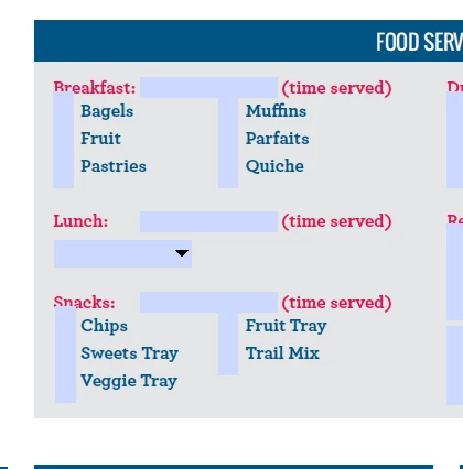
In 10 and versions before looks correct
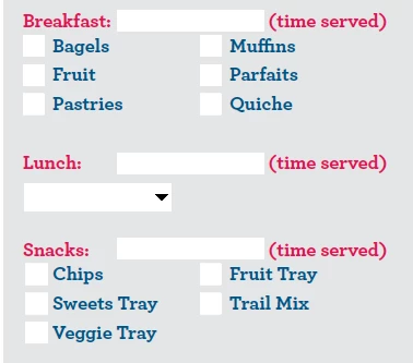
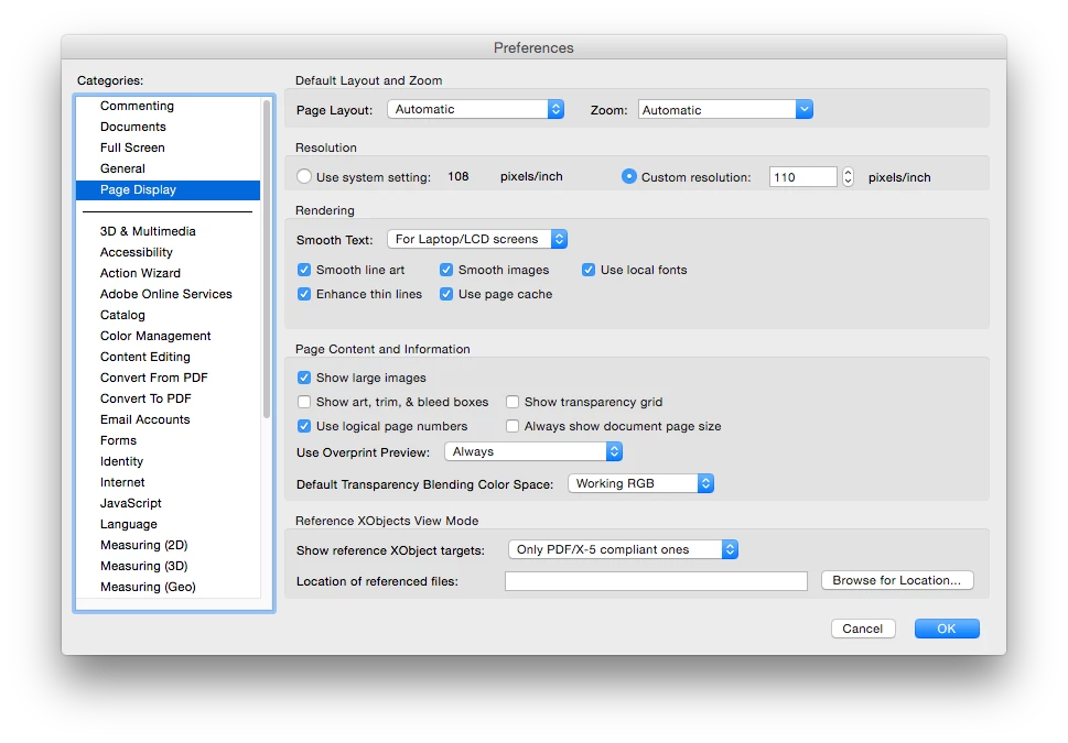
Cannot find a setting problem here
Acrobat DC seems to be cumbersome in editing forms so will use 10, but cannot control what my audience uses.
Go to Edit - Preferences - Forms and tick off "Highlight form fields". It's exactly the same as in older versions, I believe.
Copy link to clipboard
Copied
Go to Edit - Preferences - Forms and tick off "Highlight form fields". It's exactly the same as in older versions, I believe.
Copy link to clipboard
Copied
Thanks that fixes the DC problem. One more if I can ask so similar but entirely different cause.
You can see the problem in form editing mode (18,19,20 show as white background.)
But I see nothing different in properties. I am making my pdf forms in InDesign first, so not sure why the boxes get taller than i originally made them on check boxes. I believe this may've to do with 18 overlapping 15.
Copy link to clipboard
Copied
I would recommend not creating the fields in InDesign. It creates problematic fields, unfortunately.
Create the layout in ID and then add the fields in Acrobat.
Copy link to clipboard
Copied
Is so much easier to start forms in InDesign do not think I could go back to the old way. In InDesign you lock on all your field names, list box options, etc, so makes revisions so much less time consuming.
Were we not able it past versions of Acrobat to numerically change the size of form fields in Acrobat. Maybe that was on windows, as I am on Mac now, but I remerge right clicking to get a formatting pallet and x, y w, & H were there.
Copy link to clipboard
Copied
One problem with InDesign, particularly with checkboxes, radio buttons, and push buttons, is that it allows you to create custom field appearances, which isn't event possible in Acrobat (except for buttons, but in a different way). When field highlighting is active in Acrobat/Reader, these custom appearances don't display correctly since the method Acrobat/Reader uses makes assumptions without considering these non-standard appearances, so it can become a mess.
While it is very convenient to create the fields in InDesign since it has things like smart guides and other convenient means that help with layout, it is also problematic since you can't specify all of the field properties like you can in Acrobat. This is a problem if you need different field properties, then make the changes in Acrobat, and then make a change to the source document in InDesign and export an updated form. You then have to redo all of these changes that were previously made in Acrobat. Scripting in Acrobat can help out a lot (e.g., setting the font for all text fields), but it gets more cumbersome if the form uses scripting, among other things. As try67 mentioned, there can be odd problems with fields generated by InDesign.
There are some little used/known features of Acrobat that can help a lot with laying out fields, including the not very well document keyboard shortcuts that were introduced with Acrobat 11, as mentioned in this other thread: Acrobat XI switch between form design & form view
Copy link to clipboard
Copied
Thanks for your reply George. InDesign allows me to come in under budgeted amount of hours on forms design jobs as is so much quicker to do major design revisions, with my fields names, descriptions and attributes intact.Changing the fonts again is annoying in Indesign, but this works faster and cleaner for me than edit page in acrobat to go into Illustrator. Thanks for the shortcuts did not know those.
Is there a formatting palette in Acrobat, that allows you to numerically see & edit the width, height, X & Y coordinates? There used to be one altos on PC version, and I am on Mac now. That would help as visually correcting the height of boxes is prone to error and takes longer.
Copy link to clipboard
Copied
The forms preference that controls field highlighting is the unfortunately labeled "Show border hover color for fields", as opposed to "Highlight form fields" which would make a lot more sense.
Copy link to clipboard
Copied
Yeah, it's not very good wording... For starters, it has nothing to do with "hovering". The highlight color appears all the time, not just when you hover with the mouse above a field.
Copy link to clipboard
Copied
Would make sense for that to be off by default, as this will create problems for the average person filing out a form.
Copy link to clipboard
Copied
Why is that? It shows them where the fields are located... It's not a bad setting, only a bit difficult to locate.
Copy link to clipboard
Copied
On my 2nd screenshot, how does someone know where to click to mark a checkbox, or that those even are checkboxes?
For someone who may be seeing this form the first time, would probably scare them away and think the form is not functionable.
Copy link to clipboard
Copied
The fields are overlapping so they look weird, but if they didn't it would be quite clear. Anyway, that's a personal preference, I guess.
By the way, it's possible to embed a script in your file that will disable this highlighting, but it will affect all other files as well, not just your own.
Copy link to clipboard
Copied
Thank you try67, will do a search for that script.
Copy link to clipboard
Copied
The script itself is very simple. It's just:
app.runtimeHighlight = false;