

- Home
- Adobe Color
- Discussions
- Thoughts on the site re-design from the Kuler team
- Thoughts on the site re-design from the Kuler team
Thoughts on the site re-design from the Kuler team

Copy link to clipboard
Copied
Today we're launching the new site and making Kuler available on the App Store for iOS. We've worked really hard to make Kuler easier to work with and accessible on all your devices. And, we have a lot more planned. So, let us know what you think.
If you are an active Kuler user, you may notice a few pages and features missing from the new Kuler website. I’m writing to explain what’s missing, why it’s missing, and what you can expect to see in the coming weeks and months. Here's an overview of what you won't find on the new site:
Create a theme from an image: We know many users really like the “Create from an Image” feature. Unfortunately, this feature was not ready for the new site launch. So, rather than launching a buggy or half-baked feature, we decided to take a bit more time to get it right.
We intend to add this feature to the site as soon as it’s ready. Until then, you can use the free iPhone app to create themes from images.
Color space “slider” controls: We talked to a lot of Kuler users about the slider controls. Some users like them and others don’t. The main complaint we heard was that the sliders add unnecessary complexity and take up too much space.
So, we opted to not add the sliders and err on the side of making the creation experience simple. Though, we decided to keep the “brightness” slider control since some colors spaces don’t have a brightness variable. We'd love to know what you think. You can voice your opinion here on the forum.
Change the order of colors: In our research, we found most users did not know you could re-order colors on the old Kuler site. And, it’s actually quite a bit of work to build this feature. So, rather than re-building a feature many users don’t know about or use, we wanted to hear from you first. I created an idea for this feature on the forum. Please add your vote if you think this feature should be worked on immediately.
Avatar: Most of the users we talked with about Kuler avatars were indifferent. In fact, they asked us to focus on other features first. So, that’s what we’re doing--we're focusing on some of the most requested features first.
Community spotlight and Pulse: The Community Spotlight and Pulse were beta features that never really gained any traction. So, we opted to not continue with these features.
API: We're working to rebuild the Kuler API to offer more robust capababilities. Until then, we're no longer issuing new API keys. If you already have a key and are using the API, your service will not be interupted (your key will continue to work).
We’re always looking for feedback and would love to hear what you think about any of these topics—please join the discussion here on the forum.


 113
Replies
113
113
Replies
113

Copy link to clipboard
Copied
On the topic of the color wheel's large size and obscuring the swatches:
Both the largeness of the color wheel AND the fact it obscures the swatches are detrimental to a workflow, damaging to the user experience, and interfere with Kuler's prime purpose of making accurate color combinations.
First, the largeness of the wheel occupies such a huge amount of screen space that it's impossible to see the whole screen without scrolling, even with a maximized window. Max window screen shot:
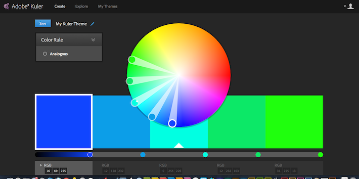
See how the hex codes aren't showing on screen? And if I use the twirly-arrow to access other color modes, they appear below the fold of the screen as well.
I understand the goal of having a larger colow wheel is for easier selection, and having it scale so large with the window size is just too much.
Next, by making it so large, and overlapping the color swatches, you are actually hurting your same goal and making it detrimental to accurate color picking. I beleive this was touched upon under a different forum topic, and allow me to explain here for consciseness.
By overlapping the color wheel with the swatches, the human eye's perception of color within the swatches are changed due to the proximity of other colors. This is called simultaneous contrast. For example, an orange swatch against the blue bottom of the color wheel is going to appear much more intense and saturated because orange and blue are complimentary colors. In fact, our eyes are "tricked" into seeing that orange as a completely different color than if that color was standing alone.
For a quick explanation of simultaneous contrast check out this link http://colorusage.arc.nasa.gov/Simult_and_succ_cont.php It has image examples and explanations.
Additionally, by obscuring half of the middle swatch with the color wheel, you're introducing some other perception problems with the percieved intensity of that color against the others. I forget this particular term at the moment, perhaps my peers can rememeber it from color theory lessons.
So by making the wheel so large, and overlapping the swatches, you are actually hurting your goal to make color picking easier. It actually causes confusion, distortion, and less precision.
My suggestion is to remove the overlap, shrink the color wheel so it fits above the swatches, and shrink the scale or create a max-size so that the whole screen can be viewed when the browser window is maximized.
Thank you for reaching out the the community for the feedback, and being very attentive in our needs for this great and valuable tool in our workflow.

Copy link to clipboard
Copied
Thank you, j post design, for putting my thoughts into a great explanation - clear and exact!
Copy link to clipboard
Copied
Thank you all for your constructive and thoughtful comments. We're looking into different adjustments that can be made on the site.
We regularly talk with Kuler users to gather feedback about designs and features (And, yes, yerbajunkie we did consult many of your peers when redesigning the site). That said, if you are interested in guiding future feature and design decisions, send me a private message with your email and I'll get in touch with you.
Thanks again for your patience.

Copy link to clipboard
Copied
I rarely make comments on public forums. However, I decided to make an exception here. I agree with the other 99.99999% who think the redesign of Kuler is a complete and utter failure. In a strange way, I find it to be an insult and I really, really miss the old Kuler which was an elegant tool that I used regularly, introduced to others and had planned on introducing in a publication related to design for academic presentations and posters (not anymore).
As someone else said, I can be resistant to change. I, however, acknowledge that failing in myself and will make it a point to reserve judgement as I explore new interfaces and features. This time, though, I can unreservedly say that the problem lies not with me, but with the redesign.
Hugely disappointed!

Copy link to clipboard
Copied
I actually like change, if it's good change.
But having said that, I agree that the current kuler site design is too simplistic, toy-like, and sadly lacking. Things it needs: A color picker that includes Saturation without having to go to another control, Getting colors from images, How to change the NAME of a color set (I can't DO it!), and most of the other comments listed in this thread. :+)
The idea of a central color-set resource (via web) is fabulous! But so far I've only found the web-kuler panel in Illustrator. Why not Photoshop, InDesign, Premiere, After Effects, etc. as well? But before you do that, please redesign the site so it's actually useful to pros. :+) Actually, the kuler panel in InDesign CC is pretty good, as it has searchable categories, and a saturation picker right next to the color wheel. But I don't think this is connected to the kuler site (thankfully). It's the "old" kuler, right? Much, MUCH better!
Can we share color sets on the new site? I haven't found a way. This would be essential as well.
I think Adobe really missed the mark here so far. In its current form, I won't be using kuler.adobe.com at all. Building swatch sets is the way to go for me.

Copy link to clipboard
Copied
I appreciate that you are actively working on Kuler. Here are a couple things I noticed with the new design. When you are browsing themes and find one you like and click it there is no easy way to get back to where you were. It would be nice to have an X in the corner so you can close and keep browsing where you left off. The second thing I noticed was that you can't rate a theme unless you go into it. Combined with the fact that you can't close and resume browsing it discourages people from leaving feedback and ratings. Hope that helps.
Copy link to clipboard
Copied
@RogerAasheim
Thanks for posting. Great feedback about maintianing browsing context. We're looking into that one.
Regarding ratings, this is an interesting topic--with many different points of view. I'll share my view: We heard from many users that ratings were not ideal because they introduced some negative feedback. Some users, for instance, give themes 1 star just to be malicious. While favorites, on the other hand, allow you to express positive feedback. And, if you don't like something, you simply don't favorite it.
So, for this reason, we opted not to add ratings on the explore page. Instead, we added the ability to favorite themes.
Hope that makes sense.

Copy link to clipboard
Copied
I feel like the new color wheel and swatches are so huge... I can't get a feel for how the colors work together because it's so in my face - I'm literally backing away from my monitor to get a better sense. I like how they're bigger than the previous site but I'm thinking this is a bit too much... Like others, I also don't like the color wheel blocking the pallet. The whole purpose of design is... visual, so things need to be visable so we can see them in their entirety and plan our work accordinlgy.
I'm also missing the "from photo" feature and look forward to its return (along with the options to choose muted, bright, etc.).
Reordering the swatches is a nice option and I think the reason people didn't know it was there is because the interface didn't make it clear (I discovered this feature within my first few hours of using the old site but only because I played outside the obvious boundaries). I think the fact that people aren't aware of the feature is more indicative of gaps in the interface than it is of the usefulness/interest in the feature.
I do like how it feels a bit cleaner and easier to find buttons and options so, overall, I like the new layout - just some tweaks and enhancements needed, I think.

Copy link to clipboard
Copied
I understand the reasoning behind making the color wheel bigger for accuracy, but placing it on top of the swatch squares is not the solution. Can we at least have the ability to resize it? Can it only cover the swatches when you are manipulating it then shrink down? Can I have a button to click to downsize it so I can view the swatches unbostructed? Please reconsider this.
Also, how exactly are we suppose to edit and save new swatche sets made from previously saved swatch sets without losing the original swatch set? When I edit a saved swatch set and rename it, I lost the original swatch set I started from. I'd like to keep both the original saved swatch set and the new edited one. Can we at least make a duplicate? I thought I could rename the saved swatch set I was editing and that it would save both the original and newlery renamed. I was wrong and lost the original swatches I started with.
Why did the sliders need to be taken out? Couldn't they still be there hidden and then shown via a drop down? Why completely remove a feature that many did use just because some didn't use them?
Copy link to clipboard
Copied
@benmp: thanks for the feedback. I'm taking note.
There is a workaround for creating a duplicate theme. It's not as easy as before (I'll see if we can fix that). But, it works. Here's how:
(1) Click edit on an existing theme.
(2) Make your edits on the color wheel. (note, all your edits are recorded in the URL)
(3) Copy the URL and paste into a new window.
(4) rename the theme to whatever you prefer.
(5) save.

Copy link to clipboard
Copied
Aha,
Thanks ! This was the problem I meant before (post 9), I'm glad there's a workaround.
Copy link to clipboard
Copied
I just created 2 themes - the first one was a major change from an existing theme - I was able to rename it and it then shows up as "my theme" - then, I took a theme of mine I created several months ago, changed it alot, renamed it, and it still shows April being the date of creation - I was experimenting, and apparently if you are starting with an old theme of your own, you have to copy the url and paste into another window.
If you are copying a theme that belongs to another person, you can rename it and claim it as your own - if anything, I would prefer copying another person's theme and not being able to rename it (remains as "copy of....."
Once again, just checking out what can be done and what can't - just wanted you to be aware of this.

Copy link to clipboard
Copied
Hello, Dave! It was nice meeting you in real life at Adobe MAX, thanks for reaching out to the community!
The kuler faq does not state anymore that the kuler panel is not available in the french versions of Photoshop, did the situation evolue in that matter?
Copy link to clipboard
Copied
@PECourtejoie: great meeting you as well! No, the panel is still not available in French. Sorry. 
Copy link to clipboard
Copied
That's what
I thought, maybe should it then be re-written in the FAQ, unless I missed it?

Copy link to clipboard
Copied

Copy link to clipboard
Copied
HELP!!! I need the "create a theme from an image feature"! Is there a way to do this? Some other source?? anything???
I'm new to this world of color (currently in school) and I was introduced to Kuler by my instructor several months ago. I use it for every project and the most important feature to me is missing....and I'm in the middle of a project where I need this feature.
Copy link to clipboard
Copied
Hi Brad, if you have access to a computer with Adobe Photoshop you can use that to choose colors from an image. It's as simple as using the eyedropper tool. I can give you step by step directions just let me know.
Copy link to clipboard
Copied
Great! I can use the eye dropper. If there is a way to make themes I'd appreciate instructions?
I consider myself anti-artistic. I liked the 'create a theme from an image' tool because it did all of the creative work for me. I don't believe that creativity is something that you can learn...and I wasn't born with it so I need help.
Copy link to clipboard
Copied
Open your image in Photoshop and use the eyedropper to choose a color. You will notice a little color window in the upper right corner of Photoshop, it displays the RGB values for the color you selected with your eyedropper. Write those values down and open the Kuler website. In Kuler create a custom theme and use those numbers you have written down for the colors. Rinse and repeat until you have all the colors you need for a theme. Hope that helps!
Copy link to clipboard
Copied
You can also add the color(s) to the "swatches" in photoshop - I'm attaching what you would click to do this - keep in mind I have CS4, so I don't know what the newer ones have, but my guess is the features are the same.

Copy link to clipboard
Copied
Thanks for suggesting a workaround (albeit painful) for the Create Theme from Image function. I use (or used) it all the time in design school, and so do the other students. As far as I'm concerned, it is Kuler's #1, most important, can't-do-this-easily-elsewhere function. Adobe actually disabled this #1 feature and instead did a new look and feel for a site that already looked good?? Are you kidding me?
Regarding the new look and feel: I realize no matter how nice a new site design is, most people just don't like change and so they will complain. Also, the service is free, so really people shouldn't be complaining. That said, I agree with the others that said it is so overly simplified that it looks like elementary school and no longer looks professional (plus all the other complaints). Has it occured to Adobe that there seem to be NO positive comments here? I know you ran the new design by a panel of reviewers, but they do not seem to have been fully representative of your average users. Or perhaps it was the WAY it was run by them, e.g., I've seen a lot of well-meaning user tests that didn't test the overall UI experience, only discrete portions, and consequently those products failed.

Copy link to clipboard
Copied
I am really dissapointed in the new site- I find it even harder to use, more confusing and quite frustrating. I use Kuler quite often and I study at a design college. There are many of us students that are Kuler fans! But soon to be dissappearing elsewhere!!! Please bring back the old site?

Copy link to clipboard
Copied
I strongly agree with other commenter's -Please remove the color wheel/theme overlap or if you need to be trendy as opposed to practical maybe just a tiny overlap?!
Also, when returning to themes after commenting or rating you have to start all the way back at the top and can't remember where you were. Something like Google's image search page perhaps?
Otherwise I'm lovin' it!!

Copy link to clipboard
Copied
PLEASE PLEASE go back to the old Kuler. So dissapointed. I use this site VERY often in the design work that I do. The text on the site itself is horrible. Very hard to read. Not sure what's up with that, I am currently using Chrome to view the site.
Find more inspiration, events, and resources on the new Adobe Community
Explore Now
 AdChoices