

- Home
- Adobe Color
- Discussions
- Thoughts on the site re-design from the Kuler team
- Thoughts on the site re-design from the Kuler team
Thoughts on the site re-design from the Kuler team

Copy link to clipboard
Copied
Today we're launching the new site and making Kuler available on the App Store for iOS. We've worked really hard to make Kuler easier to work with and accessible on all your devices. And, we have a lot more planned. So, let us know what you think.
If you are an active Kuler user, you may notice a few pages and features missing from the new Kuler website. I’m writing to explain what’s missing, why it’s missing, and what you can expect to see in the coming weeks and months. Here's an overview of what you won't find on the new site:
Create a theme from an image: We know many users really like the “Create from an Image” feature. Unfortunately, this feature was not ready for the new site launch. So, rather than launching a buggy or half-baked feature, we decided to take a bit more time to get it right.
We intend to add this feature to the site as soon as it’s ready. Until then, you can use the free iPhone app to create themes from images.
Color space “slider” controls: We talked to a lot of Kuler users about the slider controls. Some users like them and others don’t. The main complaint we heard was that the sliders add unnecessary complexity and take up too much space.
So, we opted to not add the sliders and err on the side of making the creation experience simple. Though, we decided to keep the “brightness” slider control since some colors spaces don’t have a brightness variable. We'd love to know what you think. You can voice your opinion here on the forum.
Change the order of colors: In our research, we found most users did not know you could re-order colors on the old Kuler site. And, it’s actually quite a bit of work to build this feature. So, rather than re-building a feature many users don’t know about or use, we wanted to hear from you first. I created an idea for this feature on the forum. Please add your vote if you think this feature should be worked on immediately.
Avatar: Most of the users we talked with about Kuler avatars were indifferent. In fact, they asked us to focus on other features first. So, that’s what we’re doing--we're focusing on some of the most requested features first.
Community spotlight and Pulse: The Community Spotlight and Pulse were beta features that never really gained any traction. So, we opted to not continue with these features.
API: We're working to rebuild the Kuler API to offer more robust capababilities. Until then, we're no longer issuing new API keys. If you already have a key and are using the API, your service will not be interupted (your key will continue to work).
We’re always looking for feedback and would love to hear what you think about any of these topics—please join the discussion here on the forum.


 113
Replies
113
113
Replies
113

Copy link to clipboard
Copied
I too used the old site VERY often. It looks cool, but not half as useful.

Copy link to clipboard
Copied
A lot of people seem to be having a difficult time naming their themes so you are getting a lot of "theme 1", "theme 2" etc. It needs to be more intuitive or mandatory to name it cause if we are searching for a theme by name we will be in trouble.
Copy link to clipboard
Copied
@Boyd - themes named "theme 1", "theme 2", etc. are being created from the new iPhone app. And, we're looking into various ways we can encourage them to provide more meaningful theme names.
Thanks for the comment.

Copy link to clipboard
Copied
Did you really get designers opinions before you started developing new kuler app?
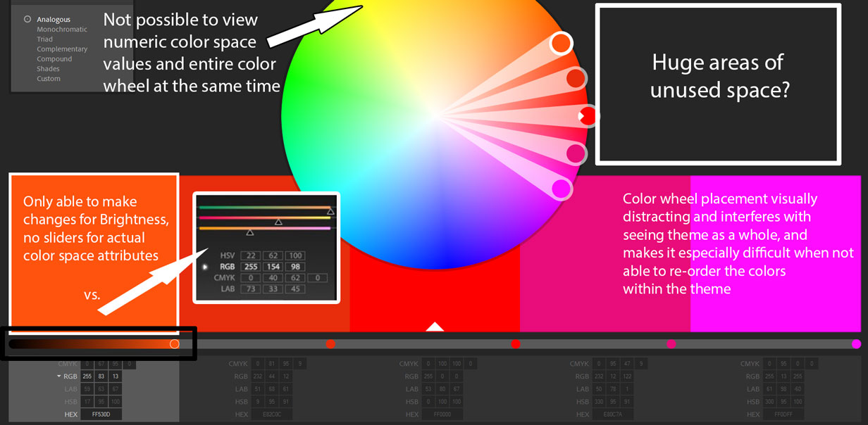
Create scheme from image, color dashboard etc. - all has been covered. I'm going to whine about the color wheel being in the way of the color scheme (squares) and why frames are bad.
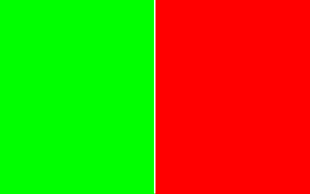
First, a picture:

Above you see a part of a screenshot of the new kuler main page with color values pasted into it. The colors of the scheme being designed is what a designer wants to see. Proportions of color blocks are one important thing to keep in mind. How the colors act against each other is the second. Both is missing from the new kuler: I don't just see red #ff0000 act against darker red #e82c0c, I see red covered by a changing color wheel and acting against the frame of the wheel in dark red #cc0000 and blue #0532ff. That's too much, it's disturbing - it's actually so disturbing that I've stopped using kuler. Similar, I can't just concentrate on the bloody red and dark red - because of the thick white border. If I wanted to see the flow the colors are making whet they pass on to another - I can't, because of the border.
More on borders: In the first pic you see two colors acting against each other. In the second pic you see one color not acting agaist the other... but against a thin frame of white. I understand a programmer is not a graphic designer, but I'm sure the difference is clear. Those are the nuances that designers are dealing with and the redesigned kuler ruined the experience...

I understand that Adobe is a huge company with a lot of ambitious people just waiting for their chance to shine, but releasing a half-made app (without create from image feature and with a malfunctioning scheme editing) is wrong. I,ve read that there is a work-around, but the easiest work-around is to find another app... just sayin'
Don't take it personal, you are not the company you're working in. My comment is so harsh, because I've seen an overly ambitious team ruin a wonderful product twice up close and I fear the same thing is happening to kuler.

Copy link to clipboard
Copied
My feedback
(Click to view larger)
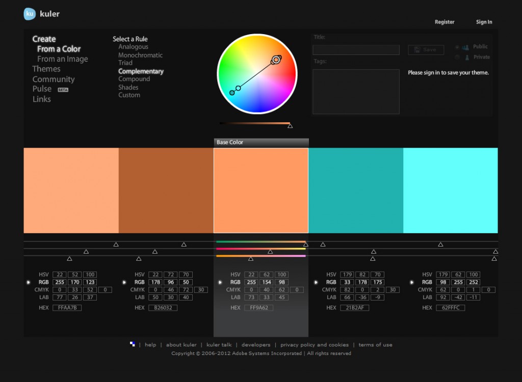
Former design for comparison

Copy link to clipboard
Copied
I am so with you.
I don't suppose it is possible to put back the old design while working on the fixing the new version?
Lisa

Copy link to clipboard
Copied
Lisa said exactly what I was thinking.
In fact, why would a company like Adobe ever release something that should be in beta and completely replace the working version?

Copy link to clipboard
Copied
I'm puzzled by the loss of the CMYK and HSB fields. At least half my work is for printing, so being able to directly enter CMYK values was invaluable.

Copy link to clipboard
Copied
Hi notarysojac, it is still possible. See answers 11 and 12 for explanation. The cmyk fields are hidden.
Copy link to clipboard
Copied
Oh, my. Who did you 'test' this re-design with, a group of six year olds? I'm a long time Kuler user. I've relied on it as a primary source of inspiration and research for years, since it was first released. If this "improved design" is what needs to happen to support an OS app or iPhone users I say "Screw 'em" please go back to the way things were.
Or, is this now Kuler Lite - a free version of Kuler? Will Adobe soon be announcing Kuler CS7 a new pay-to-play service? I have no problem with Adobe chasing every coin you folks can get your fingers on, everyone needs to make money. But please don't torcher us - just let me know what Kuler Pro or Kuler CS7 is going to cost - if it's resonable I'll subscribe.
Please consider re-instating the previous Kuler design and functionality, or announce the new pricing plan ASAP. This new site hurts my eyes.
I simply can not believe that Kuler users will find this new design better in any way.
Is this a practicle joke? Really, if it is a joke - good one, ya got me. But now please let's get back to business.
Copy link to clipboard
Copied
For those of you who are as frustrated as I am: Google "similar to Adobe Kuler". There are options. So far I like Colour Lovers: http://www.colourlovers.com/
Brad

Copy link to clipboard
Copied
From what little I've seen of the new interface, I've found it lacking compared to the prior version for desktop use. The new version appears to be an attempt to cater to all devices and platforms from one source. The result is a design that falls short of satisfactory on a desktop. This opinion seem to be a common one from those that bother to post a response to this discussion. I've never used Kuler on a tablet or phone, so I cannot comment much there.
Speed
The newer interface is agonizingly SLOW when changing between Create, Explore, and My Themes. Whatever the cause, this makes navigating a chore.
Sliders
The sliders were useful for fine adjustments. A larger color wheel does not make up for the loss of this function. Perhaps something similar to the optional method of how photoshop handles sliders could be implemented. By this, I mean click in a value field (one of the values of RGB, LAB, HSB, etc.) and then drag with the mouse to change the value (perhaps add Shift to increment larger values). Perhaps, as with Lightroom, double clicking on the name of the color mode could reset the value to the theme base (last save), or to the value prior to using the 'slider'.
Color Mode
Allow users to set a default color mode. RGB is useful for a generic default, but once a user logs in, change to their preference (CMYK, LAB, HSB, etc.). Make it easy to change the default on the fly. Perhaps, when the list is expanded, and another mode is selected, the selected mode becoms the default that shows when the list is collapsed.
Target Color
Consider using at White dot to identify the target color instead of the thick white border around the swatch. This dot could be positioned so that it is at the top of the triangle icon that represents the base color. The dot could also be added to the center of the color wheel spoke in addition to the barely visible ring.
Layout
Consider moving the color wheel to the left, and the color swatches to the right and displayed vertically, when the browser windows is scaled to tablet or phone size. As it is, there is wasted space to either side of the color values and color wheel. Perhaps this could work for desktop view as well since layout could be widescreen to fit most desktop monitors. In this case, the list of color modes/values could be shifted to the side of the swatches (instead of beneath them).
Otherwise, consider reducing the vertical scale of the color swatches (perhaps by 50%), to reduce the overlap by the color wheel.
My opinions/suggestions, for what they are worth.
-mt

Copy link to clipboard
Copied
Please - perhaps a compromise might work.
Can you add a menu item to "View in Classic Mode" that loads the archived version of the service? Perhaps restore under an independent kulerclassic.adobe.com subdomain? I'll suffer through losing the interactivity with PShop and other CC apps just to have this vital tool restored.
I'm not opposed to the new UI just to be resistant to change. The wheel is covering up the tiles big time and introducing inconsistent colors to the scheme, the ability to see interactions is taken away, and the ability to fine tune the sliders has been removed. This is a major step backwards in functionality with no new benefits being enabled other than the wheel as a crude selection adjustment tool.
I have a mild partial color deficit and so I am highly dependent upon seeing a hue number to verify that a selection I make is consistent with a reference color that I must compliment. The wheel's sliders do not constrain to a hue and if touched do not report the resulting hue.
Please provide a link to Kuler classic or give it to the community - post it as an open source download that we can use on a local webserver.

Copy link to clipboard
Copied
Ahhhhh! The new Kuler website is attacking me with color and not in a good way!!!
I used to be able to view several color schemes at a time displayed in nice small strips with wonderful black space (technically white space) around them.
I now have trouble visually distinguishing one color scheme from another as they are spaced so close together. Where did your white space go? Did it run away? I miss it.
I'm not sure if your white space is on holiday, but please tell it I miss it. I won't take it for granted in the future 
I imagine these large colors with narrow spaces are to make easy to use buttons on the ipad and ipone. This may look nice on smart phones and tablets, but I'll never know as I don't use Kuler on my iPad or iPhone and don't plan to. As a professional designer, I use desktops and laptops in conjunction with other adobe software. I use Kuler often and export .ase files to other adobe applications. I don't plan on exporting .ase files on my ipad or iphone. I understand you want to bring Kuler to the mobile crowd, but you are alienating your biggest fans—Designers. Most designers I know use Kuler on a weekly and sometimes daily basis, or at least they used to. Most designers still enjoy using a mouse or a pen and tablet and something with large processing power. I'm now worried that an update of Photoshop will leave us computer users with a watered down version of elements while they try and appeal to the mobile device crowd
Because colors have visual weight your new website is very difficult to look at. I find myself trying to zoom out as far as my browser will allow and then wheeling my chair away from my computer to the other side of the room.
Kuler, you know I love ya, but it might be time for me to start seeing other websites,
I'm off to search for your missing white space,
Brad

Copy link to clipboard
Copied
This redesign is just terrible really.
As previous posters have commented:
- The color wheel gets in the way of the swatches
- The thick borders between swatches shifts the colors
- Viewing shared themes is overwhelming and painful. Way too much color on a page. Where is the white space! My eyes are bleeding.
Next time you redesign something like this, try and make it an improvement based on user feedback, not just what your designers think is cool, really...

Copy link to clipboard
Copied
I agree. Why not use a design/build approach with the most fervent artists? The ones who actually make the palettes?
Design/build in software ensures you are meeting customer requirements. The hook for this website has been that the outside world loves it. The "guys out there" come here for inspiration. That's your traffic.
The ones who give them what they want are the artists.
Programmers need input from analysts. And in this case, they also need input from artists. Because of the nature of this product.
John Steinbeck said people don't want advice. They want consensus. I think this thread is consensus on the new design.
Copy link to clipboard
Copied
I agree that we should loose the white box around the highlighted color as it does interfere with color interaction between the color you have selected and those around it.
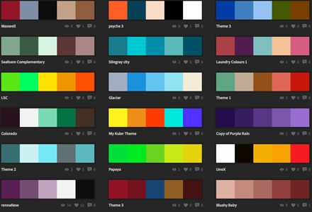
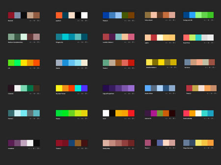
I also feel that explore makes it difficult to explore. The new explore has so little breathing room that I see all the colors as one set rather than individual themes. Here's the new explore example:
The old design allowed me to view each theme on its own terms without interference from surrounding colors.
Now here is similar to the old way (forgive the uneven spacing as I was in a rush). Suddenly don't you feel you can look at each scheme on its own even though they are in a list?
I love the breathing room.
While its nice to have continuity across devices (computer, tablet, smartphone), I would say that functionality to me is far more important. Sacrificing features and functionality for continuity across devices is a decision I hope you will seriously reconsider. I'll still recognize Kuler on my ipad and iphone by its use of color and logo. I don't plan to download the app or view it on my other devices right now as I'm unhappy with the new direction of the website.
Thanks for your time,
Brad
ps breathing room/white space/black space...Whatever you wanna call it I miss you.

Copy link to clipboard
Copied
Please go back to the old Kuler ... this version is absoluetly awful. Everything is HUGE, valuable features are left out. I understand that you want it right before launching, but please bring back the old site and do not launch a new one until everything is there. Kuler is a valuable part of my work day as a graphic designer. I am upset that Adobe would even attempt a relaunch so awful.

Copy link to clipboard
Copied
I never post but good grief! I agree with Gleaner5200 and all the others who dislike the new interface... I feel like I'm playing a Dora the Explorer Flash Game... we do not need the blocks of colors to be the actual size of the walls of our house and the color wheel for the visually impaired... I loved the old site and used the crap outta it... Please know that we all appreciate the effort because we know a LOT of programing went into this, but it truly is a giant step backward with it's lost functionality and interface. The overlapping of the color wheel on the color blocks being the biggest dissapointment... not only will it visually distort the color due to color contrasts (by the theories of Joseph Ittens and others) it just makes no sense. This actually scares the living crap outta me to see whats been done to the CC versions of the Master Suite... Obviously you won't be returning to the old site because some higher up doesn't want that, we all know how that works... but hopefully we can soon see changes that will allow us the benefit we once had...
Copy link to clipboard
Copied
For those who read comments:
WORKAROUND for Reducing the hughesness
Everything is scales with the size of your browser or device. So, if you have a big screen: Don't use kuler in fullscreenmodus. Just resize your browser till its ok.
It doesn't shrink the wheel enough and that still covers the pallette, but it's a start.

Copy link to clipboard
Copied
I got very excited about the possibilities of having Kuler available directly in Abobe Apps  . However the theory of sharing palettes goes both ways. I see no point in having this if you can't upload an abobe colour theme or swatches to Kuler or create themes and make them available in kuler to share or use elsewhere.
Does not make sense to me - I keep going to Kuler or looking up the Kuler menu in Illustrator expecting to have the option. Like surly it must be there they could not possibly not have this???

Copy link to clipboard
Copied
Wow, what an awful surprise - I pop in to put together a color scheme from a photo, and not only is that feature unavailable, the weird oversized color wheel that I thought was just some splash page image thing is actually the color wheel, and the whole interface has been dumbed down near to the point of uselessness (I'm one of those weirdos who tinkered around with the sliders for ages - fantastic for making those super subtle adjustments which I obviously can't make anymore).
What baffles me most is this new heirarchy of functions/layout. I thought that Kuler was an app for the creation of color schemes. That's the point, isn't it? In the old layout, the scheme was front and center because that was what I was making. The color wheel and sliders and stuff are merely the tools I'd use to make the scheme. I don't keep my tools on top of my projects while I'm working on them. In Photoshop, a fine application with good UI and workflow, the tools are off to the side and not perpetually obstructing my canvas. And if they do cover the canvas too much, it's not like I can't minimize or move them or take the canvas to full screen mode and leave the tools behind completely. But now, the color wheel is center stage, and seriously, once I use it to select a color, I don't care about it and want it out of the way so I can focus on the scheme itself.
So yeah... I don't want this giant dumb color wheel obstructing my work. It's in the way, and having the entirety of the rainbow sitting on top of your colors makes it a lot harder to guage those colors and how they mesh. It's visually distracting and jarring. I want to see how these colors work together, and the best way for me to do that is to see the scheme isolated and unobstructed.
In regards to the missing adjustment sliders, I do understand wanting to streamline the experience, but is including them, even if hidden by default, too much to ask? Why not have a default Fun With Colors Mode as well as an Advanced Mode For Actual Designers?
Copy link to clipboard
Copied
I so agree. I don't use Kuler anymore, but I do miss it. I guess there's no chance that the old site will be put back online, eh?

Copy link to clipboard
Copied
If you don't use Kuler anymore - what do you use? I can't wait for the "pulling a palette from an image" feature to be put back up. I need to engage in my work now. Any recommendations? Someone else suggested colourlovers.com and it's OK.
Copy link to clipboard
Copied
What the heck?
If it ain't broke, don't fix it. And it wasn't broke.
I'm not sure what this is now. There is no way to slide colors around in the palette.
I used to hover a color over another to see how they "loved" each other.
Now I need a color picker so I can copy and paste the colors if I want to move them.
Oh, please give us the color moving capability back again, guys. Pls???
This new design is probably a compromise to take advantage of cloud computing.
That's my uneducated guess. A way to streamline the database and reduce the file sizes.
Or maybe it's that and a switch to HTML 5. I don't know...
Find more inspiration, events, and resources on the new Adobe Community
Explore Now
 AdChoices