Copy link to clipboard
Copied
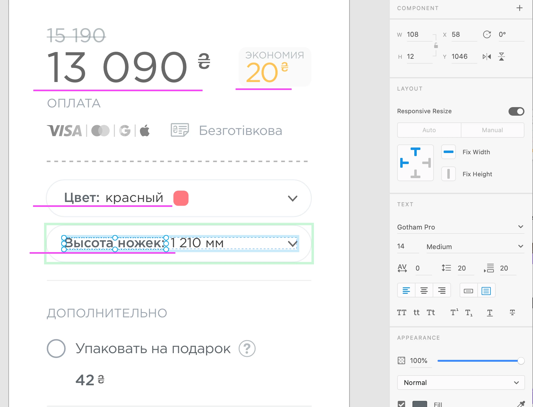
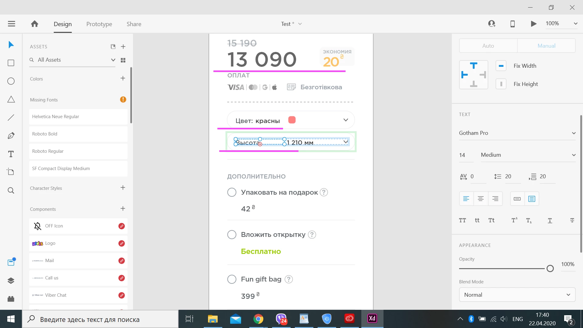
Working with developer on same file with same font (Gotham Pro, OTF format) on macOS and Windows. Showing font is completely wrong on Windows. It make XD useless!
XD is latest version on booth machines.
Fonts are ALWAYS an issue, in ANY media industry.
It starts with technical problems, and ends with legal ones... 😉
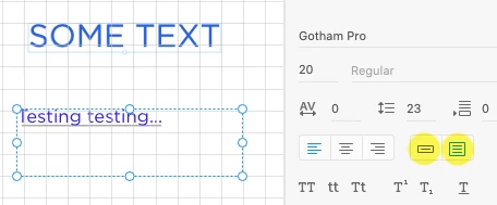
Were you able to verify that your problems also occur with Area texts, and not with Point text ?
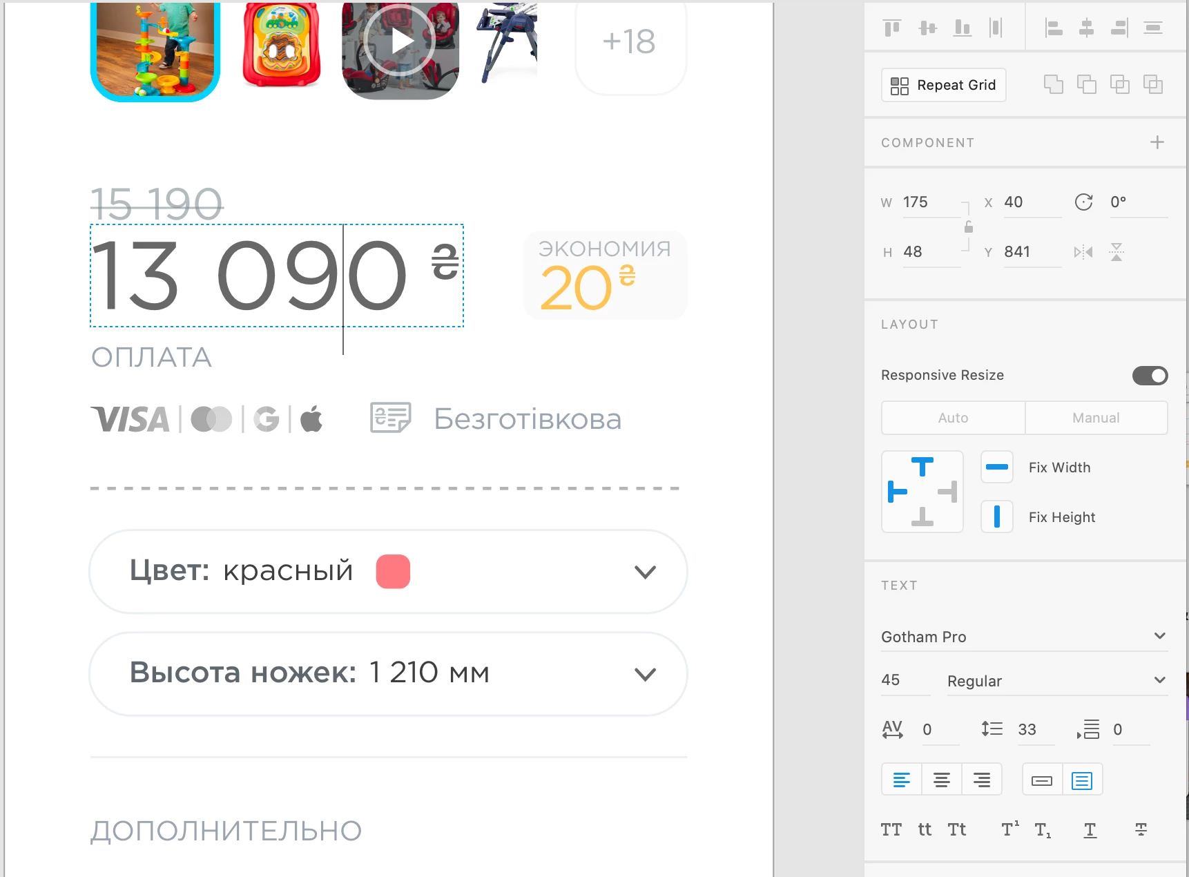
You can see the type of text frame in the Properties panel:
Copy link to clipboard
Copied
For the sake of testing, could you change the text to another font (preferably an Adobe font), and see if the difference is still a worrying amount ? Technically, there shouldn't be a difference, but bugs are essentially not logical, so a verification is crucial...
Who is the foundry or distributor of this Gotham Pro font ? There are many...
Copy link to clipboard
Copied
Thank you, Peter!
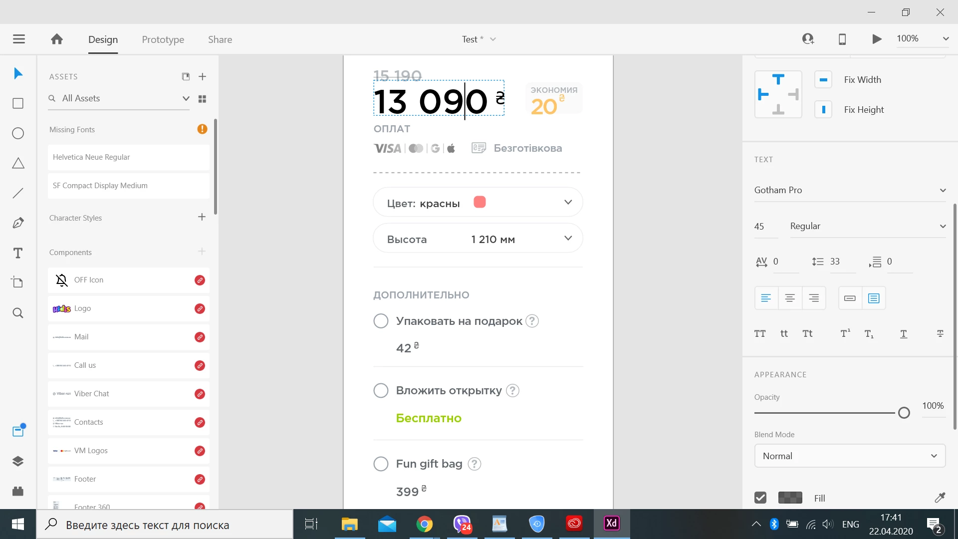
Found another version of Gotham, now bit better. But here is still a vertical shift. Even with adobe font Fira Sans...
Gotham made by Hoefler Type Foundry, but it was in 2000.
Copy link to clipboard
Copied
Windows/Mac web-safe fonts.
Copy link to clipboard
Copied
Thanks a lot, but I need Gotham 🙂 And I wish there was no such problem with XD.
Copy link to clipboard
Copied
Hi there,
Sorry to hear you are facing issues with fonts appearance on Mac and Windows. In addition to what Peter has asked, I would also like to know if it's working on other Adobe apps like Photoshop, InDesign for investigation purpose?
We will try our best to help.
Thanks,
Harshika
Copy link to clipboard
Copied
Thank you for your response.
I have tested these fonts in the Photoshop – didn't notice any problems.
Copy link to clipboard
Copied
The whole text technical treatment of Adobe XD is weak, if not flawed, in several areas and certain circumstances. Not always, but too often to be reliable. Read this topic (especially the last third of the whole discussion) about similar oddities and discrepancies in the vertical alignment among fonts. And in your case we can add among systems to the comparison. One question to ask might be: which one is correct, Mac or Windows, or are both off in their own ways ?
I'm afraid we can't do much more than shrug our shoulders, and wait for improvement.
In the meantime, I'm curious enough to see if I can pin it down to a bit more specific diagnose. Would you mind sending me the file and the font (zipped, or via WeTransfer) to my email address ?
Copy link to clipboard
Copied
I hope, that Mac version of XD is right 🙂
I will send you files, but there is a mistake in mail address.
Copy link to clipboard
Copied
Oops, I missed the .nl - corrected it 🙂
Copy link to clipboard
Copied
Check your mail, please 🙂
Copy link to clipboard
Copied
Thanks for sending the font. 🙂
I've been able to do some tests with it.
First of all, the Gotham Regular font (at least the one I received to install) is a TrueType format, not an OpenType format. But rest assured, I did run into a problem – hurray !!
I created a file with a Point Text (click and type) and an Area Text (drag and type). The point text alignes exactly the same on Mac and Windows. But the line of characters in the Area Text (positioned precisely on top of a line) moves a few pixels up within the bounding box ! That's not right...
I tested it in the most recent XD version on both systems.
Windows
Mac
Copy link to clipboard
Copied
You are welcome, Peter. 🙂
First of all - thank you for testing and for your interest in this issue!
So, as I wrote earlier - I replaced the OTF font with another one, which is a truetype format. That fixed the problem with the font name mess between Mac and PC. If you would like – I will also send you OTF font.
I think XD has a huge font issue.
Hey, Adobe! We have a serious problem with area text!
Copy link to clipboard
Copied
Fonts are ALWAYS an issue, in ANY media industry.
It starts with technical problems, and ends with legal ones... 😉
Were you able to verify that your problems also occur with Area texts, and not with Point text ?
You can see the type of text frame in the Properties panel:
Copy link to clipboard
Copied
I have checked - yes, problem presented only with Area text. It is infuriates because very offen I can not use point text, which adds lot of space under text baseline. It is very important when using paddings and vertical alignment.
Point text positioning is ok, but now there is a problem with tracking...
Copy link to clipboard
Copied
Copy link to clipboard
Copied
Hi there,
Sorry to hear about the trouble. Could you please try the suggestions shared here https://community.adobe.com/t5/adobe-xd/absolutely-different-font-rendering-on-mac-and-windows/td-p/... and let us know if this helps or if you need any further assistance.
Regards
Rishabh
Copy link to clipboard
Copied
Hello! Thank you for suggetion...
Read the whole topic, as such there is no solution ...
Copy link to clipboard
Copied
Hi All,
Sorry for the trouble. It looks like you're experiencing a similar issue discussed here. If so, I suggest you, please see the correct answer in the post shared.
We'll make sure to share your feedback with the team.
Thanks,
Harshika
Copy link to clipboard
Copied
I have a similar issue: On my PC the text is centered and on mac and the shared link is not... Everybody keeps telling me that the fonts are not centered. It took me a few days to get it, because it all looked good on my side. It really makes me look unproffesional and this need to get resolved asap! Replacing the font does not help since all companies have their particular font that you cannot replace.