Copy link to clipboard
Copied
I made a design for an google phone screen with 1440 x 2960 pixel, but if I try to shrink the size of on iPhone screen with 414 x 736 pixel. It looks horrible. My design is responsive, but it struggle, if the pixel sizes between the screens are an huge different. Please help me. Please see the picture below;
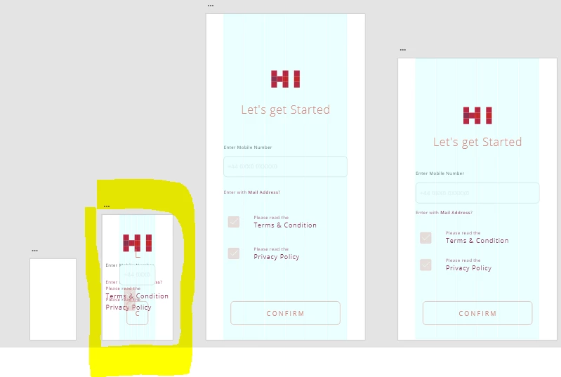
I need to know it, for the Iphone developer to be able to implement my design.
<The Title was renamed by moderator>
Copy link to clipboard
Copied
Hi there,
Thank you for using Adobe XD. XD has a feature called responsive resize, which allows you to resize groups of objects while keeping their placement and scalability. All you have to do is resize the group right there on the design canvas, and XD will keep the relative spacing in place. Please check out this blog post: https://theblog.adobe.com/how-to-design-with-responsive-resize-xd/
Let us know if that helps.
Thanks,
Harshika
Copy link to clipboard
Copied
Thanks, for the fast response. I try to follow it and also group my screen first and than scale it down. But it still looks horrible, please see screenshot below.
It looks like the text doesn't want to get scale it down. I don't know what I do wrong, please can someone help me.
Copy link to clipboard
Copied
I was able to figure out how to scal the Text, please see picture below. But as you see the corners and the broders doesn't want to get scale down. The only think what I want is to scale it down and keep the proportion to smaller Iphone size. Or exist differnt ways in doing it?